You can’t please all the commenters all of the time
The Guardian swapped flat comment threads for ‘nested’ ones. The Manchester Evening News swapped ‘nested’ for flat. Guess what happened next…
I’ve blogged a couple of times about the Guardian’s bruising experience with introducing threaded comments onto their website, a move which has sparked continuing howls of protest amongst the community.
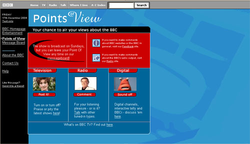
Having previously been involved in a project to move the BBC’s Points Of View message board from threaded to flat, I also know how much frustration that caused for regular users. They mourned “Ol’ blue” — as they lovingly referred to the previous format — for many months after the switch.

My own take is that opposition or love of nested or threaded comments is a religious issue — akin to top-posting/bottom-posting in emails. Not only are you fully committed to your preference, you simply can’t see any justification for doing it the other way.
So I was gently amused this week when one of the first responses to the Manchester Evening News redesign was, guess what…
“Is there any way we can reply to peoples comments like we used to and have them indented to make it clearer, rather than having to trawl through a flat list”

I'm agnostic on the subject, but I like nested threads when done well. I just don't find the Guardian's implementation very usable. My main reasons:
There's no easy way of seeing comments made since your last visit. A 'next new comment' button against each new comment would solve this, plus something saying 'n new comments since your last visit'. A (now defunct) forum I used to spend a lot of time on had these, and they worked well.
(This is particularly a problem with long, meandering threads that grow over a few days. The Doctor Who episode blogs are going to be a massive pain later this year)
There's only one level of nesting, I expect due to the width of the column, so replies to replies look just like replies to the original comment - there's no way to see which comment the reply is to.
Threads get top loaded, with a long tail. Not fundamentally a problem, I just don't like it.
Apologies if you worked on it. I'd be interested to know what your testing showed before it was rolled out (if that's not a trade secret).
No I didn’t work on it, although it is a popular misconception that I did. I did work on an earlier trial, but I left the Guardian months before work started on building the new system.
When writing for the Guardian recently I’ve found it useful because it meant I could drop into a thread, and answer lots of questions and points, and have the answers directly underneath the people asking, rather than what I used to do, which was add about 15 comments at the end of thread all having to recap who said what, where, and what I was answering. But I’m no great lover of threaded comments - I don’t have them on here for a start.
Alerts would definitely help - when I comment on sites that use Disqus actually the email alerts more than anything else bring me back to continue the conversation.
When the BBC message boards went to chronological the biggest howl of protest I saw was wanting email alerts - which were promised - if they had to put up with it like that. Then for some reason the Beeb decided to spend the money on iPlayer instead.
I've never worked out how threaded comments work, but they make more sense on blogs or news stories as comments don't follow a topic like message boards tend to. Quote buttons help enormously for chronological threads.
For a long time I turned email alerts off, preferring to work from the 'control panel', but that's because that's how I was conditioned by h2g2. Now I get annoyed if I don't get emails, who's got time to check all the subscription pages? I need info delivered straight to me!
Martin, you're right about never being able to please all the people all of the time. It's pretty easy though to irritate all of the people at any time though!
I'm curious to know your opinion about the move of many of the BBC blogs from the Movable Type platform to the iCMS one. The commenting on the new system I think provides for an awful user experience - forget about threaded replies, you can only view 5 comments at a time so it makes it impossible to even have a proper flat view of all the comments to make a reply to a specific comment!
To be fair, the ‘howls of protest’ are not just related to the change to nested comments, but to the exceptional bugginess that has been brought with it - far worse than even the nadir of the Pluck debacle - and the snotty attitude of the Guardian when there are questions are protests (OK, not all of the objectors phrase themselves in reasonable or polite terms, but the Guardian seems to have blanked all of them).