The rise and #fail of the Guardian Facebook app
This week the Guardian has announced they are changing the way that they integrate with Facebook, by closing the app that I helped design and launch. It is the perfect moment to reflect on what did and didn’t work, and why the app was designed as it was.
When I was in Frankfurt for the World Publishing Expo a few weeks back, I had the slightly surreal experience of watching someone from the Guardian I’d never met, pick up an award for something I’d designed. The Guardian Facebook app was being recognised for innovation within social media, a few months after I’d left the newspaper, where I used to be Head of User Experience. Fast-forward a few weeks, and the Guardian has announced that they are closing the app down in favour of tighter Facebook integration with their main site.
And there won’t be many people in the wider media commentariat lamenting the app’s demise.
The app was launched in September 2011 as one of several using Facebook’s new “frictionless share” feature. After a user authorised a publisher to do so, websites and apps could post directly to a their timeline without them having to explicitly share an item.
As can often be the case with many Facebook changes, the feature was greeted with suspicion and a lot of criticism.
And I’ve had some bad reviews in my time, but a tweeted death threat to “the children of whoever designed it” was a new low. I use a different tweet in presentations to illustrate the negative reactions, for the brilliant combination of lots of swearing AND caps lock:
“WHY THE FUCK IS THERE A GUARDIAN APP ON FACEBOOK WHEN THEY HAVE THEIR OWN FUCKING WEBSITE” — @Playwert
When the Guardian and Facebook partnered on the project, we didn’t know the names of the other news organisations who had joined in too, let alone what they were designing. There was no prior art, and no way of knowing in advance whether our approach was different from everybody else’s.
In fact the Guardian had taken a different approach to other publishers — intercepting referrals to the Guardian from Facebook, and directing users to versions of Guardian content that lived on a canvas app within Facebook.
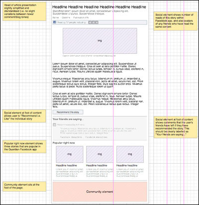
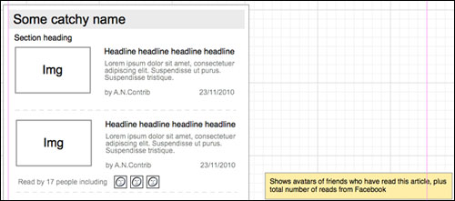
Early wireframes from the Guardian Facebook app project
Why would you do that?
In my view every design should be testing a hypothesis, and the hypothesis for displaying Guardian content within Facebook was that 77% of people who visited guardian.co.uk from facebook.com immediately bounced away. We figured that this bounce rate might be reduced by:
1: Keeping people in the Facebook environment, so they were still signed in to chat and still able to see messages and status updates arrive from their friends in the ticker that Facebook were introducing at the same time.
2: Instead of showing them links to content related directly to the story, or to the area of the website which had published it, we would show them links to content that was popular with people like them on Facebook at that moment in time.
We wanted to shift that 77% metric and get more people clicking on a second story.
My original design sketches imagined that you would be shown a selection of very popular stories that a few of your friends had already read, and some less popular stories that your friends had shown a disproportionate amount of interest in. In the end, the database operations to do this seemed like too much heavy lifting, and blunt popularity ruled the day.
Conversion rate was fairly low for signing up to the app, but I think a lot of people who criticised the implementation were missing a rather significant point. You didn’t actually want too high a conversion rate. Crucially anyone clicking “Cancel” ended up on the Guardian website, and reached the article anyway.
Think of it this way.
One person frictionlessly sharing one article might share it to their (on average) 150 Facebook friends. If 15 of those friends clicked on the link, 13 might end up reading the article on the Guardian website because they didn’t want the app, and two might install the app.
Those two installations would then automatically share the article to a combined (on average) 300 friends. 30 of those might click on the story, with 26 ending up on the Guardian site, and four installing the app.
Those four people would then share it to a combined total of (on average) 600 friends. And so on. Potentially exponential traffic growth. The graphs were sensational. The app was an engine of viral distribution, not a destination in itself.
There seemed a consensus amongst media commenters that the Guardian had ceded too much control to Facebook. Certainly the volume of traffic and the distribution of content within Facebook was down to the algorithms concocted in Menlo Park, but it was in Kings Place that the master switch on re-directing traffic to Facebook resided.
The Guardian could have switched off the app at a moment’s notice. The pages were delivered via a system residing on Google App Engine, and all of the ad revenue within the canvas iFrame was the Guardian’s to keep.
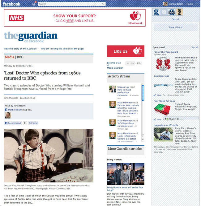
Ads in the unshaded area generated direct revenue for the Guardian
I used to have a poster next to my desk of a tweet which had asked:
“I wonder how much referral traffic the Guardian has lost from Facebook since implementing their social reader”
Nobody outside the Guardian seemed — or still seems — to understand how the Facebook sharing was still driving lots of referrals from facebook.com to the main site, and lots of search traffic began to be related to stories that people had only been exposed to because of a “frictionless share”.
The app was designed to be a leaky bucket, and most of the traffic still ended up on the Guardian website.
It isn’t all about the end product
If you can only look at what appears front-of-house, you don’t get to see the other ways a project or product might be valuable for a company.
A very small product team worked on the project, demonstrating that at very low cost you could build and deploy something built on top of the Guardian’s API, and deeply integrate it with somebody else’s system, all in the space of a few weeks. The tech team had to learn to work at Facebook’s speed of constantly releasing new code and changing specifications and schemas.
A team of developers and myself went to the US in February to work directly with Facebook along with some other Guardian colleagues, and it was an amazing learning process. Not just the experience of the culture of Facebook itself, but a reminder that four people locked in a room can get a hell of a lot designed, coded and released if none of you are distracted by meetings or working across multiple projects.
It was also that trip that caused me to switch over to designing in the browser with HTML prototypes as my preferred method of working, and the app gave the tech team a chance to get to grips with running the first A/B tests the Guardian did in a relatively low-risk environment. Facebook also taught us a lot about the power of obsessing over data and metrics. My morning commutes turned into one long Facebook Insights and Omniture session, tracing the rise and rise and eventual fall of the app.
Wall decorations in the Facebook Menlo Park office
Too much sharing
Were there problems with the approach of frictionless sharing?
Absolutely.
I think the initial launch in a blaze of glory, with recently read stories pinned to the top of everybody’s Facebook news feed, was clearly overkill to a lot of Facebook users. And the stories weren’t presented in the ideal way for news — a lack of timestamps allowed old news to propagate as if it had just happened, and a lack of thumbnail images blunted the appeal of human interest stories.
Mind you, when Facebook did start adding thumbnails into people’s news feeds, we discovered there was just a little too much human interest in the naked human form — I’m fairly certain that the Egyptian blogger story was the only place you could see full-frontal nudity in the Facebook environment. We also found that images with even a hint of nudity were being marked as “offensive” by Facebook users.
And the user experience of signing up to the app was always problematic. The app sign-up page had to be generic enough to work for every type of app on Facebook, and so my initial ideas of a sign-up flow didn’t ever see the light of day. In the end all the Guardian had to play with was about 140 characters of description to convey to users what would happen if they said “yes” to the app.
No distribution. No value
Am I surprised at the demise of the app?
Not at all — the writing has been on the wall for some time. Or rather, it hasn’t been writing to the user’s Facebook wall.
Getting the kind of content super-distribution that allowed Facebook to briefly oust Google as the main referrer to guardian.co.uk requires lots of people to be exposed to the content, and Facebook has long since stopped notifying users of every single read.
You might see the odd “trending article” or “most shared” component on your news feed, but the recent changes to the EdgeRank algorithm mean brands aren’t even guaranteed to reach all their fans when they post original content on their timeline, let alone reaching people with a “frictionless share”.
The act of posting a “read” into the OpenGraph always seemed the very lowest level of interaction that anyone might be interested in doing on Facebook.
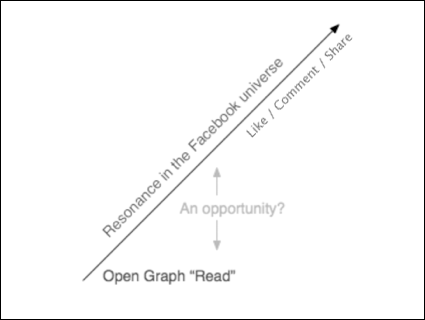
An opportunity to post more interesting actions?
There is a much richer vein of interactions to be tapped, and that was one of the reasons that in February 2012 we added the ability to simply “disagree” or “agree” with the author of a comment piece.
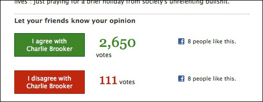
Agree/Disagree buttons in the Guardian Facebook app
Regrets. I’ve had a few.
Regrets? Yes, of course. But not too many.
I absolutely loved working on the project. As I’ve said in several presentations about the app, being at the sharp end of the relationship between a company that is nearly two hundred years old, and one that isn’t yet ten, was an incredible experience.
At the time of launch the Guardian had around 40m monthly active users, and Facebook 800m active users. That meant there were at least 760m active monthly Facebook users who weren’t getting exposed to the Guardian’s journalism, but who potentially could be. It still seems to me to have been worth trying to reach for that prize.
Prior to launch, the product manager and I went around key senior editorial figures at the Guardian to explain what we had built. Our message to them was that “Either in a month’s time we’ll be issuing press releases about amazing traffic figures. Or we’ll switch it off after two days because the whole thing will be an incredible privacy PR disaster for us and Facebook. At the moment we simply have no idea which.”
That is an unusual position to be in. It is very rare that an established large media organisation will take on such a big risk with a high-profile product launch.
There is an unquantifiable long-term effect on the Guardian. It is one of the top three visited newspaper websites in the world, so the approach of channeling some traffic through Facebook clearly hasn’t greatly impeded growth.
But as I used to say, “I can show you an analytics graph with the numbers of people visiting. I can’t show you an analytics graph of the number of people being annoyed.”
Over recent months, since I left the Guardian, I’ve observed a lot of user testing sessions where people are very nervous about clicking any kind of Facebook sign-in or integration button, expressing concern that they don’t know what it will do, and don’t want everybody to know everything that they are reading.
This must be a worry for Facebook, although it isn’t by any means universal. Only yesterday I observed a session where a woman explained that she was more than happy to share whatever news she was reading. “There is no secret in reading the newspaper. It isn’t porn” she said. But the longer legacy of “frictionless sharing” might not be lots of rows logged in a database somewhere, but an impact on the willingness of users to activate features that involve Facebook.
Evolve or die
Another thing that struck me during the course of working on the app was how little news organisations do to really promote individual items of content. They might link once to a piece in their Facebook or Twitter streams, but the rush and the push to fill the pages and the airwaves daily means that even feature pieces have a limited shelf-life.
Something like the Jonathan Jones piece on a 9/11 photo was viewed around a million times within Facebook over several months. The sharing may have been “frictionless”, but consuming the content still involved a click or two.
When do news organisations ever set themselves the goal of getting the maximum possible number of views for a specific piece of content, and work it day after day?
I began to look at the high page impression numbers you could get for a well-crafted piece of content with massive Facebook distribution, and wonder why you wouldn’t strive to hit those sorts of numbers all the time, producing less features perhaps, but devoting more time to specifically marketing each of them.
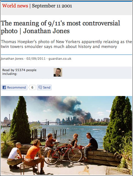
This was one of the most popular articles in the Guardian’s Facebook app
In the end though, everybody keeps saying the media has to try different approaches in order to work out the future.
It is a case of evolve or die.
Just as we know that evolution throws up some mis-steps in the natural world, we also know that not trying new approaches will see many media companies go out of business over the next few years.
I’d always much rather be working on projects that try something new, and learn from the trying, even if they ultimately fail.

Great piece Martin - it should be on the Guardian, too! Ultimately I don't think you can say this project failed. It was a superbly executed idea and, as you said, the learning process was invaluable. But you built the best thing you could with a small team - and within the parameters of how Facebook then operated. The fact that they f*cked their own processes around and changed parameters doesn't mean the app failed. Not failing meant responding, and actually pulling users back to guardian.co.uk with Facebook logins, rather than trying, uphill, to get more activity through the app, was the right thing to do.
It's counter productive to highlight failures - not talking about anyone specific but we have a cultural problem with that in the UK I think. We're failing if we're not trying stuff out. I always say this, but news'papers' can't be radical enough.
Miss you!
very interesting insight! Couldn't agree more with "When do news organisations ever set themselves the goal of getting the maximum possible number of views for a specific piece of content, and work it day after day?"
Embedding the long tail into journalists' practices is proving so difficult. It's no longer only about getting the story first, but also about getting one story best. And then, as you say, work it day after day.
Why can't print journalist see this? My sense after a decade in print journalism and 18 months with the Guardian writing an experimental bankingblog is that it's in print journalists' DNA to think in 24 hour cycles. Journalists who grew up on paper, so to speak, instinctively consider yesterday's story fishwrap.
You can teach an old dog new tricks, but you can't rewrite an old dog's DNA.
What a cracking post. Really insightful and raises a load of interesting questions.
The point about individual articles is really interesting and food for thought in terms of how individual journalists might approach sharing content off their own backs (or actually not do it!)
I think the insights about the way the platform works and people view it is also really interesting.
But I think the big take away from me is the shift in thinking that orgs need to adjust behaviour to suit the platform. In this case it seems that the Guardian suffered a little from the Facebook habit of doing testing and development of features in the wild. Maybe there is also a little of that wanting to 'deliver' news to places rather than deliver the interaction as well. But, as you say, credit for giving the permission to fail. A very rare thing indeed.
The fundamental problem (not just with the Guardian but other papers too) was that when a friend posted an article and you clicked, you were prompted to install the app. No! Not interested! Just let me get to the article on the website without bothering me...
Great post Martin - agree with Jemima should be on the Guardian! Thanks for sharing more about how the app came about and what worked/what didn't - so insightful for others out there.
I loved working on the app with you and miss your visits to the communities desk too!
I was never a fan, but as long as I could click Cancel and go to the article I was happy.
I remember the Independent removed that bypassing feature, so you could only share or leave.
I also remember the Guardian adding an 'Are you sure' to get a second chance at catching 'people like me'.
A great experiment, but I dislike the general direction. It's not actually the sharing that bothers me - it's the profiling. I don't mean by the Guardian, I mean by Facebook. Whether I'm a Guardian reader or a Daily Mail reader is none of their business.
It was an annoying and invasive piece of adware that I will be glad to see the back of. When I want to post something in my timeline I will do so. This article trying to excuse the reasons behind it holds little water for me. If the Guardian want more online readers then they should put something more interesting online that other newspapers do not. The really annoying thing is I liked the Guardian. Their NoW phone hacking piece was world class journalism. This app was third rate (if that).
Smashing read. We switched off the Metro app two weeks for exactly the same reasons you've detailed - the opportunity to consistently reach a new, large, younger audience didn't really come to fruition after the changes to how social reader open graph actions appeared in newsfeeds.
What I did really like about canvas apps is how much cleaner the design was for most of them compared to the web. Far fewer ads and related items crammed in. The new responsive Metro site design was partially inspired by our open reader app - now we've launched that, the time was right to move the focus away from the app and onto the site.
Really interesting piece.
I find your 30 users, 4 app, 26 direct to site stats interesting.
I always fell into the 26 box. The problem was that I was a Guardian fan anyway but I didn't want the app. For whatever reason the browser never remembered that I clicked Cancel and always appeared the next time I wanted to see another linked to article. So I wanted to go to the site but everytime I was getting more and more annoyed about about having to click that stupid Cancel button.
For me the whole experience wasn't frictionless.
It also worried me that most of my friends didn't realise that installing the app meant they were in effect spamming their friend's timelines. They actually didn't know that I could see what Guardian articles they were reading. As you said people are becoming less trusting and need clear information as to what installing the app(any app) will actually do.
Thanks for your post.
Thanks for this - very interesting! I was always "suspicious" of the app when I was told what people I knew were reading. I am generally interested in the articles linked to by my fb friends but the app join page that would appear put me off, I would go back, copy the title and Google it. I never realised that "Go to guardian.co.uk instead" would take me to the article sans app!
Hi Paul, thanks for your comment. I used to draw a Venn diagram type affair with “people who use and love the Guardian website” in one circle, and “people who use Facebook” in the other. It was always clear that if you were in the intersection, then the app was likely to really bug you. But if a few people in that space could be used to kick-start distribution amongst people who would never otherwise read Guardian journalism, that might have been a price worth paying.
Hi Nelson, thanks for the comment. Yes, we saw a lot of this behaviour of people using Google search for complete headlines of articles that had gained popularity in the app. It clearly was a poor UX and inconvenient experience for you, but nevertheless it meant the page impressions to stories that had featured heavily in Facebook just kept on adding up. The traffic growth really was incredible if you gave stories the platform of widespread distribution in Facebook.
Actually some of the comments above have got me thinking. I hated the app because it kept appearing on my page because one of my friends had installed it. If it had just gone to the page instead of anally invading the FB account then you would have had something there. The marketing director's insane drive to grab more people's private data and never let go has had its day. We are tired of it and want them to just clear off. If it had offered "no strings" browsing I think you would have increased footfall without offending people. Looking for new customers is OK but alienating the ones you already have is sheer madness.
Good piece Martin - agree it would be good to see it on the Guardian itself.
The sharing might have been frictionless, but the reaching the content had added friction.
I didn't mind the app when i could bypass it, although even then it was *adding* friction to the process of reaching news websites via FB, when compared with a link straight to a website.
Once you couldn't refuse the app, it added so much friction it became a wall, unless you were happy to surrender your privacy to a degree (which I wasn't). To the extent I still use Facebook, I now never click through to links of news websites I know have an app, because I hate it. So I click on FB links much less.
More than that, it means I won't *share* Guardian/Indy etc articles on Facebook, even the old fashioned way, because it will force the app onto my friends. I share FB links less if there's an app.
And this is the nub - the more you share news (as a personal disposition) the more that added friction annoys you. The people who don't mind the social reader are either those who don't care about the privacy angle, or those not reading/sharing that much. Any news junkie with a semblance of privacy concerns is going to decide there are other platforms/content to share, and they are precisely the people a news site shouldn't want to stop/impede from reading and sharing its content.
I think the app was a brilliant experiment, albeit one I'm not entirely sorry has been discontinued. The data alone should have made it worth the investment, and great lessons to learn for whatever replaces Facebook...
Insightful post Martin.
A bottle of wine and ernest discussion on how we can frictionlessly save the world awaits you the next time you are in Paris! Do ping me. :-)
Fascinating read. I was particularly interested in the hypothesis you stated and how the reality differed from it.
"One person frictionlessly sharing one article might share it to their (on average) 150 Facebook friends. If 15 of those friends clicked on the link, 13 might end up reading the article on the Guardian website because they didn’t want the app, and two might install the app.:"
I note that some commenters baulked at opening an app, but I wonder if my anecdotal observation (from other online media) is borne out, namely that when people like/retweet or otherwise share a link, it's ultimately a statement about themselves and a click through rate of 10% is hugely optimistic?
Hi John, thanks for your comment. I picked 10% as the click-through rate to make the numbers work easy in the example. I don't recall what the real figure was, and it varied over time. Video had a higher click-through than text articles
I always copied the article titles into Google to jump to the guardian website so some of the Google traffic also originated from Facebook! Facebook where users fear to click... (Once a Lurker...) As a tool to observe what your friends where reading it was sometimes shocking...they were revealing too much about their social and political mores.
Fascinating article Martin, thanks so much for sharing.
Having worked on a Facebook app too for a reasonably large website, I understand that a lot of the comments about not liking the app are just about how Facebook apps work *in general*, not just your app. They've clearly been trying to make the experience better with things like authenticated referrals etc, but having 140 characters in a generic pop-up to explain the benefits of something, and its privacy implications, really isn't enough
I remember using your new implementation as inspiration when working on open graph sharing,
so it's nice to close the loop and hear what your team learnt.
I wonder where open graph integration/apps will go in the future, both for media and other sites. I guess the first feedback loop is over, what's next...?
"Another thing that struck me during the course of working on the app was how little news organisations do to really promote individual items of content."
Is this how news is or how it should be? Guardian presents them selves as a neutral news outlet (to the my best of knowledge) and to me that automatically means let the people decide whats important, but keep feeding them news.
Why promote an individual news piece when other new items have equal opportunity? Who's to choose what to highlight? or who's to choose what's important within the guardian? or are the users already decide for themselves?
I shared an article yesterday and clicked on that link to make sure it got to the article I was sharing and Facebook asked me to install app. I was slightly annoyed about this as I thought the site already exists. its their brand, why have it in facebook, when you have it coming directly from you?
I think choice plays a bit part in internet browsing and that there is too much emphasis on certainty. Certainty that one must have interest and that they have to satisfy the numbers game.
Whoa great post. I really liked the Guardian app, and I can't understand the reason you're trying to close it. I really liked the design of it as well, so you've done a great job. Thanks.
Wow, you could click cancel to get to Guardian website?
I'd never guess, probably tens of times I clicked the link to what my friend was reading, saw the 'give up your personal data or f*** off' app sign up dialog, and hit back button.
This way I learned to never click Guardian links on Facebook.