Would you vote for that web design? London Mayoral campaign sites reviewed
We seem to have matured beyond declaring each year that this is “going to be the internet election” to having campaign web sites and social media as an integral part of the political cycle. Here are some notes I’ve made whilst looking at the sites of the candidates for tomorrow’s London Mayoral elections.
Calculating which websites to include
In order to decide which websites to include in this survey I put together a complicated formula that was based on their share of votes in comparable elections over the last four years, and took into account how they are polling this time around. And then, unlike the BBC with their ludicrous rationalisation of an arbitrary cut-off point, I just included all of the candidates.
Siobhan Benita - Independent
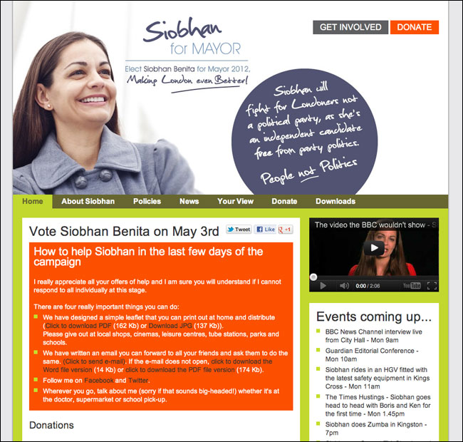
There is some sloppy coding on Siobhan Benita’s site - individual news items don’t have HTML <TITLE> tags, for instance, which make it harder for people to share the content, and inhibits SEO.
I’m also not a fan of link text that is the same colour as body text, so that you cannot see any hyperlinks in the news stories or calls to action. A typical example is the invite to sign up to Siobhan’s mailing list - you can’t see that only the “here” in this sentence is the hyperlink.
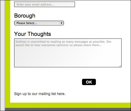
It isn’t possible to tell which bits of text are hyperlinks on Siobhan’s site
The site does have an excellent download centre, where you can get her manifesto, and themed excerpts from it, as well as campaign posters and press images. Siobhan also has a specific iOS app for her campaign.
Carlos Cortiglia - BNP
The BNP does not seem to have a specific site for campaigning for London Mayor. Instead a rotating banner on their main site campaigns for candidates they are standing in Mayoral elections across the country, and the news feed carries an aggregation of news from all of the campaigns.
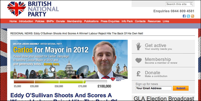
The BNP national site homepage
They were making use of embedded media to include clips of candidate Carlos Cortiglia, and from a quick scoot around the site it looks like many news stories generate a lively comment thread. Their pages include Facebook OpenGraph mark-up, they are using Disqus as a commenting platform.
Interestingly they are using Lockerz as their social media tool - a system that allows users to collect points for sharing content, which they can then trade in for discounts elsewhere on the web.
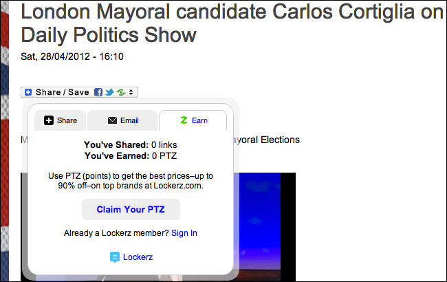
The BNP’s choice of social media widget allows people to earn money for sharing content
Boris Johnson - Conservatives
A day before the election and the Conservative website was trying to launch a video splash page on me. Since I was connected to the web via a 3G dongle with poor signal strength, it just stalled the whole site. A typical example of why measuring screensize and detecting that a user agent has come from a desktop or laptop computer doesn’t guarantee that you can deliver high bandwidth content.
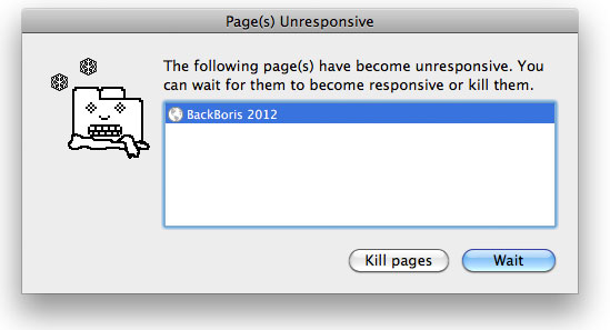
Unresponsive Boris - a political metaphor?
After some time the video did load, although probably eating up rather more of my data plan than I would have liked, given that I didn’t ask for video.
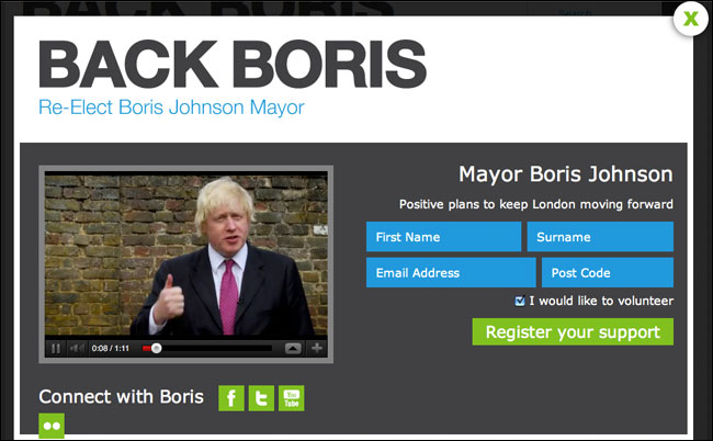
Back Boris video splash page
The site’s homepage comes complete with an interactive map where you can upload your face and location to show your support for the incumbent mayor.
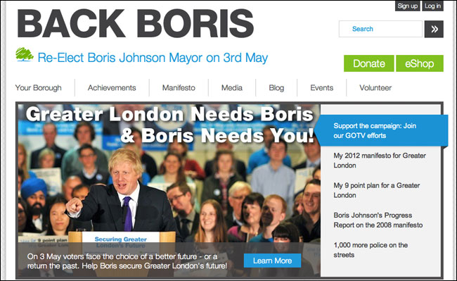
Back Boris website homepage
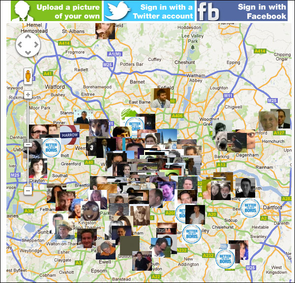
Interactive map of Boris supporters
Boris borrowing the Mayor’s Twitter account caused a bit of a storm pre-campaign, and the website has a heavy social media presence, with the latest tweets, a Facebook social plugin, and invitations to sign in to back the campaign prominently in the right-hand column of the pages. The Back Boris 2012 blog has been running since March 2011.
Jenny Jones - Green Party
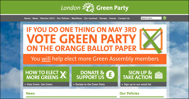
Of all the websites I visited, I thought the London Green Party had the clearest opening message. Never mind a video intro or splash page, you are welcomed by one clear call to action designed to increase the chances of Green representation in the assembly.
Ken Livingstone - Labour
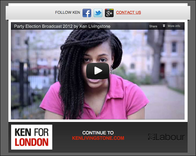
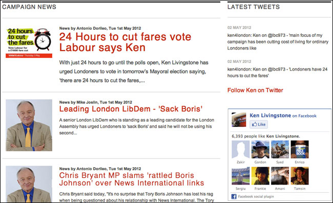
Ken Livingstone’s site also launched a video splash page at me, but at least as it did not autoplay, the page managed to render on my connection.
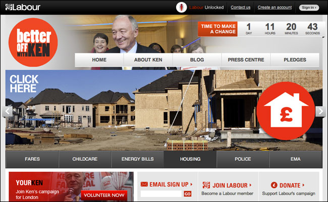
Once I loaded the main site, I found the inclusion of the large “Click here” headlines in the carousel on the homepage a bit odd - they are the only text on the images, so it isn’t at all clear as a user what I’m going to get. People seldom click on things just for fun because they’ve been told to click here - it doesn’t sell the content at all.
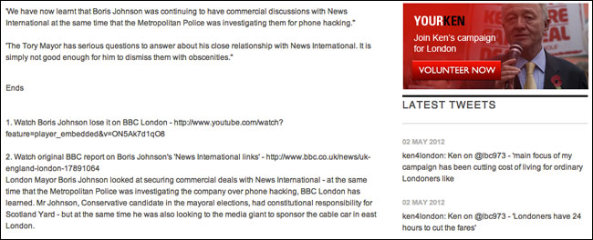
There is also some poor copy‘n’pasting in the news items - this piece on pressure being applied to Boris Johnson over links to News International includes full length ugly URLs to pieces of BBC media that are not actually hyperlinks. This is an incredibly basic mistake for a campaign website to be making in 2012.
The main tie back to the national Labour site is via the “Labour Unlocked” toolbar at the top of the page which links to the Labour Membersnet beta. Like Boris, Ken has Twitter and Facebook components on his website homepage, which persist as you navigate around the site.
Brian Paddick - Liberal Democrats
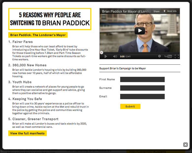
With just a couple of days of campaigning left, Brian Paddick’s site at brianpaddick.com opens with a lightbox-style pop-over with an embedded video, a clear five point list of main policies, and a call to action to join the campaign.
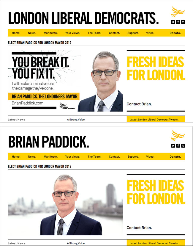
Once you are on the main site homepage, there is quite a bit of distracting movement, as the banner alternates between “Brian Paddick” and “London Liberal Democrats”
The site also includes very specific Facebook OpenGraph metadata, including:
<meta property="og:politician" content="Brian Paddick" />

<meta property="og:cause" content="London Liberal Democrats" />
Lawrence Webb - UKIP
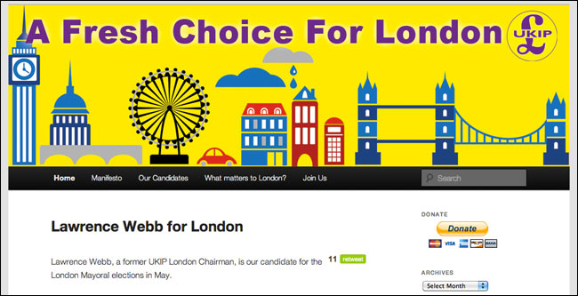
UKIP have what looks like a standalone mayoral campaigning site, but I noted some odd behaviour around the domain name - the homepage lives at ukipmayor.com, but the candidate’s blog resides at indhome.com/londonmayor. UKIP are using Wordpress for the blog, and social media widgets present included LinkedIn and StumbleUpon, as well as the usual suspects.
And the winner is...
Is it too trite to say that web site design underlines aspects of the candidates’ campaigns? The posh boys making Back Boris ambush you with video and didn’t consider that not everybody can afford limitless bandwidth and uncapped data plans. Ken’s site is so over-confident that you already know what Ken is about that it relies on “Click here” to sell his policies. And the Liberal Democrat site is indecisive, with a banner flip-flopping between selling Brian Paddick as a personality candidate and the party he is standing for?
It is still shocking to see some of the basis errors in website building though. In 2012 anybody who has paid for a website that doesn’t include title tags, has accessibility issues with link text, doesn’t optimise the page for social sharing, or has a CMS that doesn’t spot and autolink URLs needs to have a quiet word with their agency about how that happened.
QR codes are for idiots
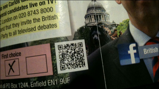
Is the final proof that QR codes are only for idiots the fact that the BNP alone included one on their double-page spread in the London Elects booklet?
And finally...please vote
Please vote on Thursday. It took a long time to get universal suffrage in the UK, so we should continue to use it. Personally I find that I can no longer support any of the major parties, and so I support smaller parties or independent candidates in the hope that it helps them keep their deposit, encourages them to continue, increases their access to media, and does my bit to depress the overall voting share for the major parties whilst keeping turnout up. However you are inclined to vote though, please do so.