Give share buttons their due - they do change user behaviour
There’s a really interesting post by Oliver Reichenstein doing the rounds at the moment entitled “Sweep the Sleaze”, about why sites should remove share buttons from their pages. If you haven’t read it, you should. So go and do that and come back here afterwards.
You back?
Great.
I’m a huge admirer of Oliver’s work - in fact if you just visited his website you’ll see we have extremely similar views on how to lay out a blog, and iA Writer is my productivity tool of choice - but I can’t say I agree with him on this one.
Share buttons aren’t there because people don’t know how to share without them. They are there as a visual cue to share.
And they are an effective one.
In his post Oliver says “Some people probably do use those buttons. Maybe even a lot of people. And maybe you do and think I’m dead wrong about this. Maybe I am. And maybe someone needs to do some serious research to know for sure.”
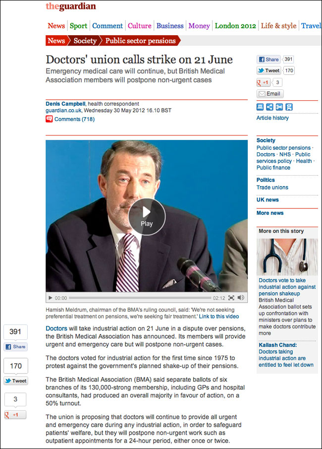
Well, I don’t have serious research across the board, but I do have access to the Guardian’s analytics, and we’ve actually just done a fascinating set of A/B tests around sharing buttons. This has culminated in the appearance of a “floating” set of buttons to the left of an article.
What intrigued me most of all when we did the test was not that “position A” generated more share interactions than “position B”, or that “position C” sounded the death-knell for sharing whilst “position D” caused people to share more freely. What intrigued me was the effectiveness of the positions was different for each service, even though they were always all presented as a block together.
As a business you end up in a position where you know that one position for the sharing tools boosts your presence on Facebook, whereas another position on the page boosts the number of tweets you’ll get, and you can optimise the page according to which you think is more valuable.
The point isn’t that people don’t share without buttons, but that you can increase the level of sharing if you present a reminder to share at the “seduceable moment” where a user might be considering to share. You’ve taken the friction away from them at that moment.
I don’t think there is a single news site on the planet that wouldn’t be improved with a severe design de-clutter, but, if it was up to me, the share buttons would survive the cull.

Above: Share tools on the Guardian site now
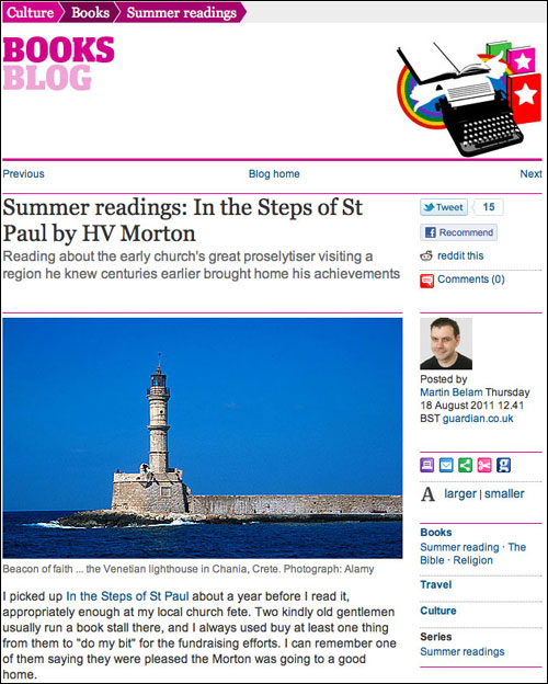
Below: Share tools as they were

And there was I thinking I was a rebel for copying URLs into a tweet and never using the buttons. Bah.
The numbers are interesting too. The more popular something is, the less likely I am to tweet about it because everyone will have seen it already. Is it supposed to work that way or perhaps make people think its worth reading because other people have "shared" it? (in which case it has to be at the top).
I saw the new Guardian floating share buttons and hate them like I hate all other floating content. Yes they make sure you're aware of them, but they also don't stop making you aware and are a massive distraction. Luckily I use no script to rescue me from this so I don't have to see them.
For me, no social media buttons are ideal and I rarely add them to any sites I make. Otherwise, stationary at the top or bottom for when you've finished reading is fine.
Hey Martin,
Would be nice to see what and how exactly you tested. What was A and what was B?
You probably didn't test what I suggested as a replacement: Direct interaction from the journalist on social networks, embedding the best reactions into or after the article. Like Matthew Caruana Galizia from the FT team said: "decreasing the distance between producers and consumers" (http://m.cg/post/24106441716/decreasing-the-distance-between-producers-and-consumers); this is what I claim to be more efficient than code snippets and automatisms.
Also, I think, to see a clear result for the effect of just removing those buttons, we need to test newspapers, blogs of various sizes and different target groups (tech, fashion, agencies, corporate sites...) What might give TheGuardian additional clicks (how many? how did you measure it?), will probably be irrelevant for Hans Meier.
From my own experience and the analytics data we see from the newspapers we consult (generally smaller than the Guardian, and no English language ones) I can't see any substantial effect from these buttons. But like I said: It's very difficult to measure. But we both know for sure is that newspapers could indeed profit from less clutter and from a greater (closer) involvement of journalists with their audience. :-)
I ditched the official buttons from my own (admittedly small) sites because of concerns over page load and privacy. But also I increasingly couldn't see any real point at all to getting a Facebook Like. I had some likes but they didn't drive traffic and they seemed to stop becoming relevant within the Facebook Timeline. For me, Facebook killed off their usefulness.
Sharing however seemed far more useful; more valuable within a Facebook context.
The result was I built my own simple set of share buttons. Now whether anyone uses them is another matter but at least they're fast, there's no privacy concerns and they promote the concept of sharing.
have you seen an marked increase in "shares" since your are floating the buttons as well?
I'd be curious whether embedding the Tweet (using Twitter's code) used to promo the story might generate different and sometimes better outcomes? As the tweet is embedded in full, the typical options for retweet and reply and there. Could be an interesting one to test.
While he does question whether or not people use these widgets, I don't think that was the main point of the post. My sense is he's asking if we want to encourage this *type* of sharing (i.e. quantity over quality) and whether or not the benefits are outweighed by the possible costs (page performance, brand impact, etc.).