Design error pages for users, not IT consultants
I came across this tweet yesterday, by an IT support company called IGC Technical Solutions
“Windows 8 has a redesigned Blue Screen of Death, It's worrying that Microsoft has taken the time to update something that shouldn't be seen.”
Worrying? What nonsense.
If error pages are going to be seen, then they should be designed well for end users. Once a product is released, error messages shouldn’t be there for the benefit of developers debugging, but for the people who your product has just let down.

My daughter wrestles with the blue screen of death at the Wellcome Collection
One of the age-old criticisms of Windows has been the cryptic error message. If you know computers, you might deduce that an “illegal operation” is a command your processor didn’t like. If you don’t, then being told your software has performed an illegal action might just leave you thinking you’ve been hacked and it is downloading Adele mp3s behind your back.
IGCTech compounded their initial tweet by replying to me:
“Time spent designing the error page is time not spent preventing the error in the first place.”
As if the people trying to figure out “KERNEL_DATA_INPAGE_ERROR - 0x0000007A” are going to be the same people designing the way an error page should inform users.
Ask yourself, which is more likely to give your users product benefit - improving the experience when something goes wrong, or leaving that until you’ve eliminated every possible use case for the error page appearing?
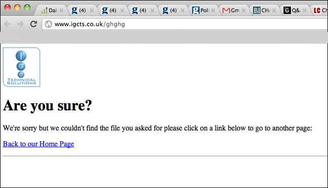
@flashboy pointed me to IGCTech’s own 404 error page. It says it all really.
