Template-free publishing tool Scroll debuts on the Guardian website
At the weekend the Guardian became the first major publisher to experiment with Scroll, a new tool from a New York based start-up which promises to allow users to build magazine-style layouts for the web without having to know any code at all. Benji Lanyado put together a version of the weekend’s lead travel section article using it, and we published that in our new Guardian beta section, as well as publishing the more conventional version. There was also a blog post talking about the experiment, where Cody Brown, founder of Scroll, has joined in the conversation.
This is what the Scroll layout version looked like:
And here is the version in our conventional article template:

Scroll is in early days as a tool, and there are plenty of cross-browser and cross-platform issues with it at the moment. When you start to lay something out, the template is intimidatingly blank, which I worry under-estimates the requirements to have good visual design and interaction design guidelines if you want a consistent user experience on the web - and in truth - in magazines and in print newspapers as well. It looks interesting though, and you can expect to see an experiment with it on this blog later this week.
In the meantime, I thought it might also be worth bringing together some images of the layout of the Ladakh article in some of the other formats we published it in - iPad, print, iPhone and Windows Phone are all illustrated below.
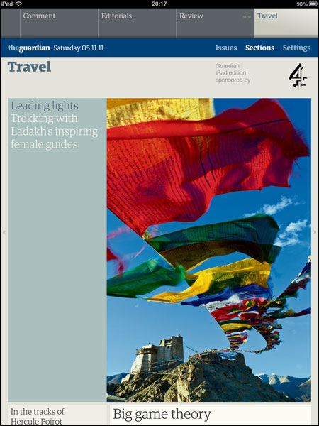
The Ladakh article trailled on the iPad edition Travel front
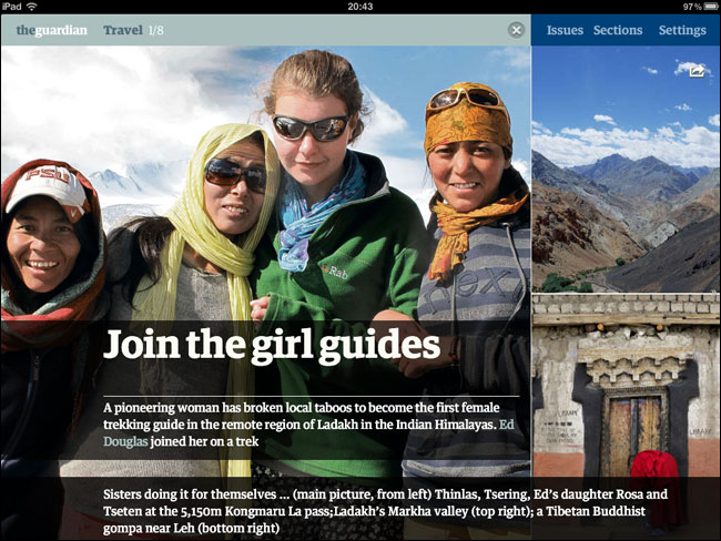
Alternative landscape article layout in the iPad edition
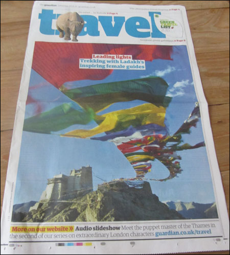
Front page of Saturday’s Travel section
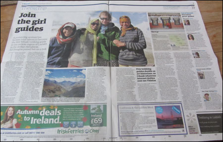
Two-page article spread in Saturday’s Travel section

The same article in our iPhone app. Note the non-functional link to the alternative version in the standfirst, because HTML is stripped by the app
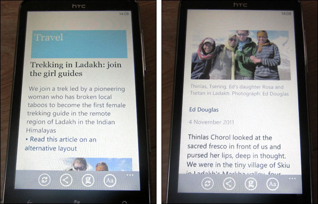
The same article again, on our Windows Phone 7 app

