How the Guardian’s iPad app changed the way that I consumed news
We’ve had a lot of products launch over the last few weeks at the Guardian, including Android and Windows phone apps and our Facebook app, but none have been as high profile as our iPad launch. With a design team of Mark Porter, Andy Brockie, Barry Ainslie and John-Henry Barac, you wouldn’t expect it to be anything other than beautiful.
Mark Porter has written an extensive blog post about the design thinking behind the app.
“To me it was always about how to capture the essence of the print experience and translate that into forms and behaviours that felt right on the iPad.”
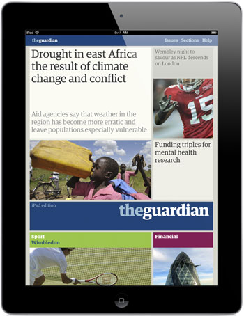
The Guardian iPad app
You can also get a glimpse behind the scenes of the design process in a gallery on the Guardian site where Andy Brockie illustrates some of the ideas that didn’t make it into the final product, and some of the deliverables that the designers produced along the way.
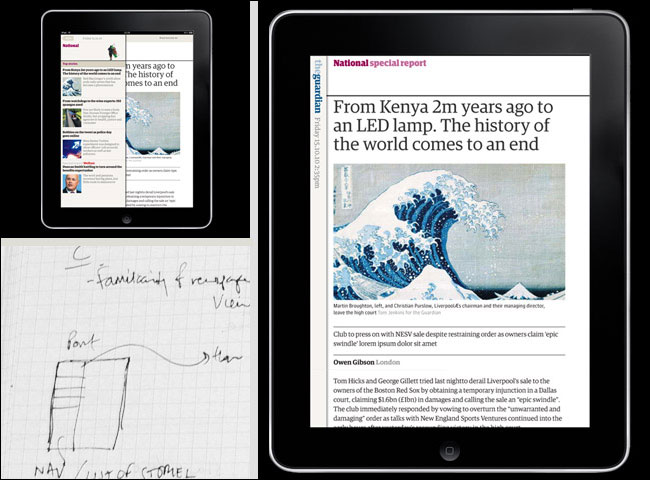
Some of Andy Brockie’s design work on the Guardian iPad app - see more here
Jonathon Moore, now Senior Product Manager for iOS at Skype, who was product manager through the Guardian iPad development process, has also written a blog post about the project. He writes a thoughtful analysis of some of the challenges of leading the delivery of a product which tries to “achieve more than others dare to imagine.”
There have been some initial responses on blogs to the launch and on Twitter. Joseph Stashko has reviewed the app here, and Patrick Smith has written about it here. You can also find write-ups in Creative Review, Mag Culture and by Steve Smith.
If you haven’t used it yet, you can get an overview in this video.
Common themes have been to question the lack of user comments, comments on the pricing strategy, the absence of some weekend content (including all of the Observer), and some people have downloaded the app without noting that they needed the iOS5 update first, which has been a frustrating experience for them.
And of course it has flaws. It is version 1 of an app on a brand new version of iOS, so it is bound to have a few kinks to iron out. Apart from which, we’ve had 190 years practice of how to lay out the paper, about 15 years of practice with the web, and just around four months of daily production of the iPad edition, which has to marry computer algorithms with human editorial instinct.
The issue of dynamic updating and web-like features vs. more static editions is an interesting one. As Jonathon Moore pointed out in his blog post:
“Our testing again discovered a strong correlation between passionate advocates of all things digital and an absolute unwillingness to pay for news content. All too often those demanding the most from news organisations are the exact same users happy to go elsewhere when asked to donate a cup of coffee’s worth of revenue to the business. Such is the state of the media industry. Quite a challenge.”
I ran several rounds of lo-fi user tests on the iPad app during development, and it was generally true that the people who wanted an app closest to a website experience were also the people who would then say they were prepared to pay the least for it. One user suggested 59p a month would be his acceptable price-point for what would, when you think about it, amount to thousands and thousands of articles.
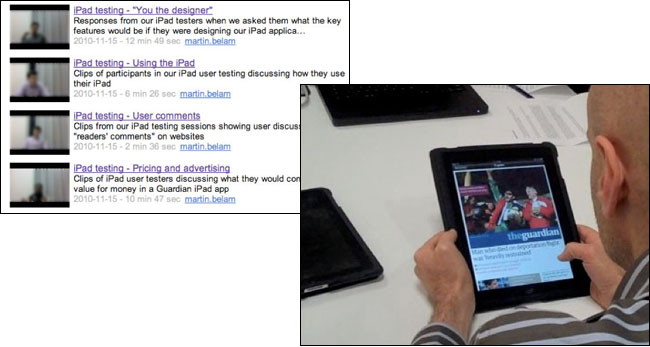
Clips from the lo-fi iPad prototype testing sessions were placed on the Guardian’s intranet
At the time I summed it up in a presentation as saying that this was like showing a family saloon to some boy racers. They would grudgingly admit that it had four wheels and got you from A to B, but they weren’t excited about it, and didn't find it digital enough.
But not everybody is a boy racer.
And family saloons still sell.
It strikes me that it is considered quite normal for car manufacturers to have a range of products that are designed and priced to suit different sectors of the market. When a news provider does it, from some sections of the web community there is an almost instant knee-jerk reaction that this proves news organisations “don’t get” digital.
Just because you can have an always on app that crams in updates and breathlessly fast breaking news from live blogs, doesn’t necessarily mean that you have to. To me, that is like arguing that there is no point the BBC broadcasting the Today programme or putting Newsnight on iPlayer, because the news might be “out of date” the instant the programme is finished. Not all content in a newspaper bundle is based around breaking news - it kind of doesn’t matter when I get round to reading a review of Biophilia to help me decide whether I’m going to buy it, or an interview with Joe Cole about his first few weeks in France. It is always going to be the same review of the same CD, and always going to be the same interview from the same stage in Joe’s career.
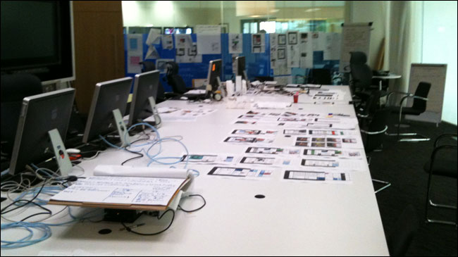
The Guardian iPad app project room
How the Guardian iPad app changed my news consumption habits
I found having the app installed changed my own news consumption habits.
I’ve had test and beta builds on my iPad since the beginning of summer. My main use of it tends to be on the commute home from work. Tired and not wanting to actively think too much, I’ll find myself swiping through the days paper, and discovering all kinds of interesting stories about the history of Argentina’s economy, or the fate of the squirrel, or an interesting legal case and so on - the kind of stories that my habitual and relentless web browsing of politics, tech & media sources and sections doesn’t surface. And this was mostly on the previous version of iOS, which didn’t have the automatic download that comes with news stand and iOS5, so I had to remember to download it myself each day prior to getting on the tube.
When I think about the editions idea, I constantly come back to the Marcia J. Bates’ model of information seeking behaviour.
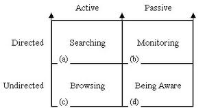
When I’m on Twitter, looking at RSS, and clicking the “Tech” link in the global navigation of a news website, I’m in “active directed searching” mode. That is quite an unusual state, and not a state that much news consumption has traditionally been in.
The editions of the Guardian on the iPad play much more into the sphere of “active undirected browsing”, when you are skipping through the edition because you know this is “the important stuff you need to know”, chosen by someone who has looked across the whole range of stories they could put into the edition, and chosen them.
The value of curation
In a strident blog post, Miles Cheverton described some of the product and design decisions around the Guardian’s iPad app as “unforgivable”. I think it is rather more unforgivable as a UX designer to forget the number one rule of building digital products - “You are not your user”. During a product development process you are very unlikely to represent all sectors of the market yourself, or all of the primary use cases.
The most wonderful responsively designed, customisable, highly intelligently personalised up-to-the-minute website in the world, for example, is useless for anyone who has a regular commute without wifi or 3G access. Scheduled downloads for offline reading have been the #1 feature request on our iPhone app for some time, and the news stand in iOS5 means we have been able to realise that goal with the iPad app. Offline reading of a carefully curated bundle that automatically downloads to your device before you leave the house, whether you remember to instigate it or not, is a compelling proposition for a lot of users.
And for a lot of users, “personalisation” means personalising their iPad by choosing to install an app, not wanting to wrestle with lots of settings. The BBC recently revealed that only a third of users had ever adjusted the settings of the homepage that was the poster-child of personalisation on the web - and 2/3rds of those changes were simply to set the location for the weather. For some, choosing the Guardian iPad app instead of the Times or the Telegraph is the act of personalisation.
Jon Gold’s blog post - “The Metaphors Breaking The Future” - praises our app for a lack of skeuomorphisms - i.e. design details that have moved “from function to form”, and says that the Guardian app also changed his mind, to some extent, about the “edition” metaphor:
“A curated collection of content is nice. I appreciate the Guardian’s curation of content – being able to flick through relevant things that I might otherwise miss on my strict diet of only reading articles linked to by John Gruber. Whilst they have everything on their website, it’s nice to just be shown some things. Just the things that matter today. It doesn’t have to compete with instant. In the same way that the weekend newspapers are a more leisurely, editorial discussion rather than break-neck to-the-minute reporting, I see a future in ‘trusted news sources’ providing that editorial discussion.”
(He also criticises Apple for the skeuomorphism of the newsstand wooden shelf. My personal metric of when the ebook has grown up will be when ebook readers don’t use faux wood and faux paperback covers.)
Conclusions
As Jonathon Moore’s blog post says, his choice early on in the project would have been to develop an app that concentrated on “the live, digital experience”. And regular readers here can certainly guess which side of the digital-vs-print divide I was sitting on.
But the user research was eye-opening.
Print sales may be in terminal decline, with ad revenues falling off a cliff, but the Guardian still shifts something like a quarter of a million copies every day. For many of those consumers, news on the web has been an unsatisfying experience to date. Too busy. Too difficult to find “what is important”. No serendipity. Jumping flashing ads leaping out at you. The quality of the product compromised by swivel-eyed loons in the comments below. No broad world overview. No sense of having finished and found out what you needed to know today.
For those of you wanting a more dynamic experience on the iPad, you can try Paul Haine’s Guardian reader. Or have a look at Phil Gyford’s “Today’s Paper” for an alternative way of navigating through a single edition. Or, use our Open Platform API and roll your own.
For me, the Guardian iPad app has changed the way I consume news.
Of course I still zip around the web, driven by links on Twitter, RSS feeds, and the recommendations of friends and peers.
But I’ve found, thanks to the editions metaphor and the effortless offline reading, that I’ve read more of the content that the Guardian produces, and on a wider variety of topics, in the last four months, than I have in the last two-and-a-half years.
I’m UX & IA Lead at the Guardian. This is my personal blog. The views expressed on currybetdotnet are my own, and do not reflect the views of Guardian News and Media Limited, or any current or former employers or clients. Read my blogging principles.
“currybetdotnet: Best of the blog 2011” brings together over 50 of the best posts on this blog from 2011, covering topics such as live blogging, community and social media for news websites, and the future of digital media. It features write-ups of talks by Guardian journalists including Paul Lewis, Matthew Wells, Andrew Sparrow and Chris Elliot, and behind the scenes looks at Guardian products like the Facebook and iPad apps. It also has transcripts of Martin Belam's talks at EuroIA, the UPA conference, Polish IA Summit, Content Strategy Forum 2011, FutureEverything and Hacks/Hackers London.
“currybetdotnet: Best of the blog 2011” for Kindle is £1.92.

This is also doable on the tube using one other well-known Guardian product. :D
Out of interest, what do you think ebook reader should/could be using rather than faux paperback covers? Or are you just suggesting it as a way of navigating content - cos I'd totally agree on that. Apple's Coverflow is another one that annoys me.
As someone who has published two ebooks and is preparing a third the cover still seems to be a useful marketing tool, even if it is a nightmare to come up with them when you're self publishing.
Dull answer is that I'd at least make them square so that you don't have to work so hard to cram text into a tiny portrait-shaped space.
Oh square would be a delight and no mistake! The Kindle proportioned portrait I can cope with but trying to do A5 is a nightmare.
This is really great work, and I think you guys focused well on the correct feature set, level of Apple Polish and it was worth the wait.
However, as a non iPad owner and heavy Guardian v1 iPhone app user, you can probably guess what I would say about v2.02 that's currently languishing in the App Store.
How difficult is it to manage two different sets of iOS devices, ostensibly with two different methods of navigation? Will the iPhone version be brought into line soon, or will they follow separate development paths?
And has native Instapaper support ever been on the cards?
I also like to read the news on the iPad or Kindle, but frankly it doesn't compare to the way it feels when reading an ink and paper one.
Still, the App looks and feels great in comparison to others out there. Worth the wait!
Armin.
Very intriguing post. I really had no idea just how much print newspapers had shrank until I noticed one outside a neighbor's house today. What used to be hundreds of pages is now a mere pamphlet. It's interesting to see how mobile devices are changing the way we all consume news.
An iPad is just an expensive toy, useful for people who don't understand how to use a real computer.
I am not a technology fiend. I belong to the old school and would love to touch, feel and read my newspaper which brings the whole world to my door steps.Some habits never die, as they say.
I like the BBC and NY Times interface. The NY times interface is really pretty using iPad. I guess the magic lies in the font that is used. It is true that more and more people are getting their news in digital form. And the interface is really important because news reading in digital form is very different from the way it is done in hardcopy.
There is something about reading from a phone, tablet on the train. I always feel like I'm being watched as all my attention is focused down at the equipment in my lap.
I still prefer newspapers to technology in public!
Clearly a ton of work, innovation and entrepreneurial spirit was put into the launch of the app. My wife has the Guardian US iphone app and she says she enjoys the look and feel of the Guardian. However, early in the morning when she's sipping on her cup of joe she's reading ink and paper. I believe the future of print is looking grim from a margins perspective, but I don't think its really ever going to go away. In any event, Martin, you've made some excellent points. I can see how consuming content digitally gives you an even greater opportunity to find exactly what you want when you want it. You pointed out that this concept has been difficult to realize in earlier forms of digital news, but the very nature of tablet device design allows users to move through content like a traditional print newspaper.