Reaction to the Guardian’s Facebook app
It is just over twenty days since we released the Guardian Facebook app. I’ve been engaged with a lot of conversations with people about it on Twitter over the last couple of weeks, and I thought I might put down a few thoughts on the app, and some of the reaction to it.
First things first though, the app is enabled by our open API, and built in partnership with Techlightenment and Facebook. We turned it around very rapidly, in fact my first sketches and early wireframes were only done a couple of months ago, although some of the ideas about how you might try an experiment with “social news” have been kicking around GNM for a good while longer.


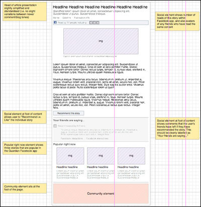
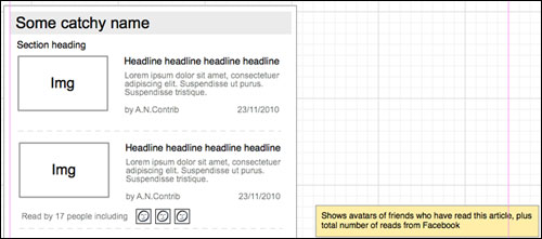
Early wireframes from the Guardian Facebook app project
The app is not a website
One of the challenges has been to convey that the app is not a website. In my original plans and sketches there was no app homepage, and the Guardian’s existing main Facebook page would have been where you were sent if you tried to access the root URL.
However, Facebook Canvas apps require you to have a “homepage”, but I think this was a bit unhelpful for us at launch. I’ve never really envisioned the app as a destination in itself, or as something people will bookmark. The idea is that as people come across Guardian content in the course of their regular activity on Facebook, they will dip in and out of the app, making the Guardian presence within Facebook more seamless. We know that the vast majority of referrals to the Guardian website from Facebook come in at the article level, and so the app is optimised around that experience.
On launch day, though, of course you promote the app with the URL of the homepage, which non-plussed quite a few people, particularly in the media circles I hang around in. “But how do I get to the rest of the content?” was a repeated refrain. Obviously we’ll learn more as more people join and start to use it - but I think starting your journey at apps.facebook.com/theguardian misses the point of serendipitous article-to-article discovery.
How do articles get into the app?
We don’t pick anything specifically to go into the app. Any text article that can be rendered via our API, and which meets a certain set of preconditions, will appear within the app. The idea is that as someone organically shares or recommends a piece of content into Facebook from the Guardian website, when it appears in their friends’ it is a gateway into the app. Likewise the stories that are posted to official Guardian Facebook pages like Culture will funnel people into the app. I’ve also made a bookmarklet that allows you to view any Guardian URL in the Facebook app, which also handily seeds it into the news ticker too if you wrote it yourself...
“Love it” / “Hate it”
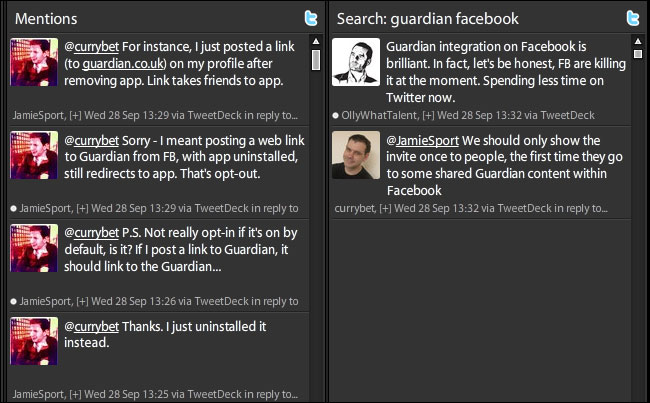
Karen Loasby did some lo-fi testing of the app prior to launch, and we discovered what we suspected, that this was going to be a “Love it” / “Hate it” proposition. Some users recoiled in horror at the very idea, others clicked through quite happily. Post-launch this was exemplified time and time again when I looked at the Tweetdeck columns. I was personally replying to people with misgivings, whilst seeing another column with specific praise for the approach we’ve taken.

Christine Burns said in two tweets: “The Guardian are going the right way to kill off normal social exchange of references to their articles. Almost as bad as Times paywall. The Guardian has been pretty sure footed with social media until now, but their Facebook integration is a fundamentally illiberal mistake”
Jason Cartwright tweeted: “The whole thing is weird - why would you cede control of the distribution to FB? Feels like old AOL walled garden model”
And @Playwert got straight to the point...
“WHY THE FUCK IS THERE A GUARDIAN APP ON FACEBOOK WHEN THEY HAVE THEIR OWN FUCKING WEBSITE” - @Playwert
For those people who have struggled to see why the Guardian would implement a Facebook app in this way, I’d point you in the direction of a piece “The Newsonomics of f8” by Ken Doctor. It had this startling statistic in it:
“You work with Facebook because that’s where the audience is. In the U.S., Facebook claims as much as seven hours of average monthly usage; globally, that number is four hours plus...The comparative average monthly usage of news sites runs five to 20 minutes per month.”
One of my bosses, Adam Freeman, executive director of Commercial for Guardian News and Media, is quoted in it thus:
“Our digital audience has grown to a phenomenal 50m+, but, with the best will in the world, chances are we are never going to outpace and outstrip Facebook’s audience size. So we see an opportunity in that — rather than incorporate Facebook features into our site, we’ve looked at incorporating our content into Facebook. There is an untapped audience within Facebook who may not be regularly encountering Guardian and Observer content, and we think our app increases the the visibility of our content in that space.”
As Doctor goes on to put it: “That’s a key place Facebook fits in. It’s a potential hothouse of new, younger customers.”
I look at that audience of 750m+ and think there is a sliding scale, from people who use Facebook heavily, but never or hardly ever consume Guardian content, and at the other end there are loyal Guardian users who rarely or reluctantly use Facebook, or who don’t use Facebook at all. The app was always likely to be more disruptive for people the closer they are to using the regular Guardian site or our apps. The frictionless sharing, however, puts our content into the news tickers of millions and millions of users who might never otherwise come across Guardian content.
“You’ve broken the open web”
There has been some concern expressed by a few tweeters that by having story URLs under the apps.facebook.com/theguardian domain, as well as at guardian.co.uk, we’ve “broken the open web”. I don’t subscribe to that view for a minute. Take the story “Liverpool threaten breakaway from Premier League's TV rights deal”
You can find that at:
www.guardian.co.uk/football/2011/oct/11/liverpool-breakaway-tv-deal
and
and
apps.facebook.com/theguardian/football/2011/oct/11/liverpool-breakaway-tv-deal
And in our Windows and Android and Kindle and iPhone apps.
And in the new iPad edition.
We already have multiple ways to access the content. What is important to note though is that we do have one canonical URL under-pinning all of that - how the story is referenced in our API:
content.guardianapis.com/football/2011/oct/11/liverpool-breakaway-tv-deal
All those other URLs (even the ones you can’t see in the apps) ultimately map to that.
Opt-in? Opt-out?
We’ve tried to make it easy to opt-out of the app. We are only presenting it to you if you were already using Facebook, so nobody outside of the Facebook environment need ever come across it. If you click ‘cancel’ when asked to join, we direct you straight through to the story you wanted on the Guardian site, and set a cookie so as to try and avoid asking you again. How widely your reading activity is shared throughout Facebook is controlled by the existing default you have on your Facebook account for sharing - but you can customise it specifically for the Guardian app, including only sharing your reads with yourself. You can remove the application by visiting the app homepage, from the apps settings menu on your Facebook account, and on every page by clicking “Why am I seeing this version of the page?” to reveal the drop-down privacy instructions.
Why do it?
Take this piece by Jonathan Jones - “The meaning of 9/11’s most controversial photo”. It was published on September 2nd. Since the Facebook app launched on September 22nd, it has been viewed within the app over 55,000 times. Nothing is allowed algorithmically to be in the “popular right now” section that is older than 24 hours, and so all of that traffic has been driven by frictionless sharing, and the headline appearing in news tickers and feeds around Facebook. That is an amazing amount of long-tail traffic for an article. And we’ve also seen the demographics using the app shift consistently downwards from the thirtysomething media commentators who were taking a peek on day one, to reaching a much younger audience.

One of the most popular articles in the Guardian’s Facebook app
The most fascinating thing
This has genuinely been one of the most fascinating projects of my career. From working with colleagues like Meg Pickard and Dan Catt on ideas of how “social news discovery” might work, to working with Facebook themselves, who definitely live the values of “done is better than perfect” and “move fast and break things”. I’ve enjoyed a lot of the debate on Twitter and blogs about whether it has been the right thing for the Guardian to do - today notably I realised it has annoyed both James Cridland and John Handelaar, two people whose digital opinions I value highly. I also found myself at one point just fixated on hitting the refresh button in the browser watching the numbers tick up and up and up and up on the metrics of how many people were viewing and sharing Guardian and Observer stories in Facebook, and very probably discovering our content for the first time.

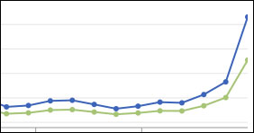
You can see why you’d get excited about this kind of adoption curve
Next...
Next? Well, we’ve already released v1.1, and we’ve got some new additions to the app to come. Will that make the app “finished”? I don’t think anything like this will ever be finished. I’ve got a UX snagging list, and the project team have got a bunch of ideas of where else the app could be developed, and presumably, Facebook will keep on developing their timeline and news ticker, and we’ll need to be thinking about how we grow an audience for Guardian content within Facebook’s space for some time to come.
As ever, apps like this don’t arrive without there being a great team working behind them, and I’d like to thank: Matt Andrews, Gideon Goldberg, Stephen Wells, Sheena Luu, Lynsey Smyth, Karen Loasby, Lisa Villani, Piers Jones, Joanne Ellis, Meg Pickard, Dan Catt, Hayley Dunlop, Andrew Lepki, Hannah Freeman, Charlene Prempeh and Nina Lovelace.
I’m UX & IA Lead at the Guardian. This is my personal blog. The views expressed on currybetdotnet are my own, and do not reflect the views of Guardian News and Media Limited, or any current or former employers or clients. Read my blogging principles.
“currybetdotnet: Best of the blog 2011” brings together over 50 of the best posts on this blog from 2011, covering topics such as live blogging, community and social media for news websites, and the future of digital media. It features write-ups of talks by Guardian journalists including Paul Lewis, Matthew Wells, Andrew Sparrow and Chris Elliot, and behind the scenes looks at Guardian products like the Facebook and iPad apps. It also has transcripts of Martin Belam's talks at EuroIA, the UPA conference, Polish IA Summit, Content Strategy Forum 2011, FutureEverything and Hacks/Hackers London.
“currybetdotnet: Best of the blog 2011” for Kindle is £1.92.

Your post prompted me to go back to the Guardian Facebook app and simply figure out how to stop people seeing what I've read.
I don't mind the idea of reading articles (and commenting) within Facebook - it's the frictionless sharing which feels awkward. The web has given us this mental model that you can follow and click links with abandon as there are no consequences - and that in order to Do Something you have to click a button.
I'm not sure this is just a privacy concern thing, there's also a relevancy thing (do you end up with more noise and less value from frictionless sharing?) and a potential spam thing - the reason I turned off the frictionless sharing for my own feed is that I get the feeling most of my friends & family would find it a little odd and intrusive to see a whole ticker full of my reads. (In the same way that the ticker was full of boring Spotify listens from about 2 of my friends before I figured out how to remove them)
One thing to note there Frankie is that we just push the "read" into the OpenGraph. I think you'll see that Facebook are working on the algorithms to make that display less noisy - I already see that my sessions of "reading" in the app are sometimes bundled together, with the most read/popular articles given priority in the presentation.
I think there should just be a simple opt out of broadcasting everything you read- not a big fan of the Guardian App to be honest, removed after a few days of use...
With the Guardian is there a way to stop the auto broadcast or possibly have it post only the ones you... say thumbs up to kinda like stumbling?
Very good post Martin, and i love the app.
To support your argument, i read most articles in the Guardian daily, either on the Iphone App or online. However i was told about the Facebook App by someone who rarely reads the Guardian (and is in the younger demographic). He says "All my mates love it. It's the best thing on Facebook". That group are definitely your target.
I think you have done the right thing by having an easy push on this. However, i am surprised i didn't even know about it.
Brilliant work as ever.
I have to be honest here, I like the App and use it alot.
I've talked to a few people and its getting mixed reviews.
So nobody outside of the Facebook environment need ever come across it.
I think the problem arises (and maybe the "breaking the open web" part comes into it here as well) when someone shares an app.facebook link outside Facebook. Then, when readers who aren't on Facebook (or are signed out) try to follow the link, they just get a generic Facebook login screen -- with no way to get to the Guardian story.
For example, the link in your earlier tweet is only followable by Facebook users, despite essentially being a Guardian story.
Is this perhaps just an edge case? Possibly -- it would really just affect the set of people who are a) being sent or seeing apps.facebook links and b) can't or won't access Facebook. It's just that I'm one of them :)
Hi! This is a very detailed post. I think it highlights very clearly that your goal is essentially to make the Guardian more "viral", so that you can also reach readers on the other side of the Atlantic. I have written some comments and criticisms about the apps here, if you care to have a look:
http://rational.pdimension.net/2011/10/11/do-not-use-the-guardian-facebook-app/