Haakon Halvorsen, Kjetil Hansen & Anna Dahlström at EuroIA 2011
I’ve been catching up on the notes I made in Prague over the course of the EuroIA Summit. Here is what I made of a couple of talks with a Scandinavian twist - Haakon Halvorsen & Kjetil Hansen from Norway, and the BBC’s Anna Dahlström.
Download all of my EuroIA 2011 blog posts as one printable PDF or for iBooks
Haakon Halvorsen & Kjetil Hansen - “Does a Rich GUI Make the Bank Richer?”
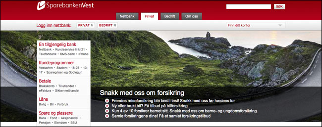
Haakon and Kjetil were presenting a case study of a redesign process for Sparebanken Vest, the third largest and second oldest bank in Norway. The old graphic design didn’t really have that “classic Western Norway look”, although, to be honest, coming from the UK, I think I’d have been hard-pressed to identify something that did have the “classic Western Norway look”. I’d just be looking out for trolls lurking in the background.
They explained that the problem with the banking sector is that is very little natural content which has good phot imagery to go with it. Unlike estate agents, who can use houses, or travel sites with their gorgeous destination photos, banks only have numbers. So there is a disconnect between the content and the fact that banks tend to fall back on cheesy stock imagery of people standing around computers, pointing at the screen. Or two hands shaking. Sparebanken Vest decided to make an asset of their location, and so the redesign features huge widescreen imagery of people and places in Norway.

Haakon and Kjetil went on to explain what a challenge it was to make banking “fun” visually. For most people, online banking is a necessary evil, not an exciting web destination. To impress the client, though, they showed lots of mock-ups of how the site could be, complete with plenty of polish and drop-shadow. Banking will be fun, the designs shouted.
Haakon and Kjetil had a nice line in self-deprecating humour. At one point, when showing a loan calculator form interface they explained: “We haven’t translated this into English, because, frankly, it isn’t that easy to understand in Norwegian.”
They showed how they had redesigned the form to make it easier to use, and put a compelling call to action on the bank’s homepage. Instead of a banner ad or promo slot saying “Calculate your loan”, they had incorporated the first steps of the process into the main page. It meant that users were encouraged to start fiddling around with it.

Anna Dahlström - “Designing for Everyone, Anywhere, at Any Time”
Anna argued that the old mantra that “Design for everyone and you design for no-one” was dead. Instead, she believes that with the proliferation of devices and the multiple contexts that people use in digital products, you have to make services that will work for people anywhere, at any time, whoever they are.
She cited the example of trying to buy a bath when she and her boyfriend were refurbishing their flat. It was a difficult digital experience because most retail websites assume you already have some foreknowledge about the type of bath you want to purchase. Since they were starting their bathroom from scratch, they needed to know about plumbing options, and there was very little to help them choose their purchase. Anna explained that whilst we should still have primary personas, we need to make sure that a service at least pays attention to secondary personas, of people who may have little domain expertise in the area you cover.
Looking at the issue of responsive design, Anna explained that she was not a great believer in wireframing up every possible combination. She preferred taking a modular approach, which allowed her to concentrate on key user journeys and key components.
Next...
And there is still more to come...next is my critique of Jason Mesut’s lively and provocative talk.
This is one of a series of blog posts about EuroIA 2011 in Prague. You can download all of the blog posts as one printable PDF or for iBooks.
All your EuroIA 2011 slides are belong to us
“Designing today’s web” - Luke Wroblewski
“The IA of /Culture” - Martin Belam
“Navigating the Digital Spice Route” - Terry Ma
“Extending the Storytelling - Blending IA and Content Strategy” - Boon Sheridan
“Pervasive IA for the Sentient City” - Andrea Resmini and Luca Rosati
iPads, kids and design lessons for adults - Wouter Sluis-Thiescheffer & Brian Pagán
“Understanding the Nature of Resistance” - Alla Zollers
“Does a Rich GUI Make the Bank Richer?” - Haakon Halvorsen & Kjetil Hansen
“Designing for Everyone, Anywhere, at Any Time” - Anna Dahlström
“Truth and Dare – Out of the Echo-Chamber, into the Fire” - My critique of Jason Mesut at EuroIA 2011
“The Rise and Fall...and Rise Again of Information Architecture” - Bob Royce
“Fill in the IA gap” - Mags Hanley
You might also be interested in:
All your IA Summit 2011 slides are belong to us
All your UPA 2011 slides are belong to us
All your EuroIA 2010 slides are belong to us
