UX drop-in at the Guardian
We had our first “UX drop-in” at the Guardian yesterday, and judging by the waiting list to get tickets and the reaction on the day, it won’t be the last. It was quite a simple format - get a ticket, turn up at the Guardian on the day, there will be some short talks, the chance to play with some forthcoming products like our Android app, and some free beer.
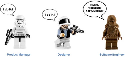
We had three talks in the end - Jonathan Richards talking about the design decisions on our 9/11 interactive, Karen Loasby talking about our challenge to test three users every week, and myself talking about “UX at the Guardian”. With the Lego men again.

Jonathan Richards on our 9/11 interactive
If you open any kind of comment thread about 9/11 on a news site you face the risk of generating comments that run the gamut from conspiracy theory enthusiasts to hate speech-mongers. And hate speech against conspiracy theorists. And conspiracies about the way you have moderated hate speech...
For our 9/11 memorial interactive, Jonathan Richards talked about the design considerations of trying to ensure that the content submitted was respectful and of value. These included:
- The visual cue of providing a design and font that placed the interactive in a space outside the regular Guardian design
- Using Facebook and Twitter as a sign-in mechanism to provide a feedback route to an identity away from creating an account on the Guardian website
- Providing a template for the kind of responses expected by capturing anecdotes from Guardian staff involved in reporting on the day
- Setting a respectful tone in the phrasing of everything around the interactive.
Karen Loasby on our “three users a week” challenge
Karen Loasby spoke about how we have recently ramped up our efforts at testing Guardian products - trying to do it more frequently and earlier in the product life-cycle. She explained how a recent visit from Marty Cagan had set us the challenge of testing every product with a minimum of three users every week. There are only two of us full-time, and the Guardian has a lot of products, so we’ve set the aim of three users a week across the whole of the Guardian’s digital portfolio to get us going. Karen explained that:
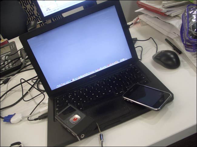
- We do it mostly in “informal lab” sessions using Silverback and a Flip.
- Recruitment is difficult because it is hard to avoid skewing towards gadget-keen males who like the Guardian.
- She has tried some remote testing tools with varying degrees of success - it is hard to avoid reaching “semi-professional” testers.
- Recording adds an overhead - some of the most useful sessions have just been conversations.
- We have a “nagging” whiteboard next to our desks telling everybody in the office how many people we have (or haven’t) tested with each week

Martin Belam on “UX at the Guardian”
I spoke about how we do UX at the Guardian:
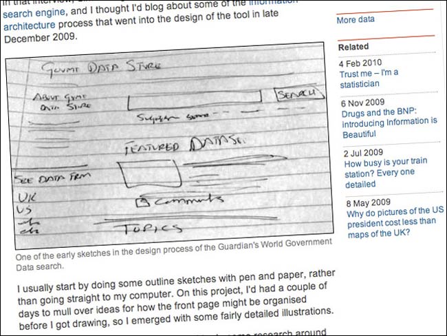
- We use a mix of tools to wireframe, from sketches and scribbles on whiteboards to fully fledged Omnigraffle docs.
- We’ve been experimenting with using Google Drawings as they offer more potential for collaboration. As yet, nobody seems to have edited or annotated one.
- Some of the best project work has been when you’ve set the developers a challenge and given them a minimal UX spec. Given a chance to be creative, they’ve produced amazing work
- We have to keep up a steady rate of work. There are two UX people and thirty-or-so developers.
- When building products iteratively, it is a real challenge for us to keep coherent visual design intact.

Next time, and “We’re hiring!”
Thanks are due to Michael Brunton-Spall, Adam McGreggor, Emma Mulqueeny and all the team who have been running our developer drop-in sessions. Also to my UX colleagues Karen Loasby and Lynsey Smyth for playing a big part in making the event work yesterday.
We will definitely do a second session - most likely in October. The waiting list for yesterday’s event had over 80 people on it. When we have it planned we will announce it on the Guardian Developer blog.
And finally...we’re hiring. I have positions open the UXD team that I run at the Guardian. Applications close on September 4th 2011 though, so move fast. Download the job description and apply here. I’m looking to build a team with a range of skills and a balance of experience, so please don’t be put off from applying because you don’t think you’ve been working in UX long enough. We are particularly interested in bringing into our team people with the skills to design and build rapid prototypes, either in code or using software tools.
There are also a whole host of other roles available in our technology department at the moment for product managers, project management roles and software developers. You can find them all here.
Update: Matt Gould has blogged about the event here.
