Better contextual mobile testing, and barriers to adopting usability - UPA Redux #3
I was recently in Atlanta for the UPA conference. Here is part three of my notes from the week:
“Technology fail” - Martin Belam
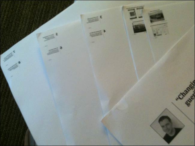
Normally when I give a talk I have a print-out of all my slides on the floor in front of me to act as my notes.

My speaking notes at EuroIA in Paris last year - Photograph by Karmen Mlinar
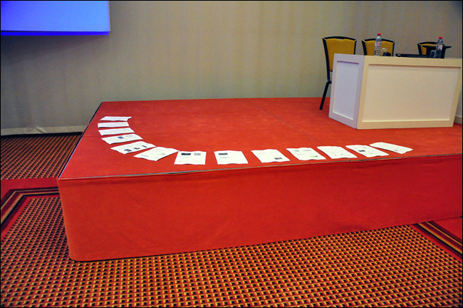
It means I can see instantly how far along a talk I am for timing purposes, and can always see what is coming up next. Not so in Atlanta, where the FedEx business centre managed to make the job of printing out a PDF document into some Herculean task which I could not complete. I ended up with the slides rendered on paper the size of a postage stamp, and as a mirror image. I didn’t even know that was possible.

My speaking notes for Atlanta - microscopic and as a mirror-image.
I’d also like to give a big thank you to Melissa (I didn’t catch her second name) who lent me her laptop so I could do the talk when nobody in the building (including me) had the right adapter to connect my MacBook to the projector.
“Improving contextual testing for mobile” - Amy Buckner and Pamela Walshe
“We test everything in the lab before it goes live, but as researchers, you all know that the lab is not real life” - Pamela Walshe at #UPA2011
One of the sessions I enjoyed most was Amy Buckner and Pamela Walshe talking about how Wells Fargo had researched mobile banking products. They had carried out a continuous diary study with participants that lasted between four and eight weeks, and really gone out of their way to build relationships with the test subjects. Whether it was the faces of the researchers appearing in the information packs the respondents got, or calling them up if they hadn’t filed a report for a couple of days, they used the personal touch to keep users engaged with the project.
An important result of the research had been to reset expectations within the business about who their target market was. Rather than just fixating on the youth market, the study had shown that people of all ages were happy using their phone to do banking when it was about convenience for them.
As part of the study users were asked to submit photos of where they used the mobile banking service. Amy and Pamela said that they were surprised to observe that people often used their phone to do their banking, even though the photo showed that they were within easy reach of a computer that could access the more fully-featured desktop equivalent. Convenience was key.
Their biggest surprise wasn’t that people used mobile banking services whilst “in the rest-room” - (if you’ll excuse my American English) - but that they were happy to self-report that they did so by sending in a photo of the cubicle door!
“Barriers to adopting usability” - Susan Dray
Susan Dray talked about how even when confronted with evidence that a product has usability issues, there was tendency to deny it. She showed how with a healthcare product, they had demonstrated that it took a mind-numbing 13 clicks to negotiate to the point of making a purchase, only for a CEO to basically say “Well, nobody has brought this up before” with no thought for the opportunity cost of potential customers not completing the task.
She also identified another common obstruction to getting usability practices adopted within a business - companies who say that “We are unique. We’ve been selling to the same type of customers for hundreds of years. We don’t need this stuff”.
Dear “news industry”, when she said that, I was thinking of you. Love, Martin.