The little things
Sometimes you can end up just as pleased with some small changes to a website as you are proud of the big projects. We’ve made a couple of tweaks to the Guardian website recently which fall into that category.
Comment preview
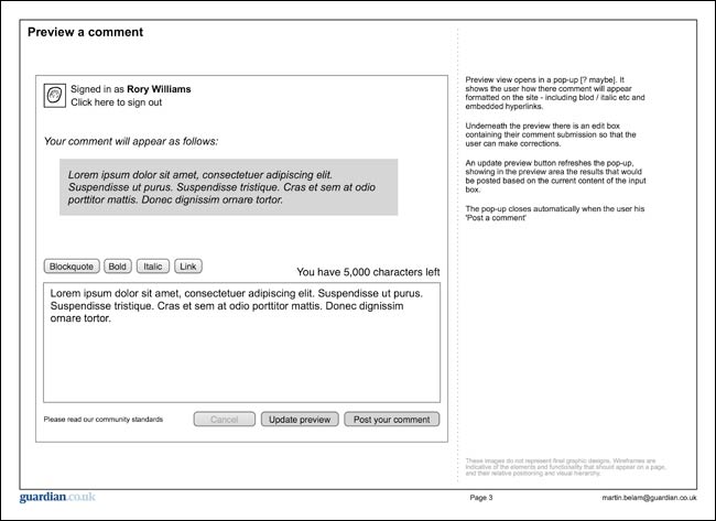
One of the most common feature requests we got on the site was the ability to preview or edit comments. I’ve no desire to see an edit button on the site, because it has too many implications for moderation workflow at volume, but we recently introduced preview.

One of my wireframes for the comment preview feature on the Guardian website
Hopefully it will cut down on typos and formatting errors - though not in my wireframes - and also perhaps give people pause for thought when they are about to press “post your comment” on something rather strident.
The little detail I like about it is that the restyled submit buttons introduced at the same time now inherit the section colour that an article is published in. It is another small sign-post of context.

“Post your comment” buttons from the Money, Culture and Environment sections inheriting livery colour
Comment bylines
Good journalism separates fact from opinion, and saves personality for comment pieces rather than news reports. We signify this in a small way by showing byline pictures on comment pieces, but not on those that have the “tone” of news.
We’ve extended this slightly.
Now in our trail-blocks, we have the option to put byline pictures from contributors up against comment pieces, again, adding another small bit of contextual difference to the way we display content.

Comment pieces with byline pictures on the left, news pieces on the right
Sometimes it is just the little things.