“Come as you are” - Part 4: The Guardian years
Having done some contract work for The Guardian, I joined full time in 2009 as “Information Architect”. I always joke that it is a lousy introduction at parties, as everybody expects someone working at The Guardian to be a journalist, and nobody outside of the software industry knows what an IA does. I wrote a blog post on Guardian.co.uk to try and explain it, but the best description I've ever seen of what I do came in a tweet from Karen McGrane:
“You know what I think I'm going to do today? I'm going to draw some pictures of hypothetical future web pages and see if anybody likes them”
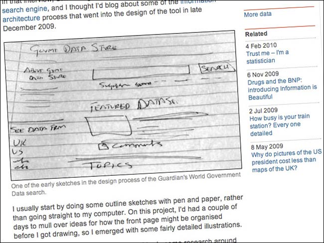
I've been at The Guardian for over two years now, and have settled into a fairly regular product development rhythm. I sketch a lot - for two reasons. One is simply time pressure. Currently our UX team consists of myself and the fantastic Karen Loasby, and potentially we could split our time across every single digital project being worked on across the whole of the company. Doing things with pencil and paper allows me to quickly sketch up ideas for projects, and iterate through variations.

Perhaps the most important thing about sketches, though, is that they are easy to change or throw away. You are nowhere as near invested in an idea if you have roughly drawn it on paper than if you’ve spent hours crafting it in Omnigraffle and rendering it as a PDF.
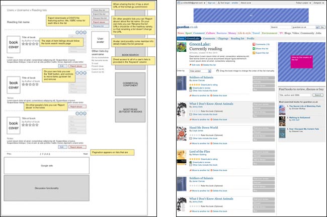
I do also produce some high-fidelity wireframes and wireframes, but I rarely cover every single screen or interaction on a particular product or service - again because of time pressure. We have some excellent designers at the Guardian, who frequently turn my somewhat messy and scratchy sketches or wireframes into elegant screen designs.

My ugly wireframe and Akemi’s elegant design
Increasingly though I try to promote a “co-design” approach. Getting together a designer, an editorial person, and a product manager/executive producer and sketching up solutions seems to be taking weeks of stakeholder management and visual design iterations out of our process. We are getting things designed and built faster.
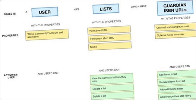
Another technique I have found very useful recently is to produce “object / property / actions” maps. These take a particular service idea and break it down into the constituent parts. For each object I list the things or “properties” it has to have, like a unique URL and a name, and the actions that can be performed on them, like creating or deleting them. Actions usually fall into two groups - those that can be performed by users and those performed by admins. What I like about this approach is that it allows me to quite quickly prioritise the key features - especially when you start to think of which of the three functions will appear as the buttons on the limited screen real estate of a mobile version. [1]

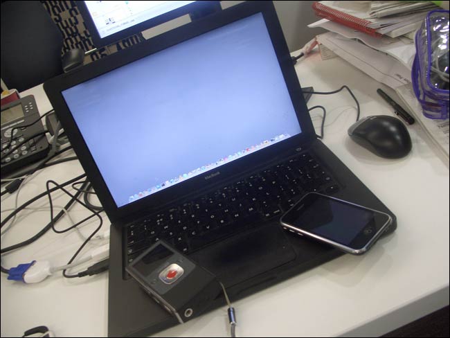
There never seems to be enough time to do the amount of research you'd like on any given project, but some is better than none, and I’ve introduced lo-fi “guerilla” usability testing into the business. Whilst always being aware of the limitations due to sample sizes, I’ve used cheap self-run sessions testing products in The Guardian office and out and about in cafes and libraries to help improve and iterate our products. My testing lab is essentially the Silverback App software, my MacBook, an iPhone and a Flip.

I’ll be presenting some of this work at the UPA conference in Atlanta at the end of June, and will be publishing an essay version of that talk on this blog next week.
The Guardian has a culture of openness about it which means that I am able to share my work and talk about it widely. I’ve contributed to projects like the “UX Storytellers” book, and an upcoming book from Louis Rosenfeld on site search analytics. I've been able to blog about my work not just on currybetdotnet, but on the Guardian Developer Blog and Inside Guardian.co.uk, and I get lots of opportunities to talk at conferences and events.
I think knowledge sharing is really important within our industry, as is mentoring the younger generation of practitioners. At The Guardian, Karen Loasby and I are working closely with several students on research projects and dissertations, and my continued involvement in London IA is about giving people who might not be able to afford to go to the big set-piece IA/UX conferences the chance to see some of the leading members of the community talking for free.
Next...
This is part four of a five part series, but I’ve actually already published part five. The talk that I’ve been posting as an essay over the last few days concludes with “Five lessons from an information architecture career”.
Acknowledgements
I’d like to thank Karen Loasby, Matthew Solle and Andrew Travers, who helped me a great deal by talking through my ideas for this talk over coffee in Kings Place during the last few months. I owe a debt to a number of people who I have learnt from over my career, but especially to Jennifer Rigby and Tom Loosemore, who helped point me in the right direction.
[1] When I presented this talk at London IA in May, I was subsequently asked on Twitter where I got this method from. I can’t, to be honest, remember, but it certainly isn’t an original thought, owing a lot at least to the way that programming languages might approach the problem. [Return to article]