“Come as you are” - Part 3: The Sony years
I only started describing myself as an Information Architect when I left the BBC at the end of 2005. This was in part because once I’d narrowed down the bits of my job as a producer that I enjoyed it seemed to fit the IA role description, and partly because it seemed there were more short term pieces of work available for IAs, whereas most producer gigs involved committing to six month contracts or more. I’d moved to Crete, and so I needed to get work that was either of a very short duration, or which could be done remotely. For most of the time I was in Greece I had either no Internet connection at home, or one that reached breathtaking 90s style speeds of 28kbps on dial-up. So I had to do most of my work from bars on the beach that offered wifi - at least, that was the excuse I made to myself.
During that period, I took a six month contract working with Sony in Salzburg, on the recurring theme of music related projects.

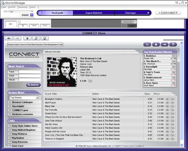
The Connect store running within the SonicStage software needed to upload music to Sony devices
The company worked very much on a waterfall project management principle, and my job involved producing highly detailed 80+ page wireframe documents that covered every aspect of an application. They had to be stored in a CVS repository, a type of version control that you generally associate more with software code, rather than the visual descriptions of what the code should do. My work would mostly be drawn in Visio, from functional specs detailing the use cases of the application to be built.

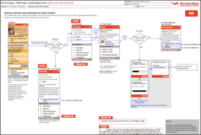
A wireframe from the StreamMan documentation about how users managed multiple devices
One of them was for the “back office” admin tool to manage a music service delivered by Sony to Vodafone across Europe. Having made the wireframes, I wanted to validate them by watching the editorial team go about their daily tasks with the existing system. This was considered quite an unusual step, and I think that the editorial team were just as worried about having the foreign-IA-usability-guy hovering over them, as the project managers were about me wasting client billable time internally.
What I observed was eye-opening, and another key moment in my career development. The tool they were being give simply didn’t have the functions they needed. They had to compile charts, for example, but had to start each week’s chart from scratch. And they had no effective way of adding a track to a promo spot directly from a search within the CMS. They had to use the search on the front-end website, and cut-and-paste an ID code out of the URL into their admin screen. As a result of watching them work, I added into the wireframes functions to search for tracks or artists within the tool, and the ability to manipulate charts by moving tracks up and down the list.

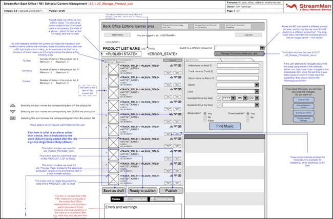
One of my wireframes for the StreamMan “back office”
The response from some of the development side of the business was “but this isn’t in the spec”. To my mind, that isn’t a good enough answer. I firmly believe that internal systems users are just as important as the end users of a digital service. If you don’t give people the right tools to manage the service internally, you can’t create a good user experience on the front-end.
It is also important to learn that sometimes a product failing isn’t your fault, and that the impact of your UX decisions is necessarily limited. One of the services I worked on for Sony was called StreamMan, and it offered streaming music over the web and on mobile phones. As the user voted to like and dislike tracks, it used over 1,000 metadata points to tailor the stream to their tastes. It looked at criteria like the tempo of a track, whether it was a male or female vocal, if the song had political lyrics or was mostly written in a minor key to work out the kind of music you liked, and play you more of that. Effectively it was Spotify about three years ahead of time.
The product was flawed though. Firstly, data plans were prohibitively expensive for consumers to afford streaming music. I got to draw lots of wireframes on different platforms delivering the message “Your streamtime budget has been exhausted”.

Secondly, it was only available to Vodafone subscribers. Whilst I understand the model of offering an exclusive product or service in order to drive up subscription numbers, without an open web-based version for anyone to trial, there was no way to actually address the general market of music fans. Spotify’s initially free service popularised the concept. And it was only after prolonged use that the StreamMan system learnt your taste, so first impressions of the service were always likely to be discouraging.
Sometimes as an IA or UX practitioner, you simply have to face the fact that decisions elsewhere in the business mean that however great you could make the product to use, it will never be a commercial success.
Next...
In 2009 I returned to the UK from Greece, and joined The Guardian full-time as the first person there to have the job title “Information Architect”. In part four of this series, I’ll look at how I go about doing my job there.