"Neither TV station nor repurposed website" - Sky News app for the iPad
My first impressions of the Sky News app on iPad have been very positive. They’ve promised that it gives “new ways to deliver news to our users”, and it is a very different visual approach.
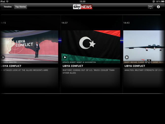
News is accessed via a timeline of video segments as they appeared on the channel
There are a couple of really nice interaction touches in the app, not least of which is that you can browse around without interrupting the current video playing. Only a couple of buttons stop playback. Mostly, if the video you are currently viewing features anywhere on the screen you’ve moved to, it continues to play in situ. If it isn’t, it shrinks down to play in miniature at the bottom right of the screen.
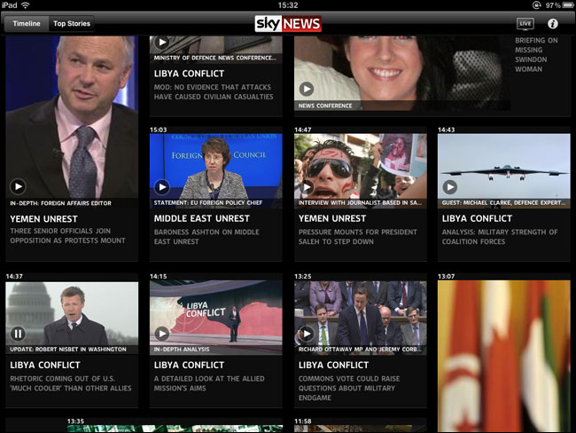
As you browse around the app, the video you are watching continues to play, here on the bottom left...
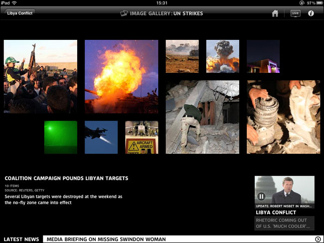
...and here on the bottom right as I view an associated still image gallery
Another interesting approach to navigating through news is the “back story” button. If tapped whilst playing a video, it takes you to a screen with related content. In the case of the attacks on Libya, this appears to be a page with some production values on it, i.e. the themed graphic at the bottom of the page.
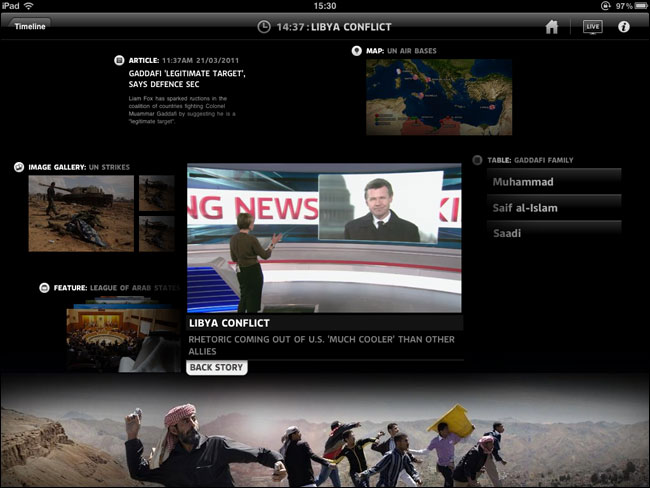
Story packages are designed, and look to have been processed by an editorial team rather than purely by machine
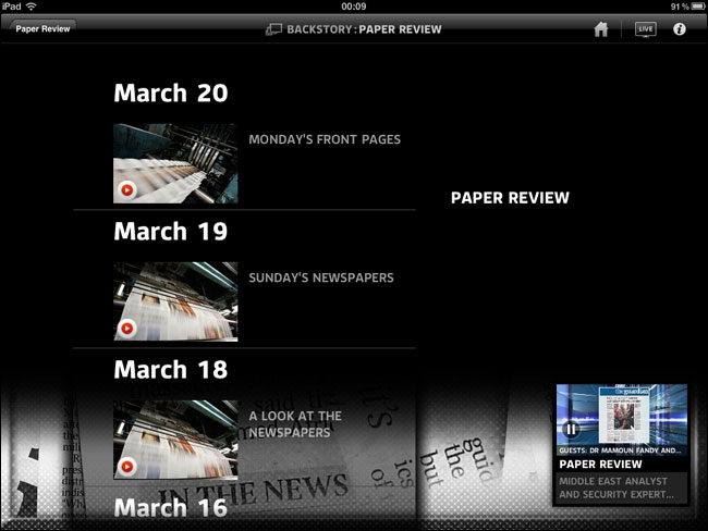
With something more of a regular feature, like the newspaper review, this produces a less-adorned list showing the slot in reverse chronological order.
I’d be fascinated to see the metadata going on behind the scenes at a production level to feed into the app, or whether this is all being overseen by people - a “dedicated editorial team” is mentioned in their publicity material.
One thing that I was going to say about the app, was that I was impressed with the way they hadn’t tried to replicate their website in an app format. As Leisa Reichelt observed during her talk about “Strategic UX” at London IA last week, one of the toughest challenges for a business can be to lose the “fear of positioning”, and stop trying to be all things to all people. I thought that Sky News had avoided that pitfall, and built an app for people who wanted to watch the news and nothing else.
Actually, it turns out that isn’t quite the case, as yesterday I encountered a text article for the first time. It doesn’t make the video features any less compelling, but I had thought that the team had opted to ditch text news altogether, which would have been a very brave product and design decision.
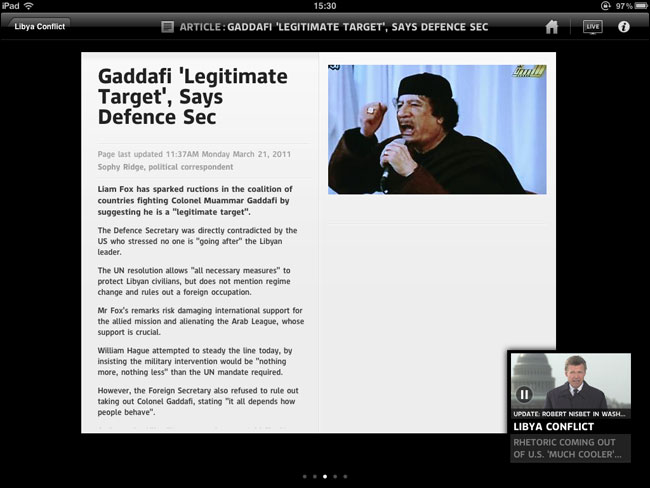
The Sky News app, although dominated by video, does contain some web-style text stories
Visually the app is an improvement on that of their nearest 24 hour news competitor in the UK, the BBC News app, which concentrates on a thumbnail image menu of text news stories, relegating the video news function to a small button that triggers a dialogue box that kind of shouts “you shouldn’t have clicked me”.
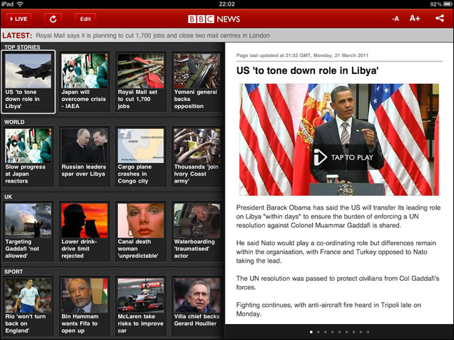
The opening page of the BBC News app more closely resembles a website
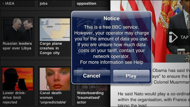
There is a discouraging warning notice before you can access the live TV stream on the BBC News iPad application
In the end I’d say that Sky have delivered something that isn’t a TV station on the iPad, nor is it a website repurposed for a different screen size, and I have to commend them for that. I’ve previously said that we are in the web’s equivalent of “the animated gif years” when it comes to news touchscreen tablet design. I think that with this app Sky News have thrown out a significant design challenge to other video based news organisations.
I usually return to sky apps when i do try others. I think its faster to load, gives you clear content and seems to refresh stories regularly. It's easy on the eye and the graphics are crisp. I don't feel like i'm lacking anything from the main Sky site which i do feel i suffer from when using the BBC.
I've just been taking a quick peek as well. I'm impressed by the largely intuitive interface (there are still a few navigational issues).
Like you mentioned I'm guessing they either have some stringent internal meta data standards or some very good semantic technology running in the background. In reality a good DAM and work flow procedure could mean very little in terms of editorial support for the information.
Does anyone know which production house actually built the app? I'd love to know because it certainly wasn't sky.
@Alex: It was indeed Sky
I took delivery of my iPad 2 today (my first iPad) and this was (after Guardian Eyewitness - very nice but needs more pictures more often I think) the first app I tried. I'm just hugely impressed with this - the whole thing is visually slick but there's also some really advanced streaming stuff going on behind the scenes. For example, the old Sky News Active feeds of live press conferences etc. are available - but you can also rewind the video - *no matter when you started watching* - i.e. you can come in 15 minutes into a live Obama speech and go right back to the start. Also what's nice is all the videos are pre-downstream key; i.e. minus clock, captions etc, and from an editorial point-of-view, they're putting up rushes that wouldn't necessarily be shown on air - e.g. today you could get a full 10 minutes of Andrew Lansley talking to nurses at the RCN conference.
I assumed it would be full of ads but there are none at all.
For someone who is routinely depressed by the repetitiveness and dumbing-down of 24 hour news (particularly given Sky & the BBC continue to lose staff, and after Sky put all that effort into a new schedule of documentaries and ditched it after a few months) I think this app is a great way for them to showcase their best stuff and it's genuinely worthy of the big on-air push and glitzy promo videos they've given it. The live Sky TV app (the one with live streaming of the sports channels) continues to improve too - I notice they've started pushing extra streams on that, for example interactive Ryder Cup coverage.