"User research lessons from Philips, Google & the BBC" - Steve Rogers at PublicZone's user research event
On Friday I was talking at an event hosted by digital agency PublicZone, who specialise in working with not-for-profit organisations. They were launching a new booklet, "The User Research Handbook", and I've already blogged what their Head of User Experience Julie Dodd said at the event. The other speaker besides myself was another ex-BBC colleague, Steve Rogers, who is now Director of EMEA at Google.
In the course of his talk Steve gave several examples of where user research had informed and improved design. He has a background in consumer electronics, having worked for Philips. He spoke about the early days of video recorders, which whilst they were fully functional, were notoriously difficult to program to record. This came about, Steve said, because it was just naturally considered at the time that the engineers building the systems were also the best people to shape the user interface.
This changed when Philips built a new design studio, which included a user research centre right at the heart of it. A constant stream of people were observed testing the latest iterations of products, shaping the way that they were designed. The "thumbs up"/"thumbs down" interaction design for rating TV programmes on TiVo machines evolved here, as it became apparent that people usually reacted to the things they watched with a "cool" or a "meh!", rather than wanting to use a complex rating tool.
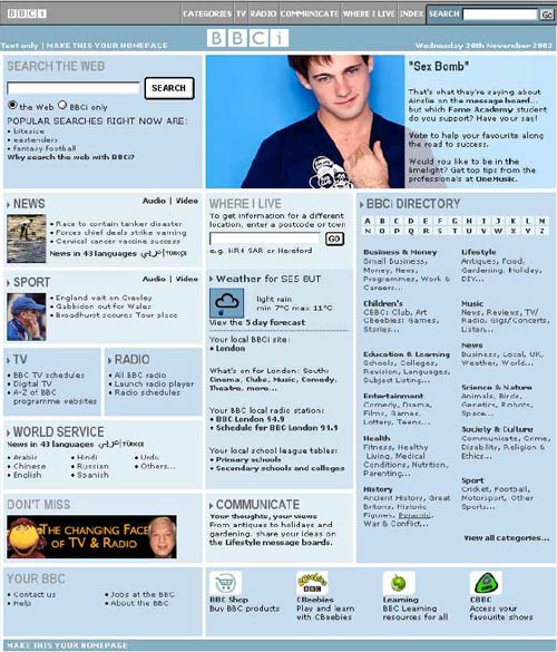
Another example Steve talked about was the redesign of the BBC homepage in the early 2000s. He explained that when he joined, as Head of Design, a relaunch was just 6 weeks away, and the page due to be launched was a mess thanks to "design by committee" and a requirement to please every department. He empowered his design team to do a salvage job on the page, but with only 6 weeks, they couldn't do much research. However, getting that iteration done bought them the time to do a very thorough piece of audience research.
The strategic aim of the project was to get people to make bbc.co.uk their personal homepage. The key piece of research for the next version, therefore, looked at the pages people currently used as their start point for browsing the web. Their design and emotional impact was analysed and plotted. The team knew that if the response to their design ended up being plotted in a similar way, they had delivered a page that stood a chance of being adopted by a wide number of people as their starting point on the web.

The entire research process was documented in a PDF book entitled "The glass wall" - and you can download it here.

Download "The glass wall" - 7.9MB
The final product that Steve discussed on Friday was the introduction of the "priority inbox" to Gmail. Pointing out that you used to get a lot less hand-written memos than you do work email, Steve explained that Google engineers had set to work trying to solve the problem of inbox overload.
A massive design challenge was that people manage their email in different ways. Steve used a show of hands in the room to illustrate that the audience roughly split into thirds either using the "inbox zero" technique, leaving everything in their inbox, or by using labels and tags. The "priority inbox" design needed to work for everybody.
Steve explained how in order to evolve the algorithm, the system was progressively rolled out to more and more people internally at Google. This gave the engineers a large test sample to work with, of people who were using the feature in their actual workplace. That meant that at the point where the feature went public, they could be confident in the workings of the algorithm, since it had already been improved and iterated based on real usage.
Next...
Yesterday I went to a new UX event to appear on the London circuit, "Lightning UX", which delivered 8 UX presentations in 40 minutes. I've no doubt that there will be some blogging about that to follow...
If you were at the PublicZone event, you can find the links, notes and slides from my talk here.
My heart warmed when I read about Google testing the 'priority inbox' for gmail! As a public sector worker for 25 years and now an independent businessman, I have suffered the effects of so much irrelevant 'inbox' information for years.
Steves point that you used to get a lot less hand-written notes than e-mails is very relevant. It's just too easy now for people to rattle off an e-mail and then fire it out to dozens of people on a mailing list. OK, it's good for communication and awareness, but while I am becoming aware of all this new information, rationalising it, filtering it and then dumping 95% of it in my junk folder, I'm not getting my real job done!!!!!
Oh well, that's my stressed out rant over with LOL.
The other great point for me was the process of making the Philips video recorders more user friendly. I really can remember well the complexities of programming a video to record a future programme successfully. There was much gnashing of teeth by thousands of hopeful people around the world when they realized that they hadn't quite got the programming of the timer quite right!
I now work as a full time professional singer with my website at tom jones tribute Yes I'm a Tom Jones Tribute artist! This involves much use of quite complex sound and lighting equipment, much of which is still in the old Philips video mode when it comes to programming or setting up the stuff. However, I'm glad to say that some companies are really making an effort to simplify matters as much as possible, which is a real blesssing when you are trying to set up a system for a live event.
Really enjoyed this article and I have marked your blog on my favourites Martin.
Now, where's that damned cable TV recording remote control....!!!!!!!