No more 'us and them': Part 5 - Designing products with the audience
How 20 years of digital communications smashed the boundaries between media and audience
In this series of blog posts I've been discussing how the digital communication revolution over the last twenty years has changed the relationship between media companies and their audience. At Guardian News & Media this new openness and dialogue extends to how we talk about our product development process. At the recent Gartner Symposium in Florida, Mike Bracken, our Technology Director (Development) shared 14 ways that the company has benefitted from social media, including some figures on just how much money we were saving by using open source software like memcached, building innovation on top of our API, and getting the best out of our talented development team by giving them the space to be creative.

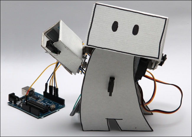
Fun projects like Ken Lim's Twitter robot are done on regular Guardian developer hack days
I also strive to be transparent about the role that information architecture plays in our process, blogging, for example, about the information architecture behind the World Government Data search engine. I recently contributed a case study to Jan Jursa's UX Storytellers project, looking at how different types of user testing were appropriate for different stages of a project. I chose the redesign of the homepage on the Guardian Jobs site, where we carried out some guerilla usability testing at the London Graduate Jobs fair, did formal lab testing using a prototype, and tested our classification and taxonomy by using an online survey tool.
I'm very lucky in that Guardian News & Media have a hard-working Research & Customer Insight team. They provide us with a fantastic range of quantitive and qualitative research material, and they are also able to help me recruit people for informal face-to-face testing sessions which we carry out at our offices in Kings Place. Whilst there are all manner of caveats to place around this type of research, I find it a powerful tool. You can show any number of graphs and charts to demonstrate something about the market, but having a video clip of a user explaining exactly what it is that they find frustrating about a product has a much greater impact.
As well as inviting recruited people into the office, I also like to go out and about and do what I have called 'ambush guerilla user testing'. For this I'll pick a location like a cafe, and pounce on people who look like they are bored or just hanging around on their own. Before they know it, I've whipped out my laptop and convinced them to have a look at a website for a couple of minutes. It isn't carefully targeted, but I've become quite adept at picking locations where there will be an above average number of Guardian readers.
I've previously blogged some tips on carrying out this kind of exercise, and one of the main tools I use is Clearleft's Silverback App, which simultaneously captures what users are doing on my laptop's screen, whilst filming them with the webcam and capturing audio. If I'm testing mobile devices, I'll point the laptop at people to get their face on camera, and then supplement the footage by getting someone to hover over them with my Flip camcorder, to capture their interaction with the phone. Another potential approach to capturing what is going on with a mobile device is to follow Belén Barros Pena and Bernard Tyers' impressive MacGyver skills.
Another habit I've got into is using the stopwatch on my phone during a session. If I can start the record function of Silverback at the same time as my phone, whilst the session is going on I can note down the timestamps of interesting comments that I think I'm likely to want to feature in the final clip-reel. That should save me some valuable time during the process of editing the footage - although in truth I generally find myself watching the whole session again during the editing anyway.
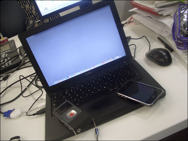
Basically, all I need to carry out this kind of ad hoc testing is my MacBook with Silverback, my Flip camera and my phone.

My guerilla usability testing kit
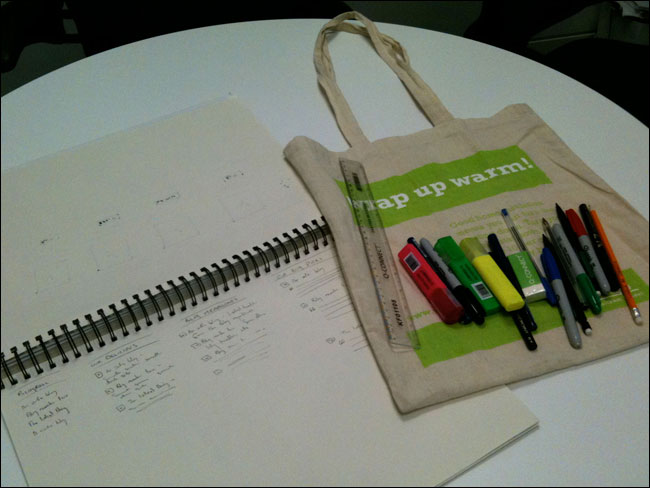
And then the results end up influencing what I sketch with my 'portable IA kit' - a cloth bag I can carry around the office with a sketchbook and a selection of pens, pencils, highlighters and Sharpies.

My 'portable IA kit'
I find that partly as a preference, and partly as a result of time pressure, I sketch more and more. I find the process useful in developing ideas and alternatives, and I've taken to simply photographing and annotating detailed sketches rather than recreating them directly in Omnigraffle.
Whilst I would never use the outcomes of my ad hoc testing sessions to be used as statistical evidence, or to dictate the development of a product, I find them incredibly useful in helping to shape my thinking. I genuinely believe that every single time you observe a person interacting with digital products you can't fail to learn something, and also be reminded one of the cardinal rules of digital product design - you are not designing for you.
"Here's to another twenty years of disruption..."
If user testing illustrates that you are no longer designing for you, it also illustrates that you are no longer designing digital media for a mass audience. The digital communication revolution of the last two decades has utterly transformed the relationship between media companies and the people who consume their output.
In the seventies, one phone number pretty much represented all the interactivity that a child could expect to have with a television show. At the moment, it seems unlikely that a child will be able to conceive of a form of mass media that isn't in some way interactive, in a format enabled by digital technology.
It has meant a massive change for organisations, and for those embracing the change, a shift from being publishers to being a communication platform. There is no reason to expect that the next twenty years won't be just as different, disruptive and as exciting to work in.
And finally...
You can now download a PDF version of this series of blog posts in one printable document.
Thank you.Insightful, and perhaps a bit scary? Will future media 'platforms' perhaps therefore just be in open competition to cultivate their 'feeds' (and ergo their life force) from wild roaming content purveyors who may not share the same intrinsic values as the platform, that current employed journos do (or should) have?
Great idea putting the series into PDF format, I can take them on the train with me.
I've always thought that usability testing is an expensive thing, but pouncing on bored looking people idea is a brilliant idea that seems so obvious now!
Certainly, any major faults should be discovered that way.
First comment: thank you so much for this thoughtful and lucid description of how interactive capabilities are transforming journalism. This is relevant to so many other types of organizations with expertise, like museums!
Second comment: your description in the previous blog post about linking databases reminds me of the iPhone app 3 Degrees of Wikipedia, a game where you have to discover the page that links New Order and The Hacienda, for example.
Finally, a question: are any of these gov't databases you mention using Freebase, now owned by Google? There are references to data.gov.uk on the Freebase site, which is why I ask and thought you might know.
Thanks again.
In my opinion with today's technology, i think that we are going to be lead by robots just like in Terminator.
And i'm not joking.
Be interesting to fast forward 20 years and see how you're doing it then!
Wonder if you'll still have your cloth bag and paper.....
Hey Martin, lovely series of articles there, so shame I didn't get to see you present at the UPA event.
Always good to hear people getting use from our Silverback application. In case you didn't know, you can actually set chapter markers or 'highlights" as we call them in the app, by pressing the + button on your Apple remote. These then appear as a dropdown list of highlights in the QT player on export. You can also export a "highlights" movie which then exports a 45 second clip around each highlight. That way you don't have to export the whole movie, just the interesting bits.
Anyway, hope that helps and keep up the good work.