"Visual note-taking": Eva-Lotta Lamm at London IA
Update: I mentioned Eva-Lotta Lamm as an inspiration for my own sketching in my talk at EuroIA 2010 in Paris. The other sketchers I mentioned as inspiring were Frances Eida and Anna Lena Schiller.
A couple of weeks ago we held the latest of our London IA mini-conference evenings, hosted by Sense Worldwide at the Sense Loft, and sponsored by Zebra People. Taking were Tyler Tate and Eva-Lotta Lamm.
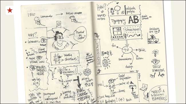
Eva-Lotta was talking about the practice of making visual notes. By sketching out your thoughts about a meeting or presentation, these become more fun to go back to. The act of sketching also fires up different parts of the brain than those that deal with words, and so you tend to remember things more. Indeed, apparently even doodling whilst listening to something incredibly dull increases recall by 30%. This may have been the secret of my A-Level success.
As part of her presentation she showed images of a sketchnotes Flickr group from SXSW, and the brilliant work on Sketchnote army, which was enough to intimidate anyone thinking about sketching in the room into saying "I can't draw". Austin Kleon's work was also praised by Eva-Lotta in particular.
Eva-Lotta thought that this was no excuse, and then took us through some simple drawing exercises to improve the way we draw people. It was incredibly useful, and also made me feel quite nostalgic for Rolf Harris Cartoon Time, a 1980s TV show which interspersed old cartoons with interludes in which Rolf taught you how to draw the characters.
If there aren't enough sketched monsters in your life, then Eva-Lotta introduced us to "The Daily Monster", a rare chance to see someone sketching in action on a regular basis.
Personally, I do a lot of sketches during my work when I'm thinking about interface design, but I think it will be hard to tear me away from my keyboard when it comes to making notes. Whilst Eva-Lotta's drawing tips help, I still can't help thinking that the most appealing sketchnotes have a real sense of design, balance and visual harmony about them, which makes me wonder if people are concentrating on 'taking' the notes, or 'designing' the format of the notes.
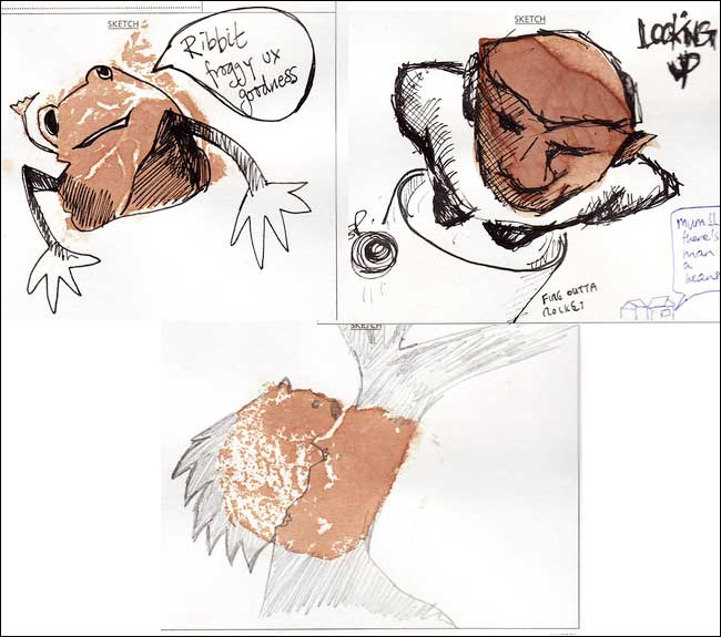
Still, it has been great to see a lot of feedback and response to Eva-Lotta's talk. On the night we played a game where we all had to come up with a sketch based on a card with a tea-bag stain on it that Eva-Lotta had given us. These have been collected into a Flickr group

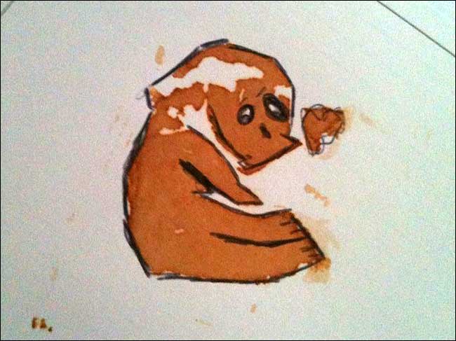
My own effort was this rather melancholy looking panda...

Matthew Solle and Lab49 have used it as the spur to adobt compulsory sketching sessions for their UX team called Sketchedelity, and other people, like Boon, have shared their sketchnotes of the talk about sketchnotes.

You can find Eva-Lotta's fantastic slides on SlideShare, and she has also written up a detailed set of notes: Visual Note Taking talk @ UX Camp London
Next...
In my next post about London IA I'll be talking about Tyler Tate's presentation on interface complexity.
“London IA: Notes from the talks”
Martin Belam, foreword by Ann McMeekin Carrier
London IA is a network of designers, information architects and thinkers. Since 2009 the group has been holding regular meetings featuring talks about UX, or of interest to UXers. This ebook is a compilation of my notes from those evenings, featuring talks by Andy Budd, Giles Colborne, Cennydd Bowles, Claire Rowland, Jason Mesut, Ben Bashford, Chris Heathcote, Dan Lockton, Relly Annett-Baker, Michael Blastland, Margaret Hanley and Richard Rutter amongst others. Topics covered range from ubicomp to psychology, from learning how to sketchnote to how to write a UX book, and how to improve digital design through diverse routes like copy-writing, designing for doubt, learning from music technology or taking care of typography.
“London IA: Notes from the talks” is available for Kindle for £2.47.

You know Martin...at launch I thought about getting a cartoon done weekly by one of the team at Dirty Garnet. However none of us has a whisp of cartoon experience unless you count drawing talking and hairy genitalia doodled during times of boredom.
For me, newspaper cartoons are like the analogy that we use for our site; when digging for something you might occasionally come across something a bit precious, but most of the time it's just rock, dirt, abrasive stones etc. Cartoons that make me laugh or think are rare; most are just lampooning caricature, too abstract, or just plain unamusing tripe.
Oh and guess what? The drawing quality is a minor factor. I've seen crudely pencilled in cartoons with no colour that are hilarious; and I've seen vibrantly rendered ones drawn well that are a total bore. As long as its intelligible it can ascend to being brilliant.
People who focus on how their toons look can't see the wood for the trees; brilliant cartoon named South Park is sign enough that you don't need to be a top talent with a deft hand to do a good job for mag/newspaper toons that have lasting appeal.