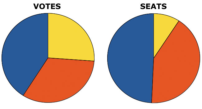
The only election graphic you need
by Martin Belam, 8 May 2010
News organisations have spent a lot of money on flashy election maps, charts and interactives over the last few days. But I think this is the only election graphic you need to see that something is incredibly wrong with the way that our first past the post system distorts the wishes of the electorate.

Actually it shows the a straight PR system would have made no practical difference to the outcome at all - no party would have had a majority and either Conservative or Labour would need a pact with the Lib Dems.
Straight party list PR would mean you could never vote out the Lib Dems who would permanently be in government to some extent, and would remove the ability to vote out individual MPs - Jacqui Smith and Lembit Opek would still be there, as voted by party apparatchiks.
An AV system might be a decent way forward, but impossible to tell what the outcome would be on that basis.
Surely James though, it shows that it would have made a difference to the base from which the Liberal Democrats would be negotiating, and that would better reflect the wishes of the electorate?
We've got to understand the benefits of the current system - it is actually set up this way deliberately, to promote stability.
That is good for business, and and good for the economy.
Will, I understand very well the benefit of the system. it ensures that a small clique in two political parties get to keep swapping who is in charge, whilst many, many people feel totally disenfranchised. I've voted in every election since 1992, in three different constituencies, and my vote has never counted for anything, since I've always been living somewhere that was a "safe seat" for someone. I'd like to see that change.