Future of Web Design conference iPhone app review
I thought I'd take a quick break from my notes of what happened at the 'Future of web design' conference, and instead look at something I tried out before I went. In advance of the conference, I received a couple of emails for the organisers, and they were promoting the fact that they had an iPhone app, so, naturally, I downloaded it to have a look.
In one sense it was very useful, as it included a complete listing of the sessions at the event, in a handier format than it had been to print out the programme from the website, where it ran to 16 pages.
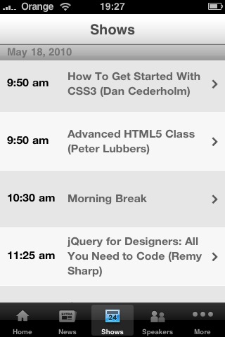
You could look to get an overview of each session, and also easily confirm and share which bits of the conference you were going to attend.
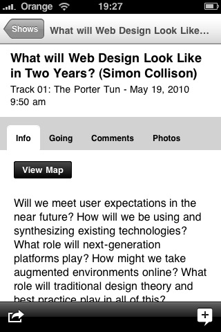
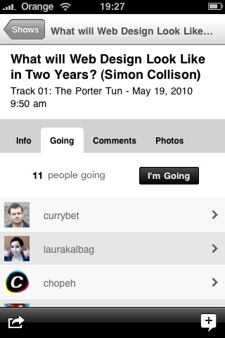
Twitter was tightly integrated into the app, and so you could get a view of what the other people attending the session were tweeting about.
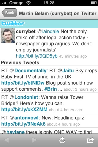
However, it seemed to have really prioritised the social aspects rather than personal utility. Once I'd stated that I was attending a while host of sessions, there was no personal overview of what I'd chosen. It would have been great if I could have got an at-a-glance view of the sessions I was interested in, even if it was just sign-posting by changing the colours of the sessions in the diary view, or adding an icon.
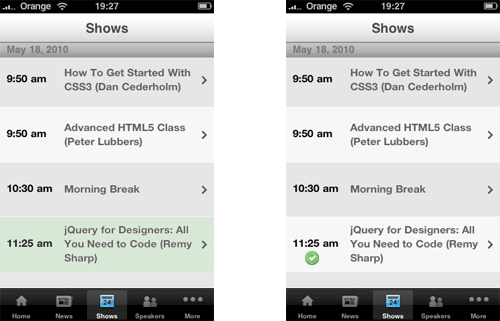
I thought the app was a great idea, and useful to have an electronic version of the itinery in my pocket, but I still ended up having to carry a paper itinerary reminder around with me, all for the lack of one key use case and feature.
Hey Martin,
I was wondering, as I was reading your post, if there was or if there was ever going to be an app that covers everything we want.
I think not. If there was such a thing, that would mean we just ran out of new ideas and where will be then?
Good thought,
Mike