Future of web design: CSS3 with Dan Cederholm and Molly E. Holzschlag

As well as blogging about it on Inside Guardian, I've been posting some of my notes from the sessions I attended at the recent 'Future of web design' conference. Today's post feature 2 speakers who were talking specifically about CSS3.
"Getting started with CSS3" - Dan Cederholm (Simple Bits)
Dan Cederholm's talk revolved around showing off some of the CSS3 styling features of a minisite built expressly for the purpose - Things we left on the moon. Dan went through the features and the CSS good at a comfortable pace, which meant that even someone like myself who hasn't really coded sites in anger since HTML4 was the new kid on the block, could follow.
I was really excited by the rich application and user experience possibilities that CSS3 seems to open up, but also a little bit cautious. I can see any number of problems with documenting design and making the business case to do this additional mark-up and work, whilst still having to deliver a baseline experience to IE6. Hearing the problems it causes time and time again from the stage, I ended up going native and tweeting:
I've only been at #fowd for an hour and fifteen minutes, and already I've been assimilated. IE6 MUST DIE! IE6 MUST DIE! IE6 MUST DIE!
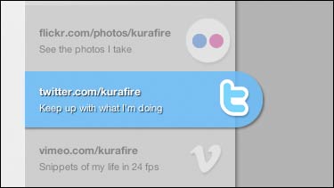
He also showed some nice designs in the wild - including the expanding social media strips down the right-hand side of farukat.es, and the subtle changes to the images on atebits.com when moused over.


Whilst I was fretting about how to justify using it, Dan was gung-ho for people to get going and start coding: "Anyone can add any of this stuff to any project, because somebody out there is going to appreciate and experience it". Definitely another case of the 'unevenly distributed future'!
"Progressive CSS3 design" - Molly E. Holzschlag (Opera Software)
I had mixed feelings about Molly's talk. On the one hand, she showed some demos of potential CSS3 features like grid layouts and a flexible box model. On the other hand, she made the internal wranglings of the W3C CSS working group sound worse than BBC internal politics.
One of her main points was that the design community needs to get more actively involved in framing the next specifications of the web. Because the big companies and vendors pay to get a seat at the W3C table, specifications are naturally shaped by their agendas and interests, rather than by what the web design community wants or needs. The community is too busy dealing with the real world web and real world problems. That's why we've ended up waiting forever for border-radius and multiple backgrounds, and they still are not universally supported.
Molly also talked of the rocky road ahead for CSS development. The CSS2.1 spec isn't actually finished yet, let alone CSS3, and there is a real risk that if they can't get 2.1 finalised by the end of the year, the working group will be disbanded and have to be reformed.
She also addressed an issue that has been niggling at the back of my mind. In this brave new world of amazing CSS3 effects and styling, when half of your audience is going to still get the bad old pre-CSS3 design on their screen - which screenshot do you show the client? Indeed, which screenshot do you mock-up? One solution is to do both designs, but then again, you don't film TV shows in high definition, standard definition and black'n'white. Another solution might be for a business to establish a style guide of how CSS3 features are expected to gracefully degrade.
I got the impression throughout the conference that we are a point that is full of design possibilities, but that both the technology and user expectation has to shift before we can regularly be deploying these richer experiences on mainstream sites.
Next...
In the third installment of these notes for the 'Future of web design', I'll be looking at two very practical talks with tips on iPhone design and wireframing, from, respectively, Sarah Parmenter and Brad Haynes.

Why did you guys make the blog so hard to read, my eyes hurt trying to read this..