Future of web design: "Play, Destroy, Create" by Brendan Dawes

Last week, as well as #jeecamp and the Open Platform commercial launch, I spent two days at the 'Future of web design' conference in London. I've already blogged an overview of the event on the Inside Guardian blog, and over the next few days I wanted to post some of my more in-depth notes about the session I attended, starting with Brendan Dawes.
"Play, Destroy, Create" - Brendan Dawes (Magnetic North)
"I don't know if you've been on the Internet. It's great. You ought to check it out."
Brendan opened Future of Web Design with an energising talk full of playful interfaces and fun. He said he talks about risk a lot, and wanted to inject it into his presentations, so he had written his own presentation tool. He drew on the screen to bring up bubbles of content, and when he did a scribble it went off and fetched a random tweet addressed to him with the day's hashtag of #fowd. The first one that appeared said "I like your shoes."
He gave a lovely example of hacking an analogue system that was based on the old days of newspapers. His dad was a sports photographer, and the demand of the time was that he file images of a football match 5 minutes after it had kicked-off, so that the pictures could make the early evening editions. Since film usually took 6 minutes to dry, John Dawes soon acquired an eye for spotting the key image from a wet film strip of 36 shots, and using a hairdryer to just focus on getting that one picture developed. Brendan was urging the web designers of today to develop that same keen eye and instinct to identify great things quickly and to get them out there.
He reckoned that one of the most important pointers for the future was the inside of his wife's handbag. It wasn't a roomful of geeks with Macs who showed technology going into the mainstream, but the fact that she had a Nintendo DS and an iPhone. Gaming and software interface design were now an increasing part of everyday life for non-geeks too, even in a handbag where "the presence of everything has to be justified".
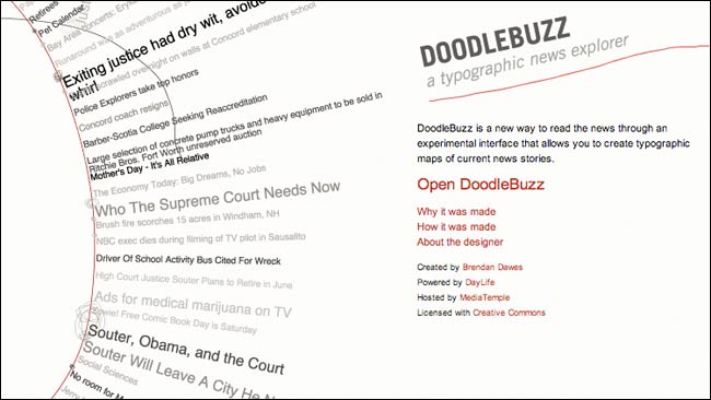
Brendan thought the web was still too uptight about rules, and showed examples like Doodlebuzz, which is an utterly bonkers way to navigate news. Brendan said he wanted to create systems that angered and delighted, and sparked debate, and that he wouldn't want to "search Amazon or view Google like that", but that it encouraged serendipity.
Another important point raised by Dawes was that one of the problems with online designers is that they get all their inspiration from the same place they work e.g. online. He felt breaking out of that monoculture was important. It is something I notice a lot in the news industry, where we all have a habit of measuring our digital designs and performance against the companies that used to be our rivals in print, rather than observing the businesses that are currently earning revenue and eyeballs that could belong to us.
Next...
In my next 'Future of web design' post, I'll have notes from two speakers that focussed on CSS3 - Dan Cederholm and Molly E. Holzschlag.

I totally agree with Dawes when he says online designers should break out of that monoculture. There are so many sources of inspiration. The only problem is many web or online designers don't go to museums to see (contemporary) art, are not interested in architecture or non-mainstream music genres.
They are simply missing inspiration from every day offline life.
Now comes the crux of the matter:
getting inspiration from other web sites guarantees one thing - providing a good user experience because most of the web interfaces and designs have a good usability, I'll just call them "proven". So now you want to design something very unique (which is quite fine don't get me wrong here) chances are usability suffers or visitors convert badly or not at all.
Even if the visitors still keep coming to your site the learning curve will be higher than on other sites the visitors already know which might lead to frustration. Again I confirm I like innovation but sometimes sticking to the "proven" facts just does the job.
You raise a very good point -- I feel that the best online designers are people who have a variety of artistic interests & passions and don't spend their entire lives in front of the computer. The most brilliant web designer I know went to art school and was trained as a painter and sculptor before he ever began to learn online design...
Until reading this article I had never heard of DoodleBuzz.
Thanks ever so much for notifying me about it, as it is so cool! I really love it, and think it will be a new way in which I receive the news.
In terms of the article, you need to be really creative to be a designer, and be original, because as Dawes said "they get all their inspiration from the same place they work".
Good article, and once again thanks for telling me about DoodleBuzz
Keep up the good work :)
Christopher