The mobile digital general election - official party iPhone app review
The digital general election campaign isn't just being fought on the web and in social media, it is also being fought in the Apple iTunes app store. I had a quick look at four iPhone apps that were available to download from the major UK political parties.
Conservatives
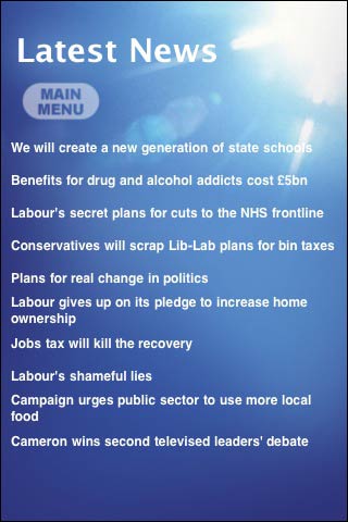
A news feed keeps the app feeling fresh, with web stories from the party available by way of a starkly formatted headlines page.
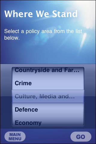
The default text size in the app is small, but could be enlarged by the user. A scrollwheel (easily my least favourite bit of the Apple UI by the way) allowed the user to explore Conservative policy by theme.
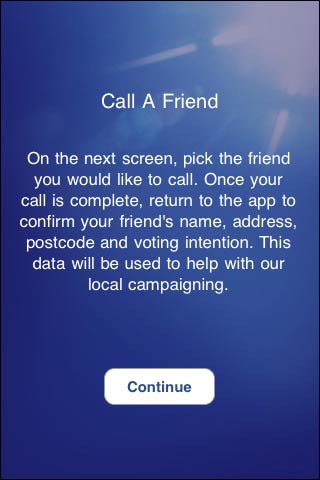
'Call a friend' might have the air of "Who Wants To Be A Millionaire" about it, but it is a campaigning element to the app. The user is encouraged to telephone canvass someone from their phone contacts book, and then report back to the party their voting intentions.
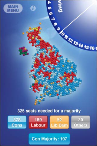
As a more fun element, the Conservative app contained a Swingometer. Tilting the iPhone made the country go progressively bluer until the Conservatives had a majority and formed the Government. The programming was understandably very loyal to party ambition, as it was impossible to tilt in the other direction, and view the consequences of a swing away from the Conservatives.
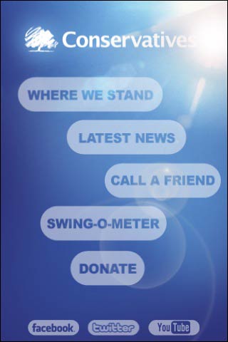
The application main menu also included links off to Conservative channels on Twitter, Facebook and YouTube.
I thought the app was solid and impressive.
Labour
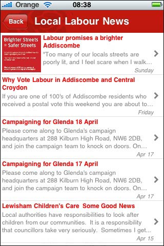
Labour are using the iCampaign app, which on first load immediately asks the user for their location.
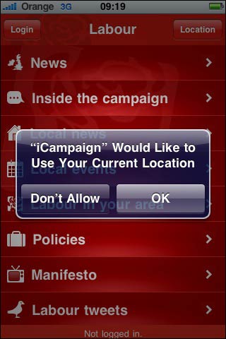
I found that slightly jarring as a user experience - I'm not a Labour member or supporter, and I was just exploring the application, and the very first thing that happened made me feel like I was giving away personal data to the party.
There is also the drawback that localised content isn't always that local. Having, for the purposes of the test, agreed to share my location in the Kings Place building, I've no idea exactly which London constituency I was sitting in, but I'm pretty certain it isn't either Croydon or Chipping Barnet - two of the bits of localisation that the application delivered for me.
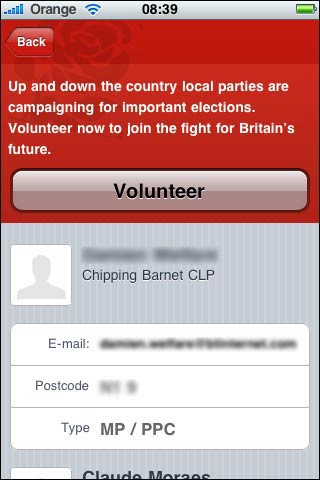
The party are using the application as a recruiting tool, with a call to action for volunteers.
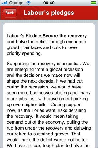
The app wasn't without some formatting issues for me. The default text size was very small, and unlike the Conservative application where pinch-and-zoom worked on their news stories and policy pages, the font was a fixed size.
The 'At a glance' section was not even worth a glance, as the destination page was empty.
Notably, unlike the Conservative application, Labour had devoted space to specifically attacking the 'risk' of voting for other parties.
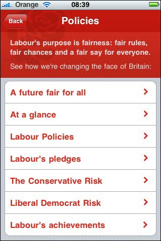
Labour's Twitter feed was more closely integrated into their app. Whereas the Conservatives opened up a Safari window and sent you off to twitter.com/conservatives, Labour tweets were embedded in the app environment.
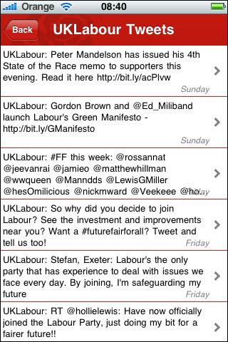
There were a lot of features packed into the app, which was definitely aimed more at the active campaigner than the floating voter. It did feel a little rough around the edges in places though.
Liberal Democrats
As they've been trying to portray in their campaign, the Liberal Democrats have taken an entirely different approach with their iPhone app from the 'old parties'. At first I was puzzled as to why it loaded in landscape mode, even though I had the phone in portrait orientation, but this soon became clear.
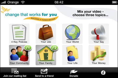
The opening screen invites the user to pick three issues, and 'mix their video'. As soon as the third issue is selected, a video starts playing, featuring leader Nick Clegg, and tuned to playing the segments appropriate for the interests you have expressed.
Other options in the app include signing up to the Liberal Democrat mailing list, sending the app on to a friend, or visiting the Liberal Democrat website to make a donation.
I have to say I wasn't entirely convinced by the 'mix your video' metaphor in the app. With there being 8 categories, and it being compulsory to select 3 before the video would play, to watch all of the clips you'd need to watch at least one twice. I'm not sure why just a simple click to play on the icons wouldn't have been just as effective. I wonder if they are able to collect metrics on which issues are being selected most, and whether people are playing the video to the end.
The lack of a campaign news feed also seemed a missed opportunity to me. The Labour and Conservative apps both had reasons to draw the user back in to get the latest updates. The Liberal Democrat app was much more of a broadcast proposition than a campaigning tool.
Green Party
Another completely different approach is taken by the Green Party with their iPhone app. This invites the user to fill in a ten question survey, and shows how closely their views match those of the party.
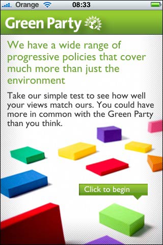
The app's opening screen stresses that there is a lot more to the Green Party manifesto than just environmental issues.
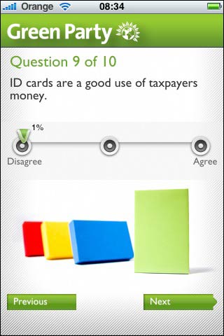
The user is asked to show how strongly they agree or disagree with a statement by moving a slider along a line between disagree and agree.
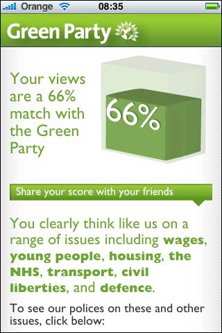
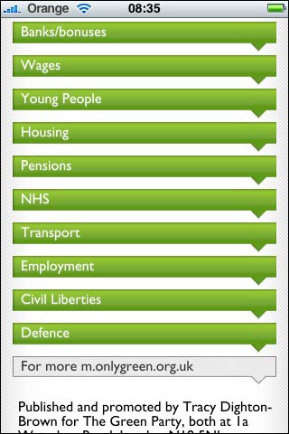
At the end of the questions, the application gives the user a percentage score match with the Green manifesto, and highlights the areas where their views are in line with the party. There is then an option to explore Green policy on each of the ten issues, or to visit the Green Party website.
I liked the playfulness of the app, although, unlike the Labour and Conservative apps with their news feeds, it didn't feel like something I would come back to again.
Next...
As the election campaign draws to a close, I'll be continuing to update my digital election timeline. Please send any suggestions for things you think I should include to martin.belam@currybet.net or contact me on Twitter - @currybet. Next week I intend to have another couple of blog posts about digital aspects of the election campaign...
What a great application, the election is something that in years gone by has passed over most peoples heads but this years election is more accesable and understandable to the common voter thanks to the use of media such as the live debates and apps like this.