"The future of web typography" - Richard Rutter at London IA
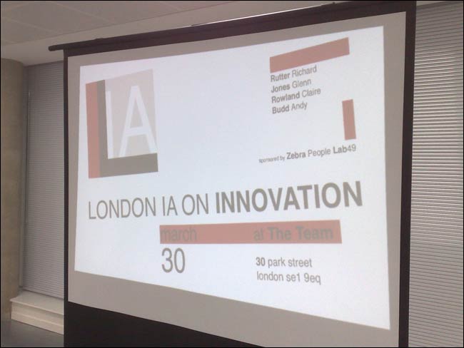
Last week we held another of our London IA evenings - this time with a focus on innovation. The night was sponsored by Zebra People and Lab49, and kindly hosted by The Team. We had four great speakers: Richard Rutter, Glenn Jones, Claire Rowland and Andy Budd. Over the next few days I'll be blogging my notes from the evening, starting with Richard's presentation.

"The future of web typography" - Richard Rutter
Richard describes himself as being an evangelist for web typography, and someone who goes on about "using the right glyph for the job". He said the future of web typography that he'd like to see is very simple - designers doing it properly. There is more to life than Arial and Times New Roman, and more variants available than just bold and italic. IKEA using Verdana in print is, he said, "just a bit wrong".
He cited the emergence of the Verdana Pro and Georgia Pro versions as fonts that could improve the web typography experience. He also stressed that some of the subtlety of typographical design should be more widely available in the future - font weight numerical values were part of CSS1, and the font-stretch property should have been in CSS2.
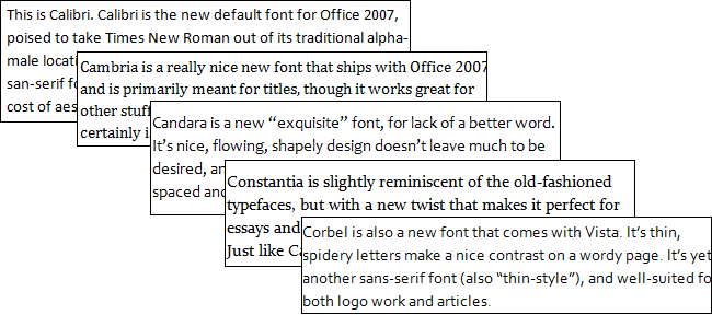
Richard Rutter thought that the new fonts bundled with Vista and Windows 7 - Calibri, Cambria, Candara, Constantia and Corbel were a step forward from the ubiquitous Microsoft fonts of old.

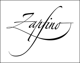
He also showed off the over-enthusiastic deployment of the ligature in Zapfino, and pointed out the work of the Greek Font Society - resetting classic fonts for use in the Greek alphabet.

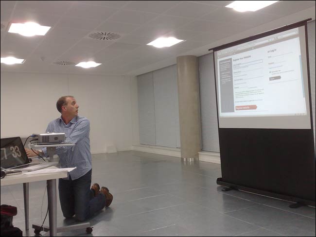
He felt the future lay in what used to be called embedded fonts, where a new set of standards and browser support had begun to enable 'web fonts as a service'. To that end he demoed Fontdeck, which allowed webmasters to quickly use specialist fonts on their site with just a couple of lines of code. The site is currently in private beta.

Richard Rutter executing a live demo of Fontdeck
It has been a tricky area to work in, since the fonts have to be downloaded to the client in some format, and there is a fear of 'accidental piracy', although Richard said that compared to the music industry, he had been impressed by how quickly type foundries had got over the "waving their hands in the air and screaming stage".
The thing that I took from the talk was that we seem to be on a cusp of a revolution of typography on the web. The last time The Guardian site was redesigned, there was simply no question of us being able to use the Guardian Egyptian typeface designed for the launch of the Berliner format. Next time around, it looks like the web technologies that might allow that to be a possibility will have matured.
Next...
In my next blog post about the London IA evening I'll have a round-up of the presentation "Re-using data people have left around the web" by Glenn Jones.
“London IA: Notes from the talks”
Martin Belam, foreword by Ann McMeekin Carrier
London IA is a network of designers, information architects and thinkers. Since 2009 the group has been holding regular meetings featuring talks about UX, or of interest to UXers. This ebook is a compilation of my notes from those evenings, featuring talks by Andy Budd, Giles Colborne, Cennydd Bowles, Claire Rowland, Jason Mesut, Ben Bashford, Chris Heathcote, Dan Lockton, Relly Annett-Baker, Michael Blastland, Margaret Hanley and Richard Rutter amongst others. Topics covered range from ubicomp to psychology, from learning how to sketchnote to how to write a UX book, and how to improve digital design through diverse routes like copy-writing, designing for doubt, learning from music technology or taking care of typography.
“London IA: Notes from the talks” is available for Kindle for £2.47.

I'm really intrigued by the idea of fontdeck, have you any idea when it will come out of private beta as I'd love to try it out on some of my sites.
I think the most specific Richard was about a launch date was "soon".
Interesting. Just looked over TypeKit which from what I hear is a similar solution to FontDeck (or vice-versa). Was there any discussion as to how they differ, or is it simply a question of different typeface providers?
Embedding of fonts seem to be better late than ever. As long as it works on all major browsers, that's great. I remember a lots of years ago I was trying to embed pixel fonts on a site. Now I'm happy I never got it to work as I'm older and actually have problems reading such small fonts.. :)
I don't want to use flash or javascript to make nice headlines, so I'd rather wait until there is some kind of standard. I'll check out Fontdeck, good luck to them!