News apps on the iPad - my first impressions
On Wednesday I had my first good grapple with one of the iPads that have been floating around The Guardian's technology department for a couple of weeks.
The good points?
The clarity and brilliance of the screen were amazing. Type was crisp, and pictures and colour looked stunning. [Even if the pictures I've taken of the iPad screen aren't - sorry]
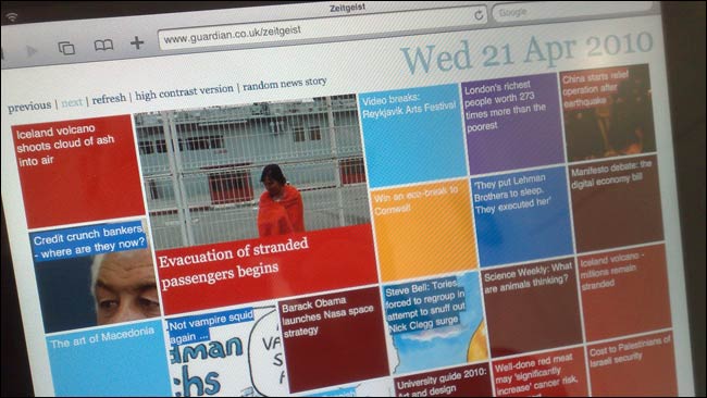
Although seeming to be mainly a 'lean back' media consumption device, I found typing on the iPad easy, and soon got up to good speed.
In my industry, there has been a huge focus on what it means for publishers, but watching colleagues play virtual touch-screen air hockey, or catching flys with chopsticks, shows what a great little casual gaming platform the device will be.
Playing games on the iPad from Martin Belam on Vimeo.
The bad points?
If the £599-£749 UK price point is true, that is one hell of an expensive casual gaming platform!
Having borrowed someone's machine, I found the constant ticking down of their battery life in the top corner of the screen disconcerting.
It is also just a little too heavy to imagine comfortably using it as an ebook reader on a long journey.
I got the chance to have a look at three news apps on the iPad - BBC News, USA Today and the New York Times - plus of course The Guardian's Eyewitness app.
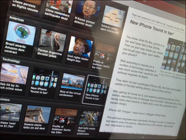
Of the three text based news apps, the BBC have gone for the most visual approach, with big thumbnail images dominating the large left-hand navigation pane of their app.
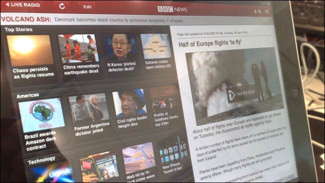
One disadvantage with this is that not every story has a strong visual image to go with it - hence the use of the stock image of the ruins on the Acropolis to accompany a story about the Greek economy in this picture. Whether a story is 'grabby' or not becomes a matter for the picture editor, not the headline writer.
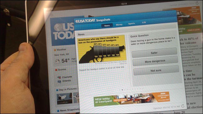
The other two had more of a traditional newspaper layout. I liked the USA Today picture gallery, and especially the little snapshot pop-up window that had a series of quick interactive votes in it.
I'm loathe to criticise these early apps, as, if development was anything like the process we went through at The Guardian, the chances are that the developers had scant chance to see their app running on the device rather than on the SDK. And of course, the iPad is being sold to us as a whole new interactive format, so there is plenty of design learning to do. This blog post from the iA agency on the topic was thought-provoking.
However, one thing really stuck out for me from trying out 'the future of news on the iPad'.
There has been a constant emphasis from the publishing industry about how the iPad is going to be the closest thing we have to 'a print experience'. Indeed, in their review of the upcoming Daily Express app, the Press Gazette said 'It perfectly mimics, and probably even improves, on the casual browsing experience of reading a real newspaper'.
I saw some evidence in both the USA Today and New York Times apps that we risk getting so bound up in this myth of replicating the print experience with electronics that we forget the value that networked connectivity gives us.
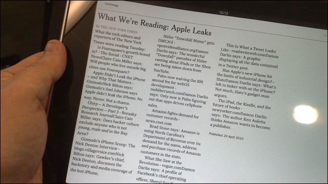
This New York Times page, from their Technology section, for example, is a list of things that the team have been reading on the web. In the iPad app, it is rendered as flat text - literally a list of hyperlinked documents with the hyperlinks removed, on an Internet enabled device.
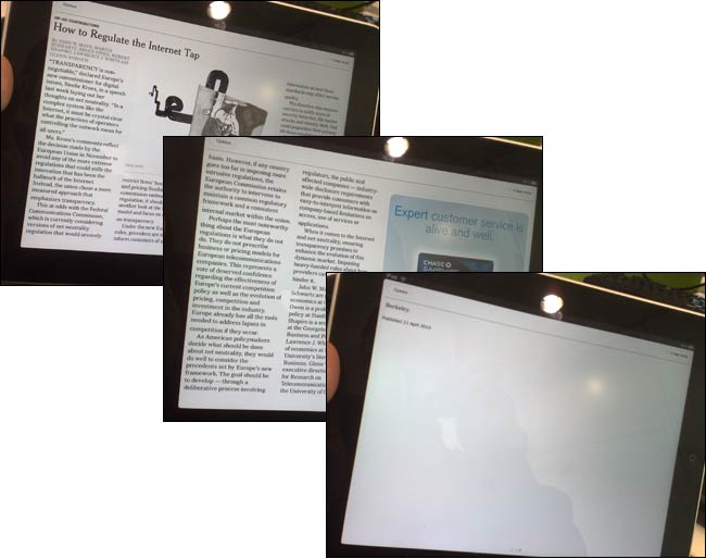
The production process is important too. iPad content looks like print, but it always acts like fluid digital text. There is no way that in print you would allow an article to spread across 3 pages, and have the third page consist of one orphaned word and a dateline - yet that is exactly what the combination of advert placement and content length did on the iPad in landscape mode with this NYT article.
As an industry, there is simply no point in us spending the money on building glossy looking apps, paying the 30% Apple tax on sales through iTunes, and then just shoving the same old print content into them. That would be to fail to learn from the mistakes of the 'shovelware' years of the web.
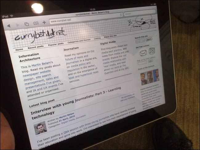
I don't know whether the iPad will be a 'breakthrough' device, but I think it is fairly safe to assume that, with more and more coming onto the market, touchscreen netbook-sized tablets are going to be a very common way to access digital content in a couple of years time. So of course, finally, I just couldn't resist checking out the experience of browsing my own site on the iPad...
Very good review! I think many people will be using the iPad as a ebook/magazine/newspaper reader and thanks to all your screenshots we can experience what it will really look like when viewing this content.
A solution in search of a problem.
I am sure the desirability of it will ensure plenty are sold while they work out what the problem is.
That would be a cynical view.
Another is that it is a 'shallows' computing device for when you don't want complexity or multitasking or to do anything difficult or involved. Like reading a newspaper while listening to your ipod. Reducing complexity (features) as a value-add. They're clever those Apple guys.
If you want to do something tricky, you probably already have a macbook or two
What do you reckon the overlap is between Macophiles and Express readers? I find it hard to believe it's that significant.
It sounds like a pretty slick device to own. Just wonder how durable that is? You can drop a book, pick it up and it works fine, how about iPad? Was there any stress test on the device? One must be treating it with extra care with the money spent on it comparing to papers.
How durable is the iPad Viv? Well, we already know it will blend.
Thanks for the review. I was particularly interested in your point about the dangers of publishing printed material using iPad apps without considering how best to make use of the new platform, especially when it comes to news apps. I don't honestly see the benefit of 'replicating the print experience' in any case. The experience should be whatever is most usable and clear in that format.
Nice review. I can't deny the allure of Apple products - they're just so slick and almost edibly gorgeous. I resisted for a long time before shelling out for an iPod touch, but am not so in love with it that I can't imagine existance without it :)
Still on the fence with the iPad, but your review helped.
I agree that the iPad is probably the start of an influx of touchscreen devices, but I have had an Archos 704 for a few years now. Not as slick as the iPad, but I can surf and watch movies amongst other things. Shame that it looks like a brick LOL.
PS. That guy that blends things is a nut!
Good review, and it seem as everyone say pretty much the same about the brilliant screen just as with all(!) Apple products.
One downside I've heard from a few people is the slippy surface, guess you might not agree to that.
I personally think it's strange that it doesn't support flash though.
Again, very good review.
Now that I've seen the catching flys with chopsticks game, I think I'll have to get one ;)
Enjoyed this review. Am one step closer to getting one. Really like NYT and USA Today app on iPhone, but like how the iPad brings in the photo galleries. The BBC one I'll have to try. Interesting that you found it too heavy for a long trip. Darn. That is what I wanted it for.
Definitely iPad is probably the start of an influx of touchscreen devices, but I have had an Archos 704 for a few years now. Not as slick as the iPad, but I can surf and watch movies amongst other things. Shame that it looks like a brick LOL.
Another nail in the coffin of traditional newspaper.
I'm an old school, I would prefer flipping through actual pages than clicking over an ipad to get to know the news of the day.