Brochure or campaigning tool? Contrasting the Labour and Conservative website coverage of the leader's debates
Tonight sees the third and final leaders debate, TV contests which have done a great deal to stimulate innovative digital applications around the web. One thing that has repeatedly cropped up has been the different web approaches taken by the Labour and Conservative websites to the debates, which I featured in my video round-up of the first debate, and my list of 10 digital things we've learnt about the election.
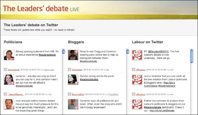
Labour have been turning their site into a Twitterfall of comments around the debate, which has been criticised online by some of the leading lights of the Conservative digital campaign.

For their part, the Conservatives have been keeping their homepage reasonably static, bar the odd tweet, during the debate, and hosting a CoverItLive chat on their Blue Blog.

The thing that struck me is that neither is wrong or right, but that they indicate two entirely different approaches as to what a political party website is for.
Of the Labour approach, Craig Elder said on Twitter that "www.labour.org.uk is now the ultimate political echo chamber - are they trying to scare off every floating voter in Britain?". And that is the crux of the question. At the moment the TV debate closes, is the party website a tool for persuading floating voters, or a tool for your existing party supporters?
The Conservatives website performs the function of a brochure. If you hit it during or just after a debate, it is a very slick and well produced site about persuading people to vote Conservative. After the 2nd debate finished, the main item was about where David Cameron would be the next morning.
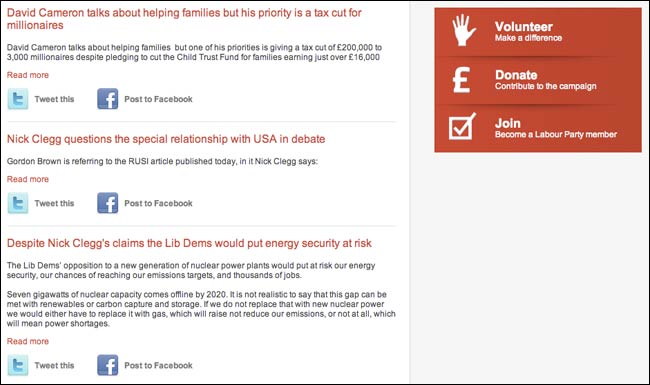
By contrast the Labour website feels more like a digital 'place'. The Twitter slot-machine has the (sometimes slightly random) feeling of the real-time web about it. The point-by-point rebuttals that were available directly after the debate last Thursday, with their prominent call to action to share on Twitter and Facebook, made it seem more like a destination and a tool for already committed supporters. Indeed, it almost had something of an 'extranet' about it.

Which approach is the stronger?
Now I'm more of a Gordon Brown "facts'n'figures" than a David "anecdotes" type of person, so I'd be wanting to look at the metrics. If immediately after and during the debates you were seeing a lot of first time visitors to the site, then the brochureware approach makes more sense. If, on the other hand, you are seeing a surge of loyal and repeat visitors, then the 'extranet' approach would be better.
However, if the campaign was running longer, I'd also want to do a bit of face-to-face testing with potential voters. Are there a significant proportion of visitors to the Conservatives site disappointed that instant reaction to the debate isn't up on the first page? Are there visitors to the Labour site disorientated by the Twitterfall who just want to find the manifesto, or pledge £25, or find out who their local candidate is?
It is not going to be a decisive factor in the campaign for sure, but it is definitely one thing I'll be looking out for again tonight - to see whether Labour are going to tone down their social-media-free-for-all, or whether the Conservatives are going to ratchet up their instant homepage reaction.