The Observer relaunch - my first impressions
The relaunch of The Observer yesterday was the outcome of a long process of rethinking what the printed paper could be, that sparked a great deal of speculation that the paper might close. I'm not a regular Observer reader myself. In fact, until yesterday, I couldn't honestly tell you last time I bought a copy. [1]
That doesn't mean I don't read Observer journalism however. My default "What is the news today?" behaviour is to go to guardian.co.uk, and on a Sunday that means reading a great deal of what has appeared in print under a different masthead.
I picked up a copy yesterday though, and here is my entirely unscientific view of six things that caught my eye about the new version. I say unscientific, because as a non-regular reader, I've no idea if these are new features, design tweaks, or 'same as it ever was'.
Discrete infographics
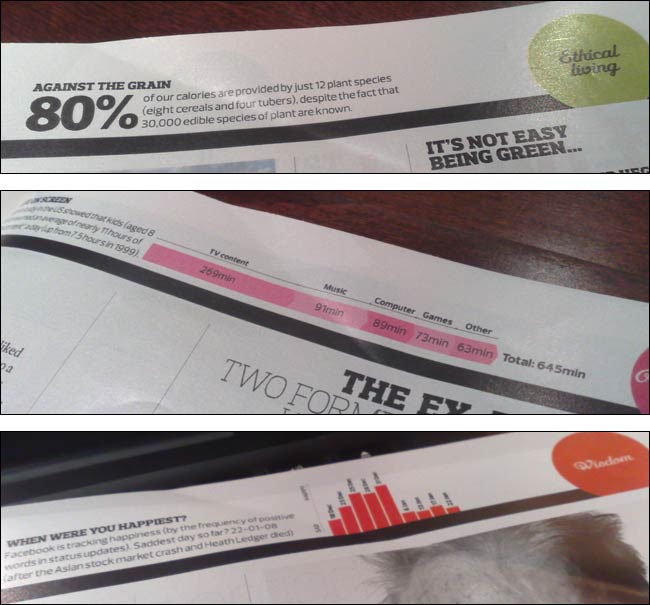
In the new Observer Magazine layout, I liked the use of the space at the top of the pages for discrete infographics and factboxes.
Prominent games coverage
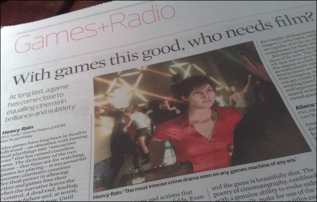
The heading 'Games + Radio' might make it look like one of our combiner URLs, but I was really heartened to see prominent coverage for the most criminally under-rated and under-exposed bit of the entertainment industry.
Seven days - international dispatches
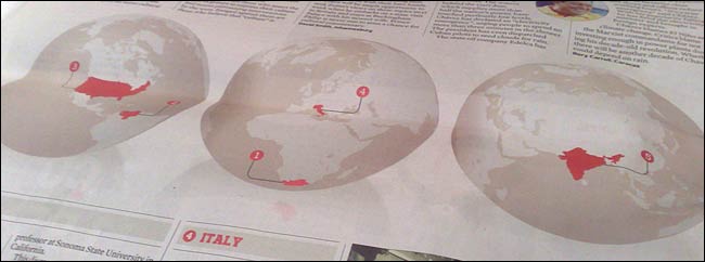
In Greece I was used to getting the International Herald Tribune for a rough catch up of news from the rest of the world. I liked the 'Seven days - international dispatches' spread in the new Observer. The globe graphic looked to lend itself to making an interesting interactive or timeline version over the course of the year.
The Observer conversation
Bite-sized chunks from bloggers 'on a matter that is in the news', the 'Observer Conversation' opened in the new format with a debate on debt in football. In this case the Sports Editor, Brian Oliver, gets to kick off the conversation - ho! ho! can you see what I've done there? - and a selection of people join in, some of them getting to have two inputs into the debate. Notably, the Observer representative doesn't automatically get the last word.
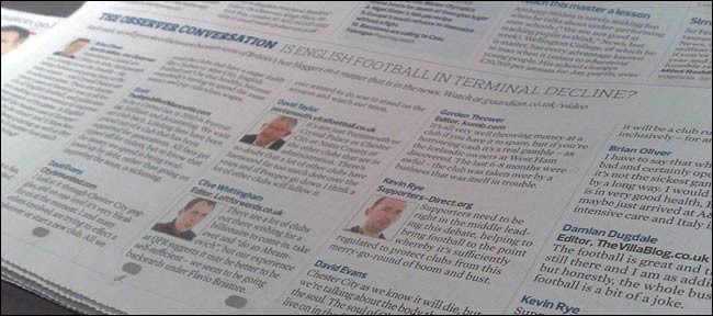
A longer video version of the conversation is available on the web.
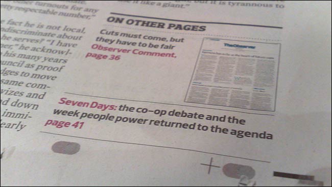
On other pages
I'm a sucker for stuff in print that looks like 'navigation', and I liked the little 'On other pages' panels that were in the main section, trailing content in the bottom right just as you were about to turn the page.
David Mitchell
Definitely not a new feature, but David Mitchell's column has been the most entertaining web read on a Monday morning for some time.

The relaunch has been accompanied by a video advert and a competition to win a year's subscription to The Observer.
And a final 'please note the disclaimer': the views expressed on currybetdotnet are my own, and do not reflect the views of Guardian News and Media Limited.
[1] Actually I can, it was August last year at the Summer Sundae Festival, and the dual Guardian/Observer branding struck me so much that I blogged about it. [Return to article]