Reader's comments about The Observer relaunch
"Well you seem to have made a lot of people extremely unhappy. Anyone who has designed anything knows it takes a while to fine tune a new concept so don't be put off. Stay focussed." - peastwood
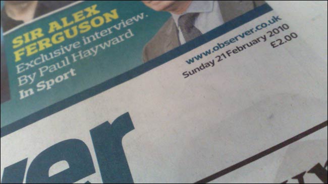
When The Observer relaunched on Sunday, editor John Mulholland wrote a post for our collective Inside Guardian blog about the changes. At the time of writing this morning, it had generated 222 comments.
Last night I was having a read through the feedback, and in amongst the expected "stop listening to the accountants" and "please get a grown-up on the design team", there were a few interesting points raised by users about the relationship between the digital and print incarnations of the title. I thought some of these were worth highlighting.

Some of the content making up the new look Observer - like 'The Observer Conversation' video - appeared online before the print edition, and some after. For commenter houlihan, the way Observer content is published online is problematic, and they advocate a print first approach:
"The Observer has no online presence. This appears to be a deliberate policy. The website is kept in a backroom of the Guardian's site like some embarrassing relative. So, why not give the print Observer a chance and keep content off here competely? Put news up, but keep Review and the Mag back, even if for only 24 hours." - houlihan
Several users posted notes asking the team not to take online feedback too seriously, as it doesn't reflect the voice of the true print audience of the paper. Referring to the calls to reinstate the horoscopes in the paper, jreith said:
"As you review the comments from web readers, not all of whom will be purchasers, please don't react simply to those who shout loudest (eg: the horror-scopers.)" - jreith
Houlihan made the same point, only more forcefully.
"The other thing to say is take care with how you interpret the comments here. Some will be left by Observer readers, those who buy the paper and support you financially and will hopefully continue to do so. And some will be left by the online crowd who'll breeze in for a couple of seconds before breezing off to wherever it is they go: ignore them, they're not your 'readers'." - houlihan
Elsewhere in the thread though, houlihan mentions that they are "a journalist on a.n.other paper", which may go some way to explaining the fierce protectionism they display towards the print side of the news industry.
They are not alone. Dandydon seems to think that the key to arresting the structural changes and long-term decline of the print newspaper industry is simply a matter of choosing the right masthead font.
"Here's what to do. Go back to about the 1986 version of the logo, and use that. You are a very old newspaper and that is something to be proud of. The eighties one was a classic serif font. All solid, comforting and reassuring. Kind of what you need of a Sunday morning. The word 'Observer' looked nice in the font too. A concept smart arse designers often forget when designing. You may even pick up some former readers too. Remember how back then when you sold a few copies?! You know how you need to be selling a few more copies?"
If only.
Digitally though, the 'masthead' badge at the top of the page makes a huge difference. The guardian.co.uk website carries the vast majority of Observer content, and showcases it on our network front on Sundays, but, without the Observer logo, people don't feel it to be an online edition of the Sunday paper. It is an interesting example of how the branding and navigation built around the atomised article content of a news site is so significant in the perception of the user.
"And stilll, on Sunday, the default front page of the Grauniad remains just that - NOT the Observer. It's like saying we've got this great Sunday paper, but you're going to have to find it." - Hannahbaby
There was also a plea to leave references to the website out from the paper all together. Yesterday I suggested that I liked some of the web-style 'navigation'', and many of the features in the new layout carry links to online content. That isn't always popular:
"All very promising, will be buying in future. Too many touts for the blinking website though. I've spent two quid on the paper, don't need to be reminded I could have got it (and eye strain) on the net." - ToshLines

Several people also raised the relative worth of the digital and analogue audience, and the way that giving content away for free on the web impacts on potential income.
"Over the last year or so I have found it easier not to pick up a copy of the papers. This is partly a technological matter - you give away the content on the internet" - RobertSmith
"I used to buy the guardian everyday, and the observer every week. The guardian has become so thin on the ground that I stopped. Seems like the observer is headed in the same direction. Basically I used to give the GMG a tenner a week - it seems it will be soon 0 a year. But thanks for the free online stuff." - KBdeRoma
"Print readers spend hours a week with the paper. Web readers spend minutes, many a few seconds as they pass through having been referred to a single item by a search engine, never to be seen again. Which, I wonder, do the advertisers prefer?" - nd01
nd01 asks a valid question about audience loyalty, but the fact remains that online advertisers prefer online audiences, and online advertising is playing an increasingly larger role in any campaign.
I've debated before the relative merits of a pub offering 'free newspapers' or 'free wifi', but a Sunday paper has some specific use cases, as nicolagallie pointed out:
"I like the old fashioned ideal of reading the Sunday paper and don't want to have to sit at my PC on Sunday just to read, I quite often like to take it to the pub or something" - nicolagallie
Personally on Sunday I could be found in the pub with both the paper and the laptop open, but I suspect I am somewhat an edge case!
One thing shines through.
A quick straw poll of the first 50 people to leave a comment showed that 16 of them (roughly a third) were leaving a comment on the site for the very first time. You know you have a product that people care passionately about when they can make the effort to go to the wbesite, find the article about The Observer's new look, and register to leave a comment online about their offline experience.
Disclaimer: the views expressed on currybetdotnet are my own, and do not reflect the views of Guardian News and Media Limited. Read my blogging principles.
How about a tip box?
Many blogs offers the ability to voluntarily pay the blogger or website for the content -- there'll be a Paypal button and you can send jkottke or the Wikipedia a fiver for offering some entertainment or knowledge.
Why doesn't The Guardian try something similar? Or how about a voluntary subscription by direct debit set by the reader?
Often I'll buy a copy of the Guardian if I'm out and about but it'll sit unopened because I've ended up reading the content online but really don't mind spending the money because I know that one won't necessarily exist much longer without the other.
I'd gladly set up a DD to pay ten pounds or whatever a month to cover the days I don't go near the newsagents but want to pass on a donation. Or use a virtual tip box.
It is an interesting idea Stu, and we do sometimes get comments from people trying to send us money. The Miami Herald introduced a tip-jar scheme in December 2009, but it only lasted a couple of months before being withdrawn. The newsosaur has more details here.
Thanks Martin.
It's interesting that the reason they give is because they felt it conflicted with a charity appeal. I expect The Guardian would run into a similar problem because of their own Christmas appeals. It's the choice I suppose between giving your copper to a busker or someone rattling a collecting tin.
But I would also add that the Herald is a local paper, whereas The Guardian is an international paper (judging by the readership figures outside the uk).
It would be a case of leaving it up to reader choice, the PBS of newspapers.