Fixing the IA of an IA's blog: Part 4
Truly my hobby is also my work, as this week I've been posting about my recent redesign of the look, feel, and information architecture of the currybetdotnet blog. With any redesign or re-organisation project, defining and measuring the criteria for success is an important part of the process.
You are what you measure
If the aim of my redesign was simply to just to freshen up the look, then I achieved that when I changed the main CSS file. Now, that might be a fine aim in itself, but I also wanted to improve the actual usage of the site, not just change the look because I was bored with it.
One area I especially wanted to address was the bounce rate from first time visitors the site.
There is a certain class of visitor that I don't think I can do much about. These are the people who come in via an image search for an oasis album cover, or because they have typed 'bit tits' into Google by mistake. There isn't anything much on the site for them, and in fact, the best I can hope for is that they click an advert on their way out.
However, amongst these first time visitors there will be those who have come in via a search about information architecture, journalism or digital media, who might want to read more about those topics. One of the aims of the redesign is to nudge those users from their original single drive-by visit, to reading more than one article, and coming back in the future.
I'm pleased with the metrics so far. Users who hit one of the hub pages during their visit spend an average of 7 minutes on the site, and these pages are much less likely to be exit pages than anywhere else on the site, showing that they are acting as the navigational tool I intended.
All the other bits and pieces
Any site redesign is at risk of having lots of other vaguely related tasks added to the project at the same time. I ended up with a spreadsheet listing 56 separate tasks to do, ranging from big tasks like 'recode the article template' to small things like 'change the favicon'.
I mentioned yesterday that I made some changes to my XML sitemap to reprioritise the URLs in the list. Another thing that I did was use Google Webmaster Tools to fix some 404s. This list identifies URLs elsewhere on the web that link to currybetdotnet, but which have somehow mangled the address. With a list of these mangled URLs, I was able to set up redirects in my Apache config file, to re-capture those potential lost visitors.
Having changed the information architecture of the site, there was inevitably going to be a time lag in Google and other search engines picking the changes up. I had removed, for example, the 'downloads' and 'recent comments' links from the old main navigation. The pages still exist, but I don't consider them particularly useful or important anymore, and so, again using Google Webmaster Tools, I blocked Google from displaying them as the mini 'site links' underneath the currybetdotnet search result listing on Google.
The power of 'Venn'
My advice to people asking me about how to make a successful blog has always been to blog about one thing, blog about it well, and blog about it relentlessly.
Of course, my own blog totally failed to follow that model, with occasional forays into relating ghost walks I'd been on, or 'citizen history' pieces about the Victorian Theatre at Alexandra Palace and the like.
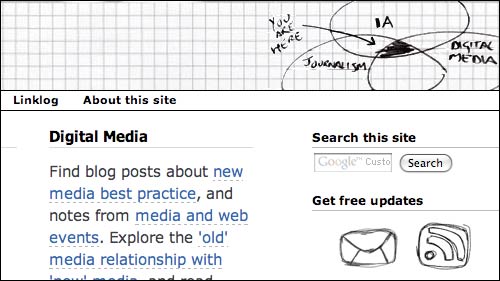
The Venn diagram in the top-right hand corner isn't just a design affectation - it is a visual representation and reminder of my new content strategy. When I have an idea for a new blog post, I ask myself does it fit into one of those three categories? If it isn't information architecture, journalism or digital media, then I need to either rethink the proposed topic to see how it could fit onto the diagram, or find something else entirely to write about.
And everybody in the user experience world needs at least one Venn diagram.

Next...
At the same time as changing the visual appearance and information architecture of currybetdotnet, I also added some new metadata into my pages. I've adopted the hNews microformat, to provide additional machine readable data about my articles. I'll be blogging about how adding that to my site turned out to be much more than a technical implementation project, and made me articulate for the first time my personal blogging principles.
And that's why my blog will always scud along quietly - I just can't get into just writing about one thing ;)
This part is really as great as the first three parts that came under the same heading of the FIXING IA... thanks a lot for sharing such a great deal of articles.