Fixing the IA of an IA's blog: Part 1
Despite spending most of my waking hours working to improve the user experience and organisation of information on websites, for some time I had developed rather a blind spot to the mess that my own website was in. I'd had a nagging feeling that I needed to 'sort it out' for some time, but it was an email from @wandster that finally forced me to act. He asked if I could give him a list of useful web resources about designing news websites. I faced the crushing realisation that, despite having written thousands upon thousands of words upon the subject, there wasn't a canonical URL I could point to on the currybetdotnet site where you could find all of that work gathered together.

Now, the excuses that I'd made to myself for not fixing the site were the kinds of things that I would find it hard to accept from a client, things like "That's just the way the CMS works", "People who use the site regularly understand it", and "It is too much effort to redesign all of the templates, and there is too much legacy code". So in December I spent some time re-evaluating the aims and information architecture of the site, and I thought I'd jot down a little bit about my redesign process.
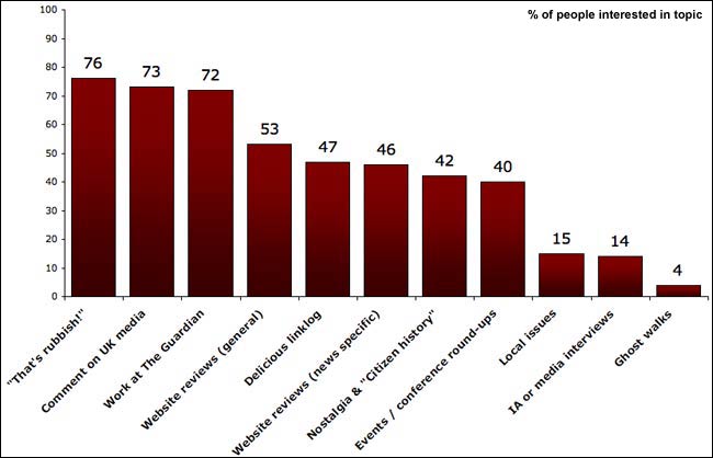
I'd actually begun the process earlier in October, when I put a survey up on the site. There were two key questions - 'how do you usually read the site?', and 'which types of content do you find useful?'. Whilst I myself very much enjoy writing about TV science fiction in the 1930s and obscure Cliff Richard tracks called 'Sci-Fi', the results of the survey were clear about what was most valued by the audience.

The answers to how people consumed the site were interesting as well. Around 40% of people who responded said they read the content by visiting the homepage, a segment of my audience that I seldom considered. I'd fallen into a common trap - thinking about my website purely in terms of how I consume the web and how I go about constructing the site. I subscribe to hundreds of blogs via RSS, and skim read thousands of posts every day. I've got no concept of what most of them look like, or how to navigate them.
After a while working on any site or in any organisation you can tend to go a bit 'native'. That is why user testing is so important, to break people out of the complacency of assuming that everybody consuming a website thinks about it in the same way that those producing it understand it. I've been making currybetdotnet for 7 years now, and it only ever features me. I'd gone way beyond 'native' - I'd literally only been thinking about currybetdotnet as 'the RSS feed of the blog', rather than as a website that people visit.
I quickly identified my main redesign aims:
- Reorganise the homepage to make it clearer what the site is 'about'.
- Arrange the information architecture so that the major recurring themes of the blog like 'newspaper website design' and 'the future of news' and 'my work at The Guardian' had canonical, findable URLs.
- Narrow the range of content I was producing.
Next...
Over the next couple of days I'll be posting about how and why I've ended up with the structure for currybetdotnet that I have - and how I've tried to circumvent the inherent information architecture limitations of 'blogging'.
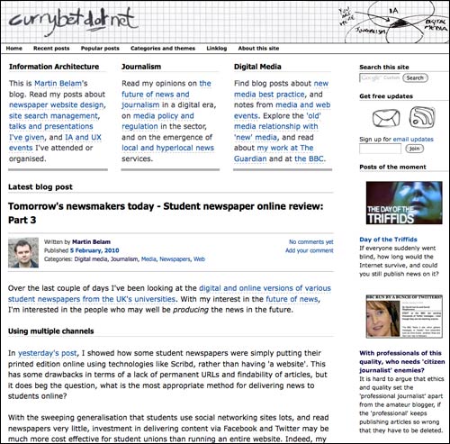
I don't know.. it's still hard to read, despite your best efforts. First, the low quality Jpeg in the header - makes the site look unprofessional, it' 2010 I think we can afford uncompressed images, everyone's using broadband. Second, the dashed highlighting under the links - confusing, especially consider that some of your urls don't have underlining.
Hi Clinton, I don't think you can afford to be complacent about broadband penetration actually - I lived in Greece for 3 years and the level of broadband there has still only reached about 16% of Internet users by the end of 2009, plus if you want a site to be usable for mobile browsers who don't have the more generous data plans, sending a heavy background image that has no functionality is a bit inconsiderate.
I take your point about inconsistent underlining of links though - my aim was that links in articles get a dashed underline, but that navigation links elsewhere on the page do not have underlines in order to avoid unnecessary visual clutter.