The UX of moving house: Part 4 - Transport links
This week I've been posting a series of blog posts based on a talk I gave at London IA in the Pub in October 2009 - "The UX of moving house...with a pregnant spouse". So far I've been looking at how, on the whole, the user experience of local estate agent websites is a bit behind the times in terms of usability. Today I want to look at the issue of gathering information about transport links when searching for a new home. Again traditional estate agents perform poorly online, but thankfully a new web and data-centric approach is on the horizon.
Transport is important
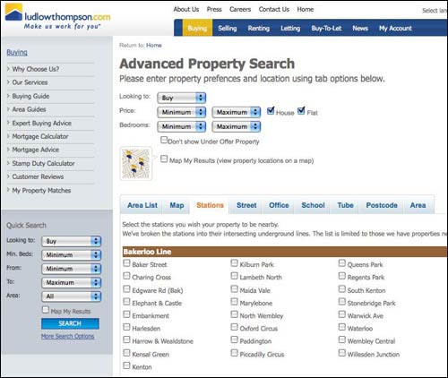
Transport is important to people when they are selecting a new home, and so providing information or selection criteria based on public transport is a sound idea. However, the execution can sometimes be lacking. I mentioned in part two that Central estate agents, for example, list how many minutes away by foot the nearest train station is to a house. However, they do not specify which train station they mean, and in London this can make a vast difference to the routes available and the commuting times achieved. Another agent I looked at in Walthamstow, Ludlow Thompson, allowed the user to select which stations they would like their new house to be located near.

At first glance this seems like an excellent idea. However, if you are going to present the user with something like 600 options, then perhaps a checkbox list is not the best UI to employ...

There is also no guidance to the user on how to make meaningful selections with this interface. If I want a house near Walthamstow Central, do I need to check the station on both the Victoria Line and on the British Rail checklists? What happens if I select two stations that are at opposite ends of a line? Will the search try and look for something near Walthamstow Central AND Brixton, finding nothing, or will it execute a search for properties near Walthamstow Central OR Brixton, finding me options in totally different places, but which both have a reasonable single line commute to Kings Cross where I work?

Perhaps a better approach here would be to get the user to select one station and choose a radius.
Getting away from structured data
One of the problems facing estate agent websites is that whilst the data about a house is very structured, our way of thinking about where we want to live isn't. The user interface of websites wants you to narrow down choices based on rigid criteria. Your requirements may not be "a 3 bedroom house in this postcode costing less than x". They may be much more fuzzy, for example "I'd like a roomy house in a quiet street with a reasonable commute to work".
That is hard to quantify with computer variables, especially the 'reasonable commute' criteria. It isn't just about time - from Muswell Hill I used to be able to commute to Kings Cross on two buses. It was less efficient than making my way to a tube station and getting the train to Kings Cross. However, on a sunny morning, sitting on the top deck with web access on my phone, it was a much more 'reasonable' way to make the journey, even if it took slightly longer.
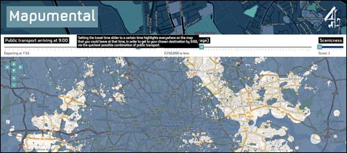
Mapumental, from MySociety and 4iP, begins to approach this type of problem when choosing a location to live. You give the site the postcode of your office, set the length of time you are prepared to commute, and the amount of money you have to spend on a house, and the map illustrates a range of areas where you can afford to live and can bear to travel from.

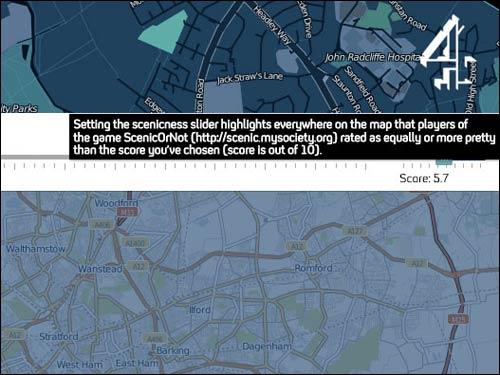
An additional feature also allows you to specify how 'scenic' you want your commute to be. Although I found that, however much I tried, commuting from East London to The Guardian's office at Kings Cross scored very low on the scenic beauty scale!

Next...
The approach of a site like Mapumental contrasts with that of smaller estate agents by appearing to be more 'web native'. It looks like an application built for the digital era, rather than the product of a small business hiring someone to 'make us a website'. Next week, in part five of this series, I want to look at how a couple of property aggregators - Globrix and Rightmove - seem to be much better than traditional local agents at providing a decent user experience when looking for a new home.