The UX of moving house: Part 2 - Estate agent search results
Last year my wife and I bought a house for the first time. As I tried to complete as much as possible of the process online, I made a record of some of the good, bad, and downright baffling user experiences. Yesterday I started 2010 by beginning to post a series of blog posts examining those, with a look at some features of using search on an estate agent's website. Today I wanted to continue looking at the experience of searching local estate agents online.
Estate agent search results
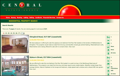
Search results pages on estate agents websites are reasonably uniform in the way they present property information. Although the visual layout and design varies, the information architecture of what is on display is pretty consistent - a fairly specific address, a suggested price, a thumbnail image, a short description of the property and some metadata attributes usually appear. This example is from Central, an estate agent in Walthamstow, where I was looking for property.

You can see that they have opted for a standard set of descriptive metadata about the property on the right-hand side of the listing, with icons representing the number of bedrooms, the size of the garden (if there is one), and the distance from the train station. It is reasonably easy to deduce at a glance what these icons mean, but some are less helpful than others.
Knowing that a property is 20 minutes from a train station is useful, but in the area where I was looking for property, it was also important to know whether this meant 20 minutes from Walthamstow Central (Victoria Line and Chingford-Liverpool Street line), Wood Street (Chingford-Liverpool Street line), Walthamstow Queens Road (London Overground) or Leyton (Central Line).
Failing to get the basics right
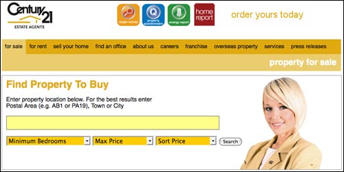
Century 21 are a franchise based estate agent who have a branch operating in Walthamstow. At first glance they have one of the more appealing property search interfaces.

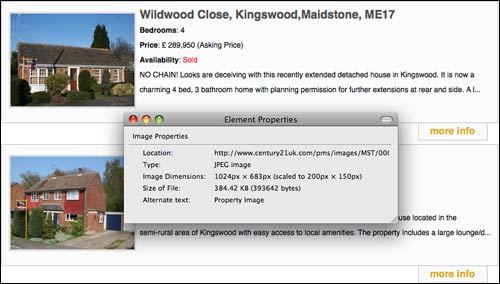
However, there are some really basic errors in the search results that they deliver. Firstly, they do a 'fuzzy search' over the postcode data they have about the properties on their database. That means that a search for Walthamstow's postcode of 'E17' returns me houses to buy in Maidstone, Kent. This is because the Kent addresses have the postcode 'ME17'.
The search results also have limited information on display, with only the price, number of bedrooms, and a truncated description allowing me to judge whether I want to click 'more info'. As an even more basic webmaster error, the thumbnail images served on the search result page are massive image files, scaled down by the browser. To be serving 384k in order to display a 200x150 picture is, over the course of a year, going to unnecessarily increase their bandwidth costs.

Next...
In the next part of this series, I'll be looking at one estate agent with an experimental search engine results interface, and wondering why estate agent sites are cursed with tiny images.
Hi Martin, I did the same last year. But rather than use the estate agents' sites I went to Globrix. Plenty on that site for IAs: crawling, parsing the results for known concepts, classification, faceted search results and then mapping results. The team responsible are great guys, ex search engine wizards. Now if someone has an app for making the whole process of actually selling / buying easier...