New interactive Flash photo gallery on guardian.co.uk
When I recently did a reader survey, writing about the work that I do at The Guardian proved to be one of the more popular topics for blog posts. However, it can be quite tricky. The things that I have spent most of my time on have tended to be strategic longer term projects that are still under wraps. On other things, very often my contribution consists of chipping in to a couple of meetings very early on in the process, and so it then seems a bit churlish to subsequently blog "Look! I did this!" once they launch.

There is good stuff and new functionality being developed all over the Guardian site, and over the last couple of weeks a few things in particular have struck me as worth blogging about, and here is one of them. To be absolutely clear, I had nothing to do with this, I just think it is really cool.
Jane Bown 'Exposures' photo gallery
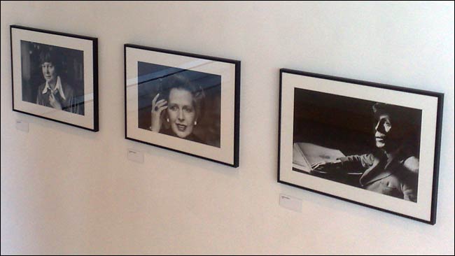
At the moment I get to walk past the an exhibition of Jane Bown's photographs called 'Exposures', which is housed in the entrance to The Guardian's office in Kings Place. There is also an online photo gallery to go with it.
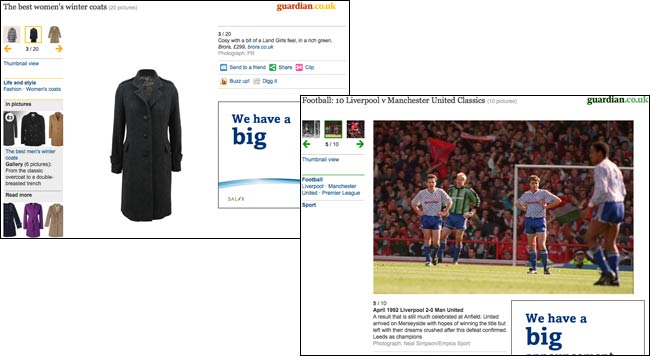
There is always a tension when designing an online photo gallery between commercial and artistic interests. In terms of user experience, providing a seamless set of photos with no obvious reload is ideal, although having a unique URL for each photo is valuable. However, photo galleries can also be a source of multiple page impressions and the ad impressions that go with them, so it is no surprise that newspaper photo galleries, ours included, veer in that direction.
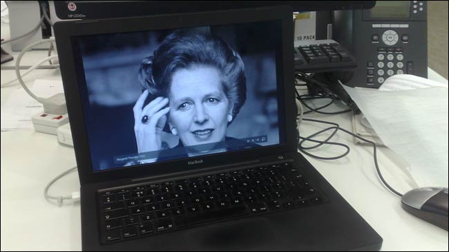
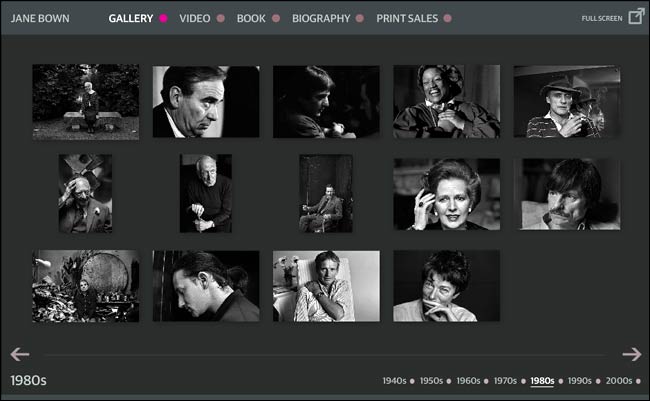
For the Jane Bown gallery last week however, The Guardian used a new flash interactive rather than our usual template, developed by Alastair Dant.

This provides a full screen option, which really shows off Bown's photography. I think it seems to work particularly well on screen because the images are such a crisp monochrome.
The new format won't be replacing our regular galleries. However, it has been designed so that the production overhead for re-use is low, so I am sure we will see the format again.
It has given me one small information architecture problem though - because it is an embedded piece of Flash, it gets classified as an 'interactive', not a picture gallery, and so doesn't appear on our 'In pictures' aggregation page.
Nice - my first thought is what the implications are for search from external sources? (e.g. Google, Bing etc)
Well, in theory the opening page comes with a blurb that has got as much chance as any text-light page on the site has of being ranked - e.g. title tag, URL, semantic tags, related content on page are all 'on theme'. You are right though that we lose a unique URL, and therefore a unique chance to rank, for the individual images. I think whether people adopt the format more in-house will actually depend from desk to desk whether their priorities are search/pageviews or "niceness".