Mail homepage goes indigo - well, 'Indigo Collection' anyway
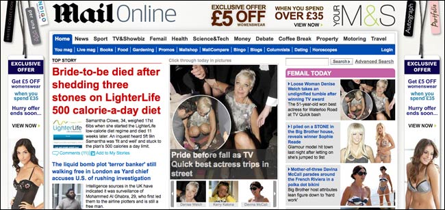
When I first saw this homepage advertising campaign last week from Marks & Spencers on the Daily Mail website, my initial reaction was to tweet that it had burned my eyes.

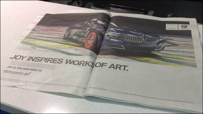
Aesthetics aside, I did think it merited further mention. It is very interesting to see a British newspaper experimenting with advertising formats like this. For the Daily Mail's online audience it seemed likely to be totally 'on brand', perhaps much more so than the Evening Standard giving pages 2 and 3 in print over to BMW in the same week.

I'd also give credit to the technical team at the Mail. Over the last couple of months the paper's site seems to have established itself in the #1 ABCe slot. I'm sure that in addition to handling that extra traffic they were delighted to be told that it was intended to serve streaming full-screen advertising on the site's homepage as well!
The campaign returned to the Mail homepage in a more modest format yesterday. Well, I say more modest. The wraparound graphic background had been toned down, but somehow I found the clothes being modelled rather more eye-catching than before...

I also noticed that it bypassed the standard ad blocking plug-ins for Firefox.
Which was more interesting to see in action.