The Ashes, personalisation and print
Mike Norrish wrote an interesting piece in The Telegraph this week, pointing out that the weekend's Ashes victory had not captured the national mood as much as it had in 2005. Stressing that at the time the 5th Test ended, Songs Of Praise was getting higher viewing figures than the cricket on Sky, he said:
"You simply can’t enthrall a nation on subscription TV. The 2005 Ashes series pulled in 7.4 million viewers at its peak. Even people who didn’t give a toss about cricket were hooked. Given the amount of newspaper coverage - Andrew Strauss even knocked Jordan off the front page of the Daily Star this morning - you would have thought this Ashes series had also transcended sport and become a genuine cultural event. But has it really? Not for my money."
I think there was another factor in play as well. The 2005 victory was unexpected, and came after a gap of 17 years between English Ashes victories, whereas for most people that 2005 series victory is still the last time that cricket loomed large in the national consciousness.
It highlighted again something about the inflexible design of our news and television broadcast websites. Back in 2005 I was at the BBC and part of the team working on special editions of the BBC homepage to celebrate the cricket victory.
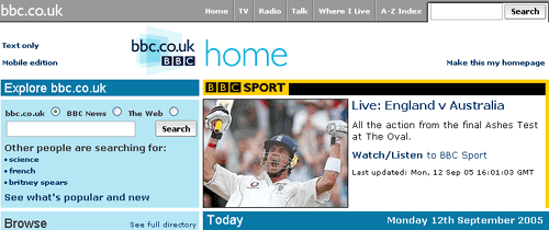
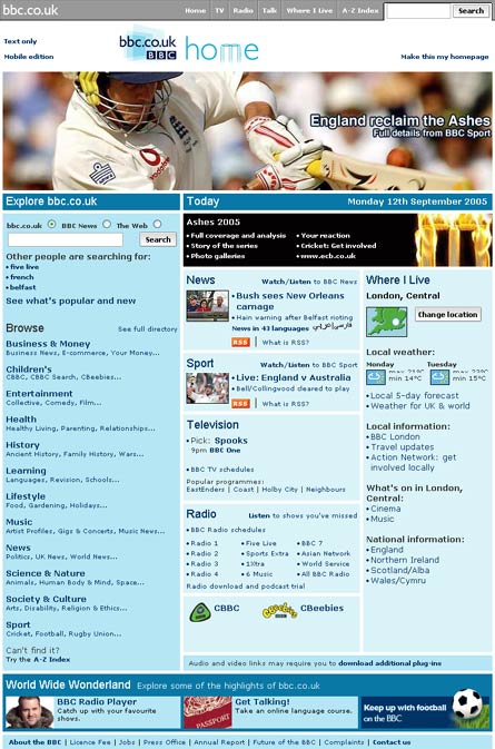
This time around, the BBC's modular homepage doesn't lend itself to that kind of splash approach. The best that can be managed is to put a big picture of something topical as the default promo slot, and to turn the page furniture a relevant colour.
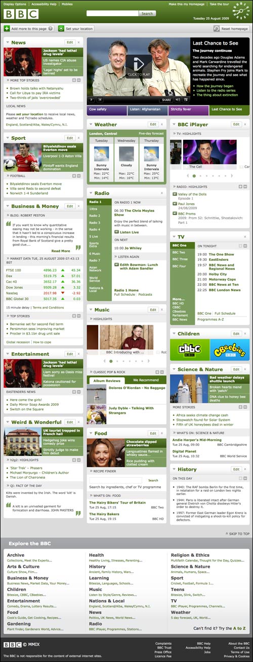
As I mentioned with the naming of Tracey Connelly and Steven Barker, even though this was mainly a picture led story, online we all seem to be constrained by relatively rigid templates that our print brethren don't suffer from.
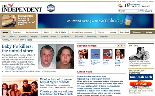
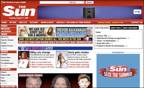
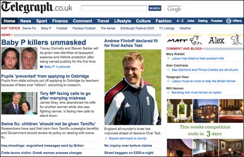
The press was able to splash the Ashes victory much more on front pages than it could do online.

It is an interesting tension that poses a particular design problem for news sites.
You want to showcase all of the best of your content and the breadth of material you offer, and you want to provide easy to follow navigational paths to all parts of your site. You might also want to provide elements of personalisation. However, sometimes events really just require you to have one thing on the homepage screaming "This just happened".
This time around, whether it is that the 2005 series was still fresh in the mind, or diminished viewing figures delivered by Sky, I tend to agree with Mike Norrish. I don't think the Ashes victory quite climbed into that 'national event' category.
You can still use a newspaper if they completely redesign the front page, though. The pron's still on page 3 and the sport's still (mostly) at the back.
Finding the layout of a homepage has changed is a bit more like going to the supermarket to find they've moved the vegetables and replaced it with a massive promotion for boneless skinless chicken breasts.
While it is true that a website (generally) cannot splash a page like a print newspaper, the website still has some huge advantages! For one thing, speed. The newspaper may be able to splash the front page, but they can't do it until the following day.