"Graceful Hacks" - UX, IA and interaction design tips for hack days
This blog post is based on a lightning talk given by Martin Belam at The Guardian's July 2009 Hack Day - #ghack2.
Putting a working hack together in just 24 hours is hard graft. When you are trying to get your pythons to catch the rubies that have been left on some train tracks, or whatever it is you developers do, user experience may not be your primary concern.
Especially when there is also usually the distraction of beer, pizza and Rock Band.
And let's be honest, we can't all be born beautiful and graceful, so here are some tips about how to avoid your hack looking like this unfortunate baby rhino.

Unfortunate baby rhino picture from fupenguin.com
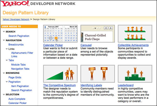
Unless your hack is actually in fact all about re-inventing the graphical interface paradigm of the web, then the Yahoo! Design Pattern Library is your friend. Basically, if you need to put some kind control onto a widget, page or element, this will give you an idea of the optimum way of doing so.
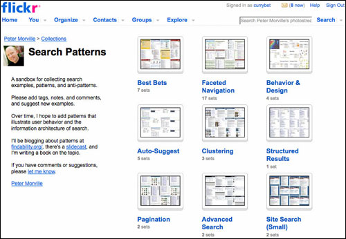
Peter Morville is possibly the only person on the planet nerdier than me about search interface designs. If your hack involves some sort of search results display, his Search Patterns collection on Flickr is essential viewing. He has collected together an amazing amount of pictures of basically every search interface he has ever seen. They are grouped into categories by the type of content they search over, and the type of features they have, and it is a great place to go for inspiration.
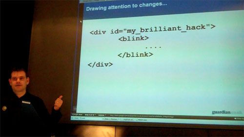
In 1995, using the <BLINK> tag to draw attention to the new elements you've added to a page was
a really cool idea. However, I am given to understand that this is now deprecated and has gone out of fashion.
If you are inserting a new widget or control into a Guardian article page - or indeed any content page - there is a relatively limited number of slots where new items can be placed without breaking the overall design and information architecture of the page.
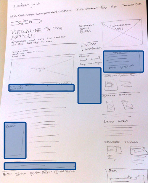
One company, though, generates the GDP of a small developing nation daily out of hacking starkly formatted bits of text into web pages, and getting people to notice them and click on them.
In unrelated news, the Google Adsense heat map may help you think about where to position your new elements on a page for maximum visibility. Although I suspect most editorial people would frown upon a hack just being strong-armed into the middle of the body copy of an article.
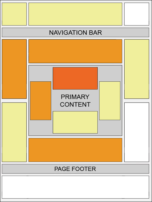
The majority of software developers I that know have a working environment that consists of three monitors placed side-by-side, each set to a resolution of a zillion pixels.
Let me reassure you, this is not normal behaviour.
Think about how your hack will appear for a regular user on a regular monitor at regular resolution. And the shape of that is changing, so think widescreen...

In Q3 of 2008, laptops and notebooks outsold desktop PCs for the first time. That illustrates a trend towards a more 'widescreen' view of the web. The Guardian's web analytics bear that out. Comparing figures from January 2009 to July 2009, we are seeing an increase in the width of open browser window size, and a corresponding dip in open browser window height.
But also think small screen...
OK, OK, so I know this contradicts the previous recommendation, but you may also want to consider the very, very small screen. Don't forget that aside from the swishy iPhone and the intriguing possibilities of Android, there are millions and millions of handsets out there that can render fully formed HTML, providing it plays nice with a small screen size and the images aren't too wide.

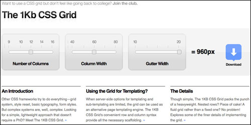
If you aren't lucky enough to get a genius client-side developer as part of your hack team, you may well find yourself remembering that the reason you program Java is because you were no good at front-end development. You can take shortcuts using CSS frameworks. Blueprint or the Yahoo! CSS grid are good options, and the 1Kb CSS Grid is flexible and lightweight. These can really save you time during your hacking.
Labels are really important to users. We found that the 'Travel' link did not perform well on the secondary navigation of the Environment front on The Guardian site, even though stories about green transportation issues gained a lot of traffic individually. 'Travel' in a newspaper context conveys something very different from 'Transport'. Contracting it to 'travel' for space reasons did not work for this audience.

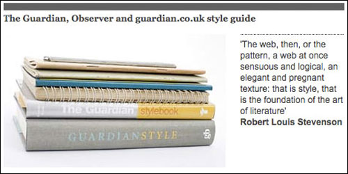
If you need help with what to call things, then The Guardian style guide can help you decide whether you need to refer to a web-site, website or "Web site".
Looking for graphical design elements? Then Smashing Magazine has lots of icon and graphics sets available to download. Most of them are more serious than mice holding favicons. Although I'm thinking that there may well be a place for mice with icons on The Guardian site, although I'd probably advise you check with Creative Editor Mark Porter first...
Rather like the people who devote hours and hours and hours to Open Source projects for nothing more than the glory of being mentioned in the documentation, Mark James has made 700 icons in his 'Silk' set available on the web. It is probably lacking an icon for "Power up Lego Robot Death Ray", which I guess might come in handy on a hack day, but otherwise it should pretty much cover any icon needs you have for rendering controls.
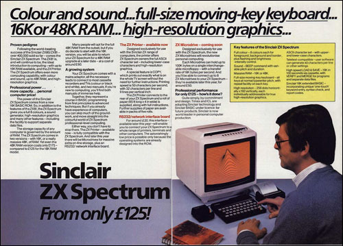
I never get to do much hacking myself. In part this is because as an Information Architect I mostly spend my time either drawing boxes or sitting in meetings, and in part because there are so few API libraries that have been adapted for the ZX Spectrum, which is the last machine I used to code in anger. However, I hope some of these tips and resources will spur on those of you who do hack to make "graceful hacks".
Martin, You are staggeringly prolific!
This is brilliant. Really useful set of resources.
i missed the blink tag from the olden days.
and thanks for the link to the icon downloads :)
Actually I think the blink thing can be effective. The mere fact that noone is using it anymore, means that when you do see it, it's an oddity that grabs your attention.
A site I use went down a few months ago. When they came back, they made the donation link which I always ignored, blink. It was actually the first time I noticed the link. So I'd say blinking can be an effective strategy...in very rare occurrences.
Interesting article - I had no idea how useful IA's were until my old company hired one about 4 years ago and it made all of our jobs much easier + the quality of our products improved so much in terms of overall user experience.
That 700 icon set was very helpful to me, thanks.