Social media unplugged: Part 2 - Yahoo! Buzz and Delicious
This week I'm looking at 'social media unplugged', finding out what the user experience is like if you click one of the multitude of share buttons that litter the web without being logged in to the service you are attempting to use. In yesterday's first part I examined Digg and StumbleUpon. Both of these put the novice user through a registration process, only at the end to have not captured the URL that they were hoping to submit. Today I'm turning my attention to Yahoo! Buzz and Delicious.
Yahoo! Buzz
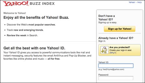
Clicking a 'Buzz up' icon when not logged in to Yahoo! takes the user to a standard Yahoo! log in/register page. The left-hand side is dedicated to promoting the concept of Yahoo! Buzz, and the right-hand side is taken up with the choice to log in or register. This design pattern has worked well for Yahoo!, and it seems to strike a good balance between the three elements I was looking for on a page.
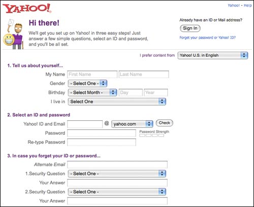
Yahoo!'s registration form is a bit daunting however - with a lot of input fields to complete just to say "I liked this!".
I also failed the CAPTCHA about four times, which concerned me. If even an experienced web user like myself can repeatedly fail it, I wonder what their drop-off rate from failed CAPTCHAs is.
What I did like was some very clear contextual help as the user progressed through the form. Not only was what you were filling in explained, Yahoo! also explained the benefit of giving them that information.


There was a slightly jarring note at the end of the process - when the page invited me to 'go and try out Yahoo! search', when I thought I had been registering for Yahoo! Buzz.
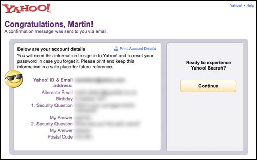
Actually, it turns out that this is just some misleading boilerplate text. Yahoo! does retain the information about which URL you had been attempting to 'buzz up', and, at the end of the registration process, you end up back at Buzz with the opportunity to submit it.

Of all the sites I tested, Yahoo! seemed to have got this process closest to how I imagined it ought to work.
Delicious
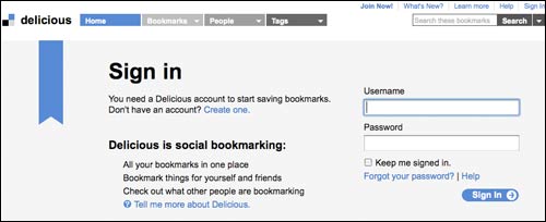
If you try to bookmark something on Delicious without being logged on, the initial page displayed to you is a mix of selling the service and logging in. There is a clear log in form on the right-hand side of the screen, but the left-hand side invites the user to register, gives a brief outline of 'social bookmarking', and a link to find out further information.
Once you get into the process, although the interface describes it as three steps, it feels a lot more involved than that.

After you've initially entered your details and picked a user name, and passed the seemingly ever-present CAPTCHA test, step 2 is about customising your browser with Delicious tools. The options are shaped by the browser you are using, with specific images of the types of security message you might encounter rather than a vague warning that 'your browser may ask you some questions about what you are doing'. I suspect that browser customisation is still quite a niche activity, and it makes a good deal of sense to provide contextual help in this way.
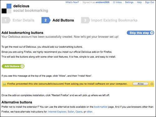
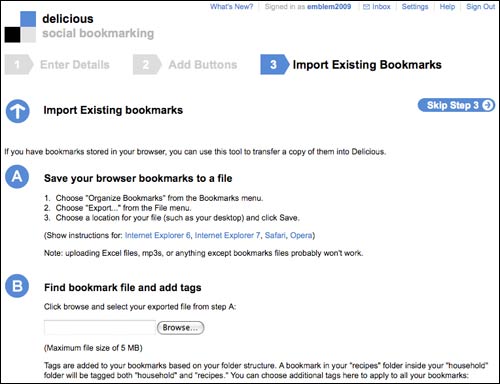
The final step is to import existing bookmarks from your browser. Having started this journey from simply wanting to try out one shared bookmark, the registration process has by now involved quite a bit of customisation and setting options - certainly a lot more than just pressing the 'bookmark' button in my browser.
Delicious is one of the few services I found that remembers what motivated you to register with the service in the first place. At the completion of the registration process, you are presented with a screen to allow you to save as your first bookmark the URL where you first clicked the Delicious icon.
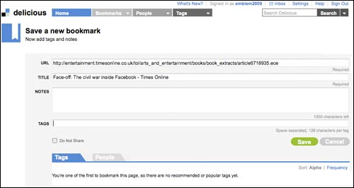
I'd love to have a look at their analytics data. Assuming they have some drop-off rate in the registration process, I'm really curious as to whether adding the details to your bookmark is optimally place at the end of the process, after the potentially scary screens about browser customisation and import have been negotiated.
Next...
In part 3 of this series, I'll be looking at Newsvine, Reddit, and one of the biggest potential mass-markets for socially sharing URLs - Facebook.