Social media unplugged: Part 1 - Digg and StumbleUpon
When I recently wrote a series of articles on how major publishers are using social media bookmarking tools to drive traffic, I mentioned that 'share this' buttons had descended like a plague on web design in recent years. It seems that at the foot of every story, we are being urged to dig this, stumble upon that, and buzz up the other.
We very carefully control the user experience around sharing on our sites. We make choices about where to place the icons on the page, and whether to show all of them at once, or to hide them behind a universal 'share this' icon. A lot of news sites also provide contextual help around their share functionality, with links like the BBC's "What are these?" pages.
However, one area where we don't control the user experience is the welcome that users get from the third party site. I was particularly intrigued to see how these services treat users who hit a 'share' button when they are not logged in or registered for a service - the 'share-curious' user if you will.
It seems to be me that if a user who isn't logged in hits one of these icons, the page they end up on needs to provide three key things:
- A route to log on. This caters for the case where the user is actually a regular contributor to a service, but isn't at that moment logged in.
- A route to register. There should be an easy opportunity for users to sign up to a service.
- An explanation of what the service is, and why it is of benefit. On the basis that people may end up on this page because they have pressed a sharing icon out of curiosity, social bookmarking sites have a user at the 'seduceable' moment where they can really sell their service.
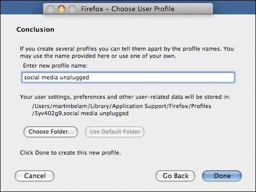
I wanted to find out how these services treated potential new users, and to that end I created a new profile in my Firefox browser - 'social media unplugged'. With no cookies, stored account details or browsing history, I wanted to see how the most popular social bookmarking services treated me when I tried to share a URL for the very first time.
Digg
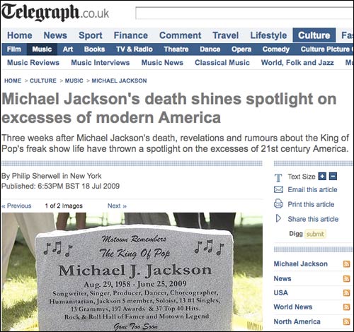
Digg is often seen as the most powerful social bookmarking tool for driving news traffic, and so I started by testing them. I tried to Digg a Telegraph story about Michael Jackson, without having a Digg account or being logged in.
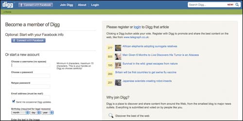
I was taken to a page inviting me to log in or join.
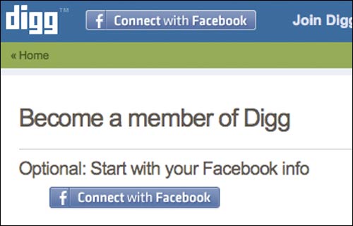
Promotions for using Facebook as the basis for your registration are prominent on the page, which I think demonstrates an interesting willingness from Digg to move away from the traditional image of their users, to a more mainstream approach. You sometimes got the impression that for Digg 'Slashdot connect' would be better placed to form the basis of their registration system.
An interesting aspect of the page was that it had noted that I had been trying to 'Digg' an item from The Telegraph, and so accordingly showed me a chart of other popular items on Digg from the paper.
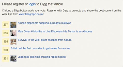
Users can get started straight away with setting their own account up from scratch, but the page did lack the opportunity to directly log in. If you were a regular user who just happened to have been logged out for some reason and you hadn't realised it, from this page you have to identify a small text 'log in' link in the banner.

If you do fill in the registration form, there are two types of verification. First the user has to pass an on-screen CAPTCHA test, and then they have to respond to an automated verification email.
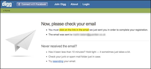
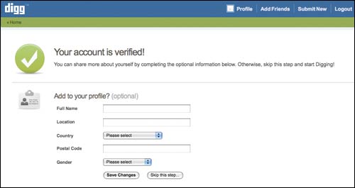
Once the email has been confirmed, the user ends up on a page inviting them to fill out more details for their profile. There is an option to skip this step, which I always think is a good piece of user experience, since it means you haven't pre-judged that the user has lots of time available to decorate their profile.
Finally the user is passed through to the Digg homepage, where a super-sized banner welcomes them, and points them on to some next steps.
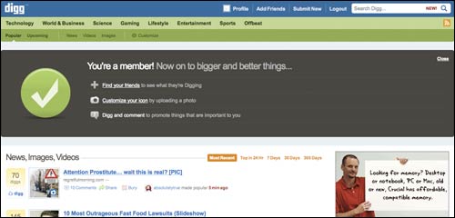
However, something has been lost in translation during this process. I may be a fully-fledged and verified Digg member now, but somehow along the way I never actually got to register my Digg for The Telegraph's Michael Jackson story, which is what started me on the journey in the first place.
StumbleUpon
A lot of the stumbling done on StumbleUpon is done via a browser toolbar. If you click a StumbleUpon link without being signed up or logged in, you get a pop-up instead.
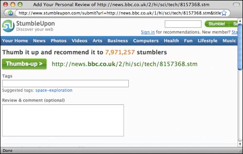
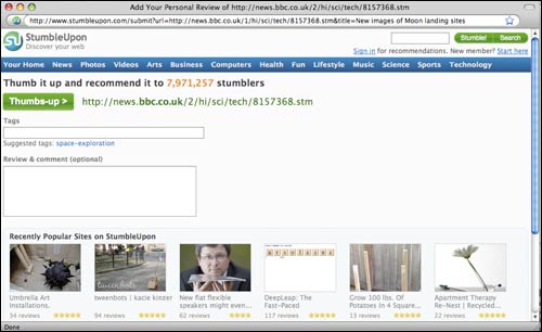
This appears to be one of those annoying pop-ups that either hasn't been cross-platform tested properly, or the content has changed size without propagating that change throughout the share-button-o-sphere. Either way, I got a version where I couldn't see all of the page, and so had to re-size it myself. A small gripe perhaps, but not a great first impression of the service.
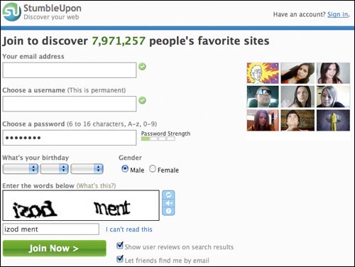
One interesting aspect was that when you get through to registering a new account, they show a series of user avatars on the right-hand side. The choice seems to heavily favour photogenic young women, making it look a little like you are signing up for a dating service.
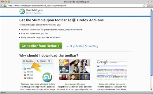
Having filled the form in, the user is encouraged to download the StumbleUpon toolbar or the relevant add-in for their browser - in my case Firefox.
After that step, there is the opportunity to set up the categories that you are interested in. Again the pop-up size was wrong for my machine, and because of the inline StumbleUpon bar at the top of the pop-up, I couldn't scroll down far enough to fully read the big green button at the bottom of the page.
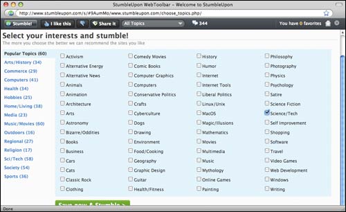
One concern I had with the user experience here is that there doesn't seem to be any way of conveying to the user how long the registration process is likely to take. The tasks are spread across several different pages, but there is no progress bar or 'stepped' navigation.
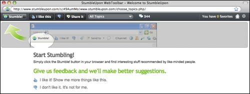
This is also another service where I've gone through the registration process, customised my browser, and added some detail to my profile, but somewhere along the way I don't seem to have actually stumbled the URL that first got me interested in sharing a link.
Next...
Tomorrow, in the second part of this series, I'll be looking at what happens to new users when they click buttons for Yahoo! Buzz or Delicious.
It is an interesting point which is highlighted here and that is no matter what the webmaster does to control the user experience on his site to the extent he is encouraging social media interaction he is necessarily ceding control to a third party. It behooves all of us to know as much as possible about the third party social media user experience and thanks for providing a detailed review.
I kind of commented on this in another one of my comments on your site, but here I go again with something slightly different. How effective are these buttons really? I haven't used them on my site but would like to at some point. I guess the reason I haven't added them is because I never cared to "share" anything myself using these buttons. I guess I would be one of those new users on the third-party website. I never use Digg or any other similar site so I'm in no big rush to add it to my site. I guess I need to look past this and put myself in the shoes of the millions that do use Digg.
I can't help but think that the vast majority of social media activity is generated by webmasters and not web surfers. The effort required to sign up and bookmark, 'digg', 'stumbleupon' or otherwise add a site to a given social media site seems something that only webmasters would be motivated to do in the interest of self promotion. This kind of follows on from your point Adi. If I find something great on the web I share it with my mates with an email. Why would I want to share it with the world other than in an effort to promote?