Sale Water Park making audience research fun for kids
One of the things I advocate when trying to do user-centred web application design is to take every possible opportunity to talk to real users to get their input into the process. That can range from running focus groups, carrying out online surveys, undertaking controlled testing in lab conditions, or just plonking myself down next to people in cafes and 'ambush' user-testing them with Silverback.
I'm always on the look-out for ways that other organisations carry out this kind of audience research, and I recently saw a great example at Sale Water Park near Manchester. Their visitor's centre had in place a series of information boards that were actually about garnering information from the user.

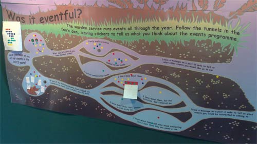
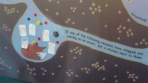
They were formatted in a way that kids could enjoy providing the feedback, by colouring in the tail feathers of a bird, or following the tunnels in a fox warren, and there was, consequently, instant visual representation of the results to visitors.

Questions asked included how visitors got to the centre, and what they had come for.

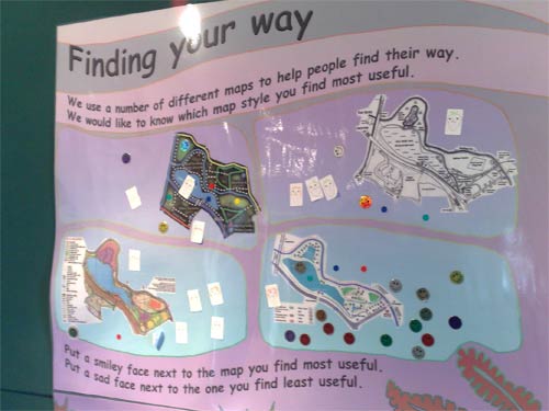
There was also a vote on which type of map was most useful to visitors, with children encouraged to put smiley faces next to the most helpful, and sad faces next to the maps that they found bewildering.

Of course, you wouldn't be able to apply any scientific rigour to the statistics the boards produced, but I thought it was a great and inclusive way for the centre to carry out some primary research on their users, whilst making a fun activity for kids.