Newspapers on the go - Metro and The Sun
Yesterday I was casting a (very) quick eye over the mobile offerings of The Telegraph and The Times. Today I'm looking at the sites that The Sun and Metro offer to users on-the-go.
The Sun

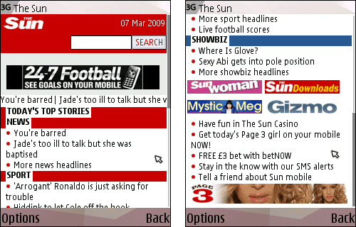
Of the sites I looked at, The Sun's was by far the most nakedly commercial.
Sometimes literally so.
Their homepage had a strong focus not just on the news, but on calls to actions to download ringtones, wallpapers and games, which are provided by a partnership with Jamster.

I presume that the [cue pun] paid-for-model of downloading Page 3 girls is targeting the diminishing demographic of men who don't know that you can get free pr0n on the Internet. If The Sun have successfully monetised this niche though, then frankly, fair play to them. I'm not so sure that the upcoming generation of 'bored white man van' will be so easily convinced.

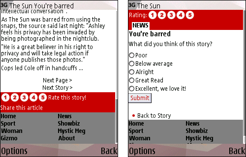
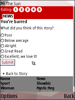
Users are able to rate stories on The Sun mobile site on a sliding scale of 'Poor' to 'Excellent, we love it!'. This is a piece of functionality not available on stories on the main web version of The Sun. As with a lot of the community interaction around The Sun Online, I really liked the way that the ratings encapsulated the spirit of the paper, rather than just being a 'number out of ten'.

Conversely, the mobile site doesn't have any place for the MySun discussion boards attached to stories. Indeed, none of the papers I looked at had user generated comments attached to their stories on the mobile versions of their site.

I know that for some users of The Guardian mobile site this is a constant source of aggravation. Personally, I remain unconvinced that the overall demand to leave comments on websites via web forms whilst out and about on the mobile web is necessarily worth the technical infrastructure investment required.
Metro
The content on the print edition of the Metro is purposefully designed to be read on the move, so I was particularly interested to see how they had adapted that to the mobile medium.
The 'Metrosexual' content about dating and sexual advice was very prominent in the navigation. I must confess on first glance I assumed this was simply an 'advertorial' way of getting users to a commercial dating destination. However, the section seems purely editorial, with no direct links to any such service.

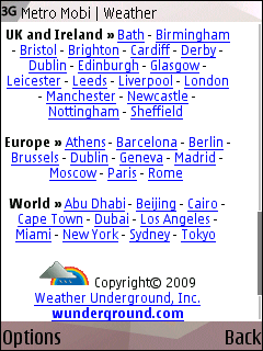
With many new generation phones equipped with GPS, I was interested to see what location based services were being offered by newspapers. The answer was very little. Metro did have a localised weather service, but this was based on clicking location text links, or searching for a postcode, town or country, not any automatic choice based on the location of the user. The service is provided in partnership with Weather Underground.

One thing I found very odd was that, at the time I was testing it (April 13th), the banner ads across Metro's mobile site were a campaign promoting BBC News on the mobile web. Leaving aside the "Is this a good use of the Licence Fee?" argument, I was astonished that Metro had taken a campaign from a direct rival competing in the same space.

Next...
At some point in the next few weeks I'm planning to look at the re-launched online presence of the London Evening Standard, including their new mobile offering.
The infrastructure cost should be zero if the pages are coded properly in the first place. That is the entire point of HTML.
The Guardian's lack of comment functionality on mobiles is a symptom of it's terribly written comment software, which doesn't work very well on desktop machines either.
Even Emily Bell admits it's shit, so I don't see why anyone would argue otherwise at this point. The only question is why the Guardian has said it's been working on fixing it for nearly eighteen months now to no effect whatsover.
Notably Newsarama's traffic numbers (which dropped by over a third after they adopted Pluck as a comment system) are back up since they dumped it and went back to vBulletin.
The thing is Phazer, it's like saying "How do we get from A to B" and you saying "Well, I wouldn't start from here" every time. I'm 99.9% sure if I asked at The Guardian if anyone thought it was a great idea to fly the comments in from a third party via Javascript on the client-side, the answer would be be no. However, I am also aware that at the time that was the least worst alternative from the options facing the business.
What is more interesting to me, and a shame you didn't pick up on, is that as far as I can tell none of the newspapers that use plain old fashioned in page HTML mark-up for their comments system make them available on their mobile versions. I'm intrigued why that should be, although I did notice that the Sky News iPhone app has a function to report news back to Sky using the phone's camera, which I thought was really interesting.
I know what the alternatives considered internally at the time were. Pluck was easily the worst of all of them but senior staff were clearly bamboozled by Pluck's sales team, as other sites were and lived to regret it.
An option that relies on breaking your comments system is never the least worst option for comments. It cannot be, by definition.
And lets not forget here, that was not that long ago. Everyone who signed off that decision is pretty much still there.
The sooner that mistake is admitted, apologised for and started to be torn down the better. Things are just going to continue to get worse until it does.
The current system isn't just bad because it doesn't work on mobiles, it is for example broken with screen reading software, in direct breach of the Scott Trust's accessibiilty guidelines. It was a scandalous mistake at the time. Every day it goes past without fixing it just makes it worse.
I simply don't think it really matters, because their comments sections already work on mobile platforms on the full versions of their site, mostly in plain HTML. The Guardian is the only major newspaper where that's not the case.
All I can say is that I wasn't at The Guardian then, and I only know you by your screen-name so I've got no way to judge the veracity of that claim. What I do know, and I'm sure you do as well, from seeing you around the web, is that given a choice between:
Option A: Sexy new baubles that do new stuff on your website
Option B: Re-do your plumbing so that you appear to have exactly the same stuff as before but just *done better* in a way that techies understand and that 95% of people won't notice 95% of the time...
Option B is often the right thing but by far the hardest thing to sell.
Wouldn't disagree with that. It doesn't make the Guardian's management look any better however, or change the fact that the system as stands blatantly doesn't work (and from my knowledge of Pluck, *can't* be made to work).
Good review Martin.
We, Mobile IQ, run many of the mobile sites you're commenting on - The Sun, Guardian, Times, News of the World and the Mirror.
You can see user comments working on articles on the Mirror site m.mirror.co.uk as mobile-specific facility ont integrated with their website.
I thought it worth mentioning that the reason comments are not on the Guardian is because we're looking to integrate with the central website commenting solution. This isn't as straightforward as using Fabric's out-of-the-box commenting plugin.
Thanks, Shaun, and I think that has to be one of the most nicely under-stated criticisms of the current Guardian comment infrastructure I've seen!