Newspapers on the go - The Times and The Telegraph
Back in March The Guardian launched a specifically formatted mobile version of the site at m.guardian.co.uk.

At the time I thought it might be worth having a quick poke around to see what other newspapers in the UK were doing with their sites in the mobile space. Since then it seems that I've been at so many different digital media and journalism events or gigs that I never got round to blogging about what I saw.
Here are some of the notes I made in March about The Telegraph and The Times on the go.
The Telegraph
They say that those who fail to learn from history are doomed to repeat it. The state of the mobile web is beginning to remind me of the battle that raged as users moved from 640 pixel monitors to 800 pixels monitors. Making a site look sexy on the iPhone doesn't guarantee it will look OK on all phones that can browse the full-fat web. The Telegraph's mobile edition is crisply designed, however the image size caused the pages to wrap on my Nokia N95.
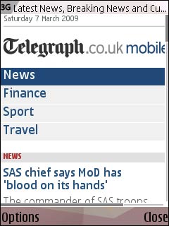
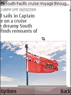
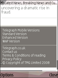
The Telegraph does offer a couple of variations on their mobile edition, with WAP and Enhanced versions available, so I guess I should probably have been using one of those instead.
One thing that I really liked about The Telegraph's design was that the front page, instead of just carrying headlines, also had story snippets.That it gave me a really good summary overview of the news on one page. On the plus side as a consumer, that meant less of a data download.
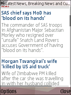
On the downside commercially for The Telegraph, I assume that potentially reduces their mobile page impressions, as I could get the gist of stories that didn't interest me greatly without having to click through.
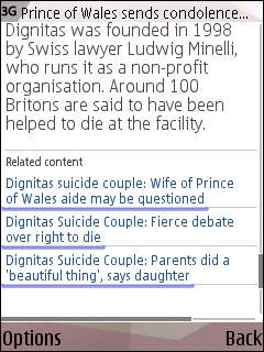
At the bottom of individual story pages, the user is provided with a selection of related content. An interesting thing in The Telegraph's design is that the coloured bar underneath each related link appeared to be a different size. My instinct was to start thinking that this 'measured' how related a piece of content was. From the headlines though, I've no real idea whether that is the case, or whether I'm trying to derive meaning from a design quirk.
The Times

I've never really taken to the lime green colour of The Times on the web, but somehow it seemed to work much better for me as a colour scheme on my phone.
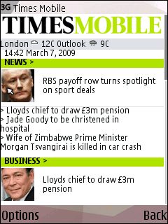
It is interesting to note that there is no top section navigation on the homepage to allow the user to easily skip to sport, for example.
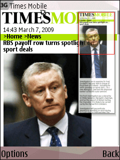
Compared to The Telegraph's and The Guardian's mobile sites, The Times uses a larger, longer image format for stories.
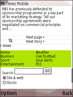
The lower navigation on The Times site is clearly focused on quick tasks, with checking the weather, live football and goal alerts represented.
Next...
This is more a sketch of impressions, rather than an in-depth review of these sites. Tomorrow I'll be publishing my thumbnail sketches of The Sun and Metro's mobile sites.
Isn't the "related links" bar on Telegraph articles simply the length of the line of text? I'd posit that it's something to do with how they (and/or your phone's browser) are highlighting links...
That is hilarious. Typical Information Architect me, trying to glean semantics from every single pixel and ignoring the bleedin' obvious!
Martin, do you know how many of British news sites have separate Applications for iphone/andriod ?
that give a different view from the standard mobile version.
thinking of upgrading my n95 to andriod soon
Quite a few papers and broadcasters have standalone iPhone apps now, and there are also several news 'aggregator' apps that blend the RSS feeds from several sources. On Android Apps I'm pretty ignorant of the state of play to be honest.