London IA Mini Conference review - Part 2
Yesterday I posted my notes on three of the presentations at the London IA Mini Conference, which The Guardian hosted at Kings Place on Monday. I was presenting "Introducing Information Architecture at The Guardian". Here are my notes on the second half of the evening.
"Design Consequences workshop" - Leisa Reichelt
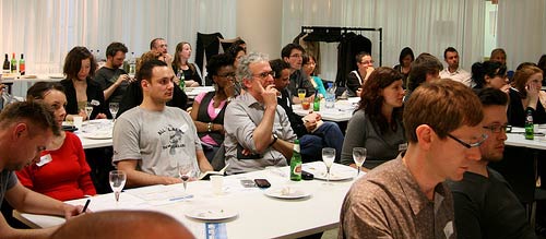
One of the aims of the London IA Mini Conference was for it to be a bit more interactive than your average evening of sitting and watching people with PowerPoint. Leisa Reichelt helped the evening live up to that with a brilliant workshop exercise for the room.
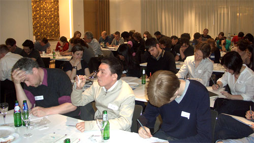
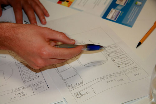
I don't want to say too much about it, because I plan to steal it and use it myself, but you can read about it on Leisa's site. Essentially you are given a design problem to solve, and have to make a wireframe of the interface you would use to solve it. After five minutes, you have to hand it over to someone else, and they have to take the design to the next stage. Of course, with a room full of Information Architects, there were several people who put their pencil down well before the time had elapsed, confidently knowing they had delivered the most informationally optimised design ever.
Aside from being fun, it also highlighted another point that kept coming up during the evening. In user-centred design we very carefully test our end products against what the user wants, expects and needs. However, we usually hand over our documentation to developers, designers, product managers and business stakeholders without ever really testing whether it is meeting their needs.
"Interacting with forms" - Matthew Solle
Earlier in the evening Phillip Winwood had to do the majority of his presentation without the slides due to A/V failure. Matthew Solle didn't run that risk, as his session about "Interacting with forms" was run with the benefit of a flip-chart and some really thick pencils.
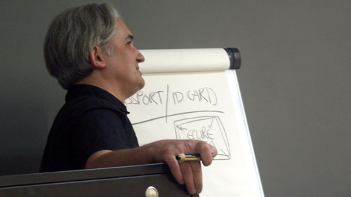
He posed a question that generated by far the most discussion from the floor. He suggested that the usability of 'non-critical' forms - like site registration - was generally poor. However, we are moving into an age where passport, visa and ID card applications are increasingly online. Having difficult interactions here could potentially pose long-term threats of identity theft and endanger 'national security'. He wondered whether there was a way of making the dystopian vision of a 'Big Brother' government holding all your personal data actually work for the user, by also liberating that data to help them in every aspect of their digital life.
Matthew's point wasn't that central aggregation of personal data was 'a good thing', but that it is almost inevitable, and so how we can influence the design for the benefit of the user. For me it echoed the challenge raised by Adam Greenfield in his 2008 Euro IA Summit keynote speech - the future will arrive, how best can we use our skills to make the technology it brings easier for users.
Debate from the floor touched upon issues of privacy, how 'Verified by VISA' was teaching people that it was OK to give important security data to the phishing design pattern, and whether mobile devices could be used for authentication.
"Interactivity - how IA's learned to stop worrying and love designers" - Tom Coombs
Tom opened his talk by admitting that the title was something he had proposed to Ken in the pub, and that he had promptly forgotten what it meant. So instead he gave an eclectic mix of demos of why he believed that our current 2D ways of looking at IA documentation limit our possibilities. Basically, we make wireframes that arrange some boxes on a page, and so then we get websites that look like coloured-in boxes on a page.
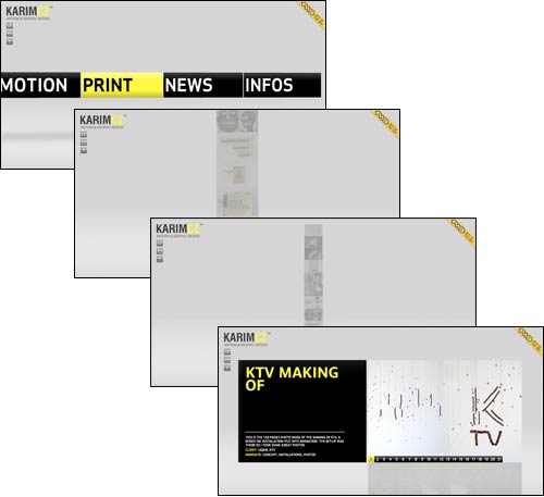
He showed, as an example Karimzariffa.com, which puts web navigation into a three-dimensional space, which could only have been described to developers by using a Flash prototype.
What really grabbed my attention was when he veered into the 'Hackday'/'Make' territory.
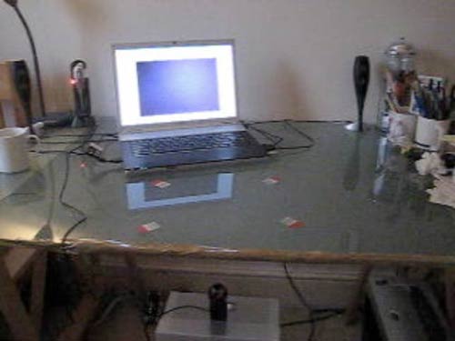
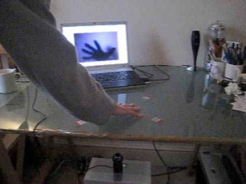
Tom thinks that touchscreen interactions are going to be one of the driving forces of the ubicomp future, and that as IAs we need to get to grips with that now. And so, with a glass desk, some infrared LEDs and a hacked webcam, he has made his own touchscreen desk.
London IA Mini Conference elsewhere on the web
Jeff Van Campen has published his great set of notes from the London IA Mini Conference on his wiki. Once I'd finished my speaking stint I tried to cover the evening on Twitter with my @currybet_live account, which I use for "live-tweeting" events. The #iamini hashtag will also give you some Twitter commentary of the night from people including @solle, @anditsin, @21five and @fstorr
“London IA: Notes from the talks”
Martin Belam, foreword by Ann McMeekin Carrier
London IA is a network of designers, information architects and thinkers. Since 2009 the group has been holding regular meetings featuring talks about UX, or of interest to UXers. This ebook is a compilation of my notes from those evenings, featuring talks by Andy Budd, Giles Colborne, Cennydd Bowles, Claire Rowland, Jason Mesut, Ben Bashford, Chris Heathcote, Dan Lockton, Relly Annett-Baker, Michael Blastland, Margaret Hanley and Richard Rutter amongst others. Topics covered range from ubicomp to psychology, from learning how to sketchnote to how to write a UX book, and how to improve digital design through diverse routes like copy-writing, designing for doubt, learning from music technology or taking care of typography.
“London IA: Notes from the talks” is available for Kindle for £2.47.
