"Introducing Information Architecture at The Guardian"
On Monday night The Guardian hosted the first London IA Mini Conference session at our new offices in Kings Place. As part of the evening I gave a short presentation about 'Introducing Information Architecture at The Guardian', which explained a bit about my role there and how the site is structured. This post is an expanded version of my notes.
"Introducing Information Architecture at The Guardian"
New web products for the guardian.co.uk site are mostly developed by the in-house technology team. As a general rule of thumb, editorial and production teams come up with ideas of what they want to achieve. Product Managers then scope out projects. The design process involves dedicated web graphic designers, alongside input from the newspaper's art direction team. These designs are delivered as pixel-perfect PDFs. The product definition and the design are then broken down into individual tasks or stories, and the software engineers pair program in an agile methodology to deliver the product.
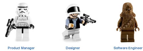
The responsibility for delivering the IA was split between these groups. Product managers produce wireframes, and detailed product specifications. The designers typically arrange the pages, and give the site's information the visual styling that implies hierarchy. And the software engineers and technical architects have played a huge role in shaping the information design of the underlying data model that powers the site. The whole platform was built using domain driven design.
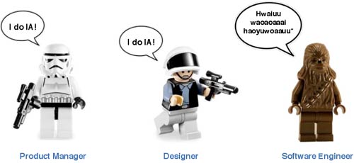
And now I am there, in a formal Information Architect role at the newspaper.

Frankly, however, turning up and acting like some kind of information freak Darth Vader would make me about as popular and successful as...

...Jar-Jar Binks!
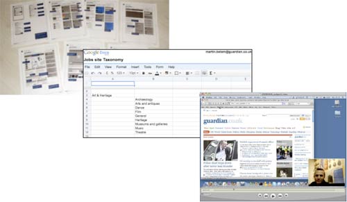
So rather than striding in and sweeping all before me, I'm working across multiple projects so that I have a high-level view of site wide developments. This covers things that affect both the nitty-gritty of the on screen IA, and the longer term strategic development of the site. Deliverables so far include the usual wireframes and taxonomies, and by carrying out 'ambush user-testing' and filming it, I'm attempting to help embed user-centred design principles fully into the product development process at The Guardian.
Our information architecture should always underpin our web principles. You might have seen these presented at the launch of The Guardian's Open Platform project. These are that URLs should be PERMANENT, that all content should be uniquely ADDRESSABLE, that multiple routes to content make everything DISCOVERABLE, and that everything should be as OPEN as possible.
All content in our database is tagged by journalists, sub-editors, content uploaders and our keyword team. Articles are tagged with relevant keywords like 'Leeds United' or 'Football', and the name of the contributor. Series tags allow us to track the narrative of a particular blog for example. Publication allows us to specify whether content first appears in The Guardian, Observer, G2 or on the web. Tone allows us to classify content in types like 'blog' or 'obituary'. Content is also classified as a 'type' - text, interactive graphic, and increasingly, as we saw with the Ian Tomlinson G20 story, audio and video.
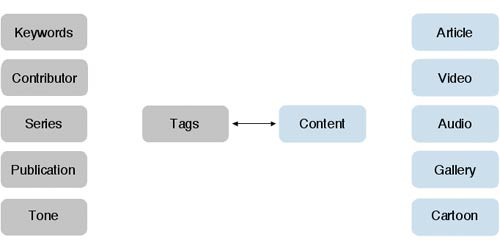
The keywords applied to an article appear at the right-hand side of the page on the web, and link through to topic aggregation pages.
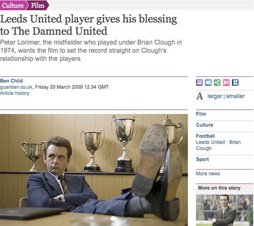
Content aggregates automatically at the article keyword tag level. This means that reviews and comment on "The Damned United" from the Culture section of the paper, automatically appear on the Leeds United page in the Sport section, without the requirement for additional editorial intervention, or indeed anyone on the sport desk having to know that the content exists.
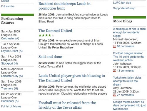
Keyword pages are generated automatically for every topic keyword using a standard template. However, for more prominent keywords, like 'Climate Change', editors can curate the page, adapting the template to showcase 'Editors picks' and other different types of content.
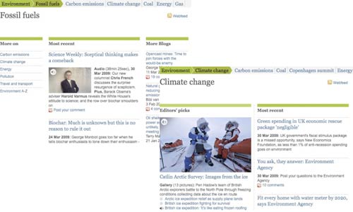
Opening up The Guardian's content via the Open Platform initiative has also opened up our metadata to public scrutiny. Now, via the API, people can find the things that we have swept under the carpet by tagging them 'XXX_test_DONOTUSE', so we strive to keep our data as pure as possible. Our keyword manager acts as an arbiter, and oversees the site-wide taxonomy development.
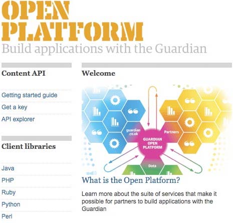
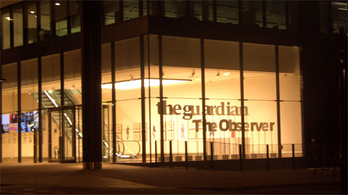
The final couple of slides were then about welcoming people to the Kings Place building, which doesn't really work in the context of this blog post...
Next...
Later this week I'll have a round-up of some of the key highlights from the #iamini event at The Guardian.
“London IA: Notes from the talks”
Martin Belam, foreword by Ann McMeekin Carrier
London IA is a network of designers, information architects and thinkers. Since 2009 the group has been holding regular meetings featuring talks about UX, or of interest to UXers. This ebook is a compilation of my notes from those evenings, featuring talks by Andy Budd, Giles Colborne, Cennydd Bowles, Claire Rowland, Jason Mesut, Ben Bashford, Chris Heathcote, Dan Lockton, Relly Annett-Baker, Michael Blastland, Margaret Hanley and Richard Rutter amongst others. Topics covered range from ubicomp to psychology, from learning how to sketchnote to how to write a UX book, and how to improve digital design through diverse routes like copy-writing, designing for doubt, learning from music technology or taking care of typography.
“London IA: Notes from the talks” is available for Kindle for £2.47.
* Actual wookie speech transliteration taken from Wookieepedia

It amazes me how many custom search tools developed for websites have been so ineffective due to the lack of using tags/keywords. It is great to see a highly targeted tool being used to deliver content based on tags.
I was not aware of The Guardian's Open Platform, it is exactly what Newspapers should be doing. All the research and data required to deliver a professional news article is wasted when only the final article is published.
The use of Google docs is a vast improvement! Some of the original documents supplied by the NHS were only available in “Microsoft Excel” file formats or PDF. The Guardian is helping to organise online data and offer it in a more accessible format. This alone offers a vast improvement on the original documents/data provided by the source.
I hope in the future a Guardian 'iPlayer' equivalent is created to serve and embed images, video and audio within external websites from API requests. Currently it appears that only the links to where the media can be found on The Guardian's website are available. This is a big barrier that needs to be worked around, once e-publishers can embed the content the uptake of the API will increase and The Guardian will become a stronger online authority resource for publishers and readers alike.
When youre working with software engineer you need to impress them to make them do what you ask and nothing will impress them more than your knowledge about their stuff. In my case, Google was my best friend.
Do you find the keywords on the right side to be confusing to users? It seems like most sites that use tags, just place them under the title content.
Your star wars analogies are priceless. I don't think I have laughed that hard at a technical blog in years LOL