The long road to the cinema
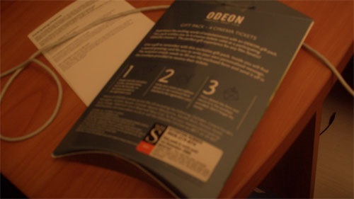
We recently got given a gift pack of 4 free tickets to go to Odeon Cinemas, which was distributed through WH Smith.

Now don't get me wrong here, I'm not ungrateful for the present. Our local Odeon costs the best part of £10 to watch a film in a stale-smelling room on a screen not much bigger than a large home cinema system, whilst you pay for popcorn which they must be able to make on a huge margin. So getting to go for just the astonishing price of the popcorn has to be a good thing.
Still, as grateful as we were, we couldn't rush straight to the cinema.
You see, first of all we had to activate our tickets.
Now, If I'd been designing the simplest user experience for free cinema tickets, I would have made it so that when I opened the box, there were four tickets in there. After all, how complicated do you have to make this?
I mean, I'd put barcodes on them, so that in the event that a load of the packages had been stolen you could cancel the tickets, but I'd pretty much let someone go to the cinema on the same day they received their box that said "Four free cinema tickets" on it.
Not so with the Odeon and WH Smith tie-up.
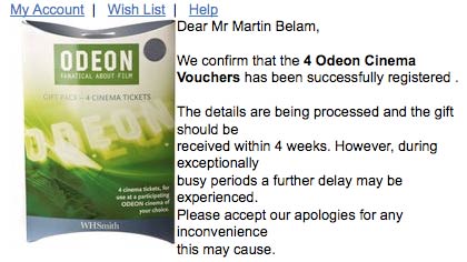
We had to register the package, and then they would post us our free tickets. Which takes up to four weeks. To be honest, that is one hell of a backlog for a virtual product where you've already taken the money.
And registering isn't the easiest thing either.
Inside the package a slip of paper informs you that it is quicker to register online. So off I trotted to the WH Smith website.
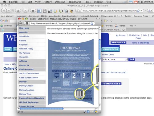
The first obstacle I faced was that I was asked to enter the barcode on the package. On the bottom right-hand side of the packet was a sticker with a complex number made up of letters, numbers and dashes, and so I put that in. Computer said no. So I tried again. Still not correct. In the end I tried several variants of upper case, lower case, or including the dashes or not including the dashes.
Eventually, I twigged that what I needed to do was peel off the sticker, and enter the number on the barcode that was totally obscured from view underneath. Why wouldn't you ask for a secret hidden number?


Having done that, the application then asked me for the number that was printed on the sticker...
You can see what is coming here can't you?
That was the same sticker that I just had to peel off to get to the barcode number, that was now in three pieces, and stuck on the side of my desk.
Suffice it to say this set the tone for the rest of the interaction.
It seemed that the whole exercise was not to deliver to me my present, but to make me jump through hoops in order to obtain marketing data about me. At the end of it, the Odeon will know where the package was bought, that I registered it, my address and phone number, and then be able to track what I went to see.
The thing is, I don't mind opt-in marketing by consent, but I do get tired with opt-in marketing by obfuscation.
And the registration process had one of the lowest points of e-commerce interaction design I've encountered for some while.
I had to put my address in, and I got down to a field that required me to enter my country. It was a mandatory field, with a drop-down menu. I pulled down the menu and found the options to be "Select" and "United Kingdom". A drop-down menu with only one option. That did not default to the valid option.

Come on guys, you are selling a virtual permissions based product. Even if you don't want to put the tickets in the box, generate me a instant barcode, send me an SMS or an email. Don't make me jump through hoops, and then slowly post pieces of paper to me.

I would have just put that package straight in to the bin. No tickets, no point. Good posting.
Unfortunately they have little incentive to improve their system. They already have the money from the unwitting purchaser who doesn't have to use the system. The recipient is unlikely to tell the purchaser how bad their gift is. Plus anyone who gives up trying to use their convoluted system means more money in their pocket! The only loss I can see is that you and I won't buy it for anyone, but we probably wouldn't regardless!
Odeon have been incapable of doing anything well online, well, ever.
Not quite as bad as this, but Norwich Union recently promised me a £15 M&S voucher for renewing my insurance with them. When they sent me the renewal documents there was a card to fill out and post back to them in order to claim the voucher! Er, couldn't they have just put it in with the policy?
Vodafone's page that let you register your interest in the new HTC Magic Googlephone had a mandatory drop-down menu for your current mobile network. It had three options - Vodafone, Orange and O2. I can only assume that T-Mobile, 3 or Virgin customers weren't welcome...
Remember Need to Know? What happened to that?
Anyway, they had a great series of emails pointing out the awfulness of the odeon site back in, er, 2003 including some people recoding of it to make it more usable and accessible. Do a search on odeon at http://www.ntk.net/ if you've got nothing better to do. EG: "Looking over last week's memepool, we're still inspired by MATTHEW SOMERVILLE's dynamic recoding of the godawful Odeon site into something that's usable (and accessible) by people wanting to actually give Odeon money."
Ha - it's just got even better.
The slip that comes in the box tells you to go to whsmith.co.uk/giftpack reg etc..
page moved to
dead link.
Nice one.