Wireframing the front page: Part 4 - The Times
by Martin Belam, 13 February 2009
This week I've been looking at various ways of comparing the newspaper printed front page with their online equivalents. Yesterday I looked closely at the Daily Mail and the Mail Online, and today I want to look at The Times.
 The Times
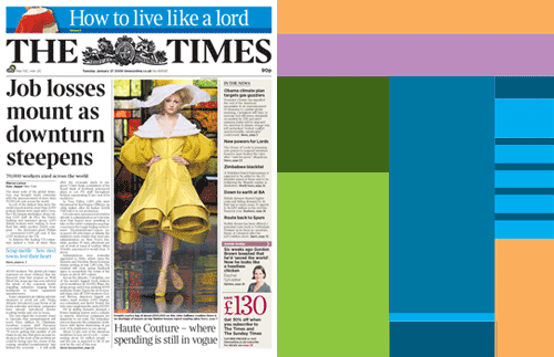
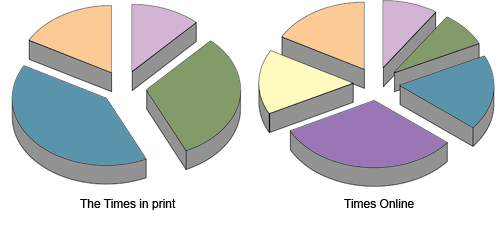
We can see a big contrast here between The Times print and web incarnations. 72% of the surface area of the printed front page is given over to carrying stories. By contrast, only a quarter of the online screen real estate carries news.

The vast bulk of the online homepage is made up of navigation (30%), third-party advertising (16%) and promotions for content elsewhere on the site (15%).
| Online | ||
|---|---|---|
| Masthead | 12% | 9% |
| Top story | 31% | 8% |
| Other stories | 40% | 17% |
| Navigation | 0% | 30% |
| Advertising | 0% | 15% |
| Promotions | 17% | 16% |
Next...
Tomorrow I'll be carrying out the same exercise for a 'red top' tabloid - The Sun.