Wireframing the front page: Part 1 - The "homepage"
I've been giving a lot of thought to the way that people navigate through newspaper websites, and it has made me consider the different functions that the homepage and the front page serve.
Navigation, for example, is mostly redundant on the printed front page. Occasionally a paper might have something like "Turn to Page 7" to link to the continuation of a story, or a promo for the sports section, but generally the front page functions to sell one major story to the audience.
By contrast, the online homepage often seems to be about showing off the breadth and depth of a site - making sure that even if you are not tempted by the lead story that there are many, many other links and stories for you to follow.
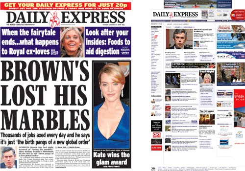
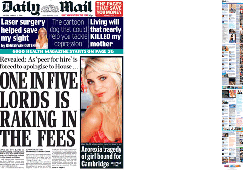
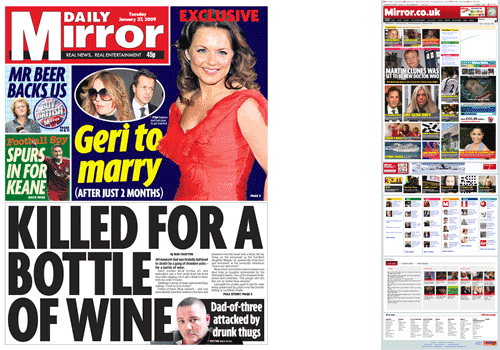
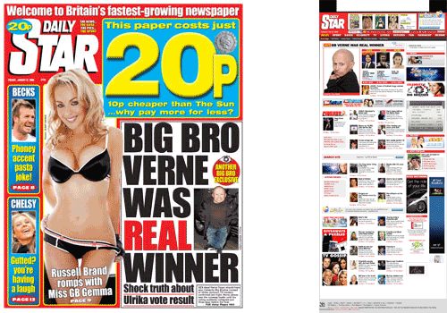
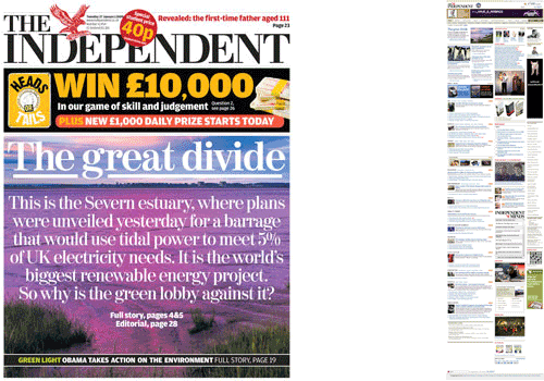
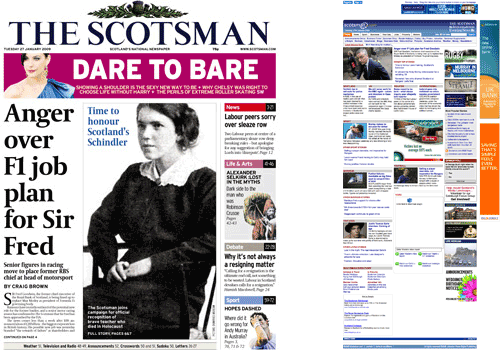
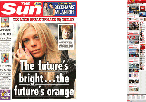
I wanted to find a way to illustrate this visually, and so I had the idea of looking at them in the same scale. I took the newspaper front page images from the Sky News site on Tuesday 27th January, and at the same time, around 8am, took screengrabs of the equivalent newspaper homepage online. I reduced the screengrabs to the same height and put them next to each other, and the results are below. In order to make a consistent visual comparisons, I have not included any papers who publish in a larger format than the tabloid.
 Daily Express
 Daily Mail
 Daily Mirror
 Daily Star
 The Independent
 The Scotsman
 The Sun
 The Times
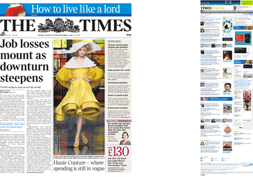
Displayed in this way, you can see which newspapers have online homepage that are really long. It is also interesting to visually compare the strong focus on 'story' with the printed front page, and the amorphous focus on lots of 'stuff' in the online equivalent.
Next...
Tomorrow I'll be looking a little further into the differences in these two different media for delivering the front page.
Interesting Martin,
I do think though that many online newspaper sites are a little over-cluttered and sometimes confusing
I believe that the reason that the online versions have some much info porn, is for the simple fact they have lots of content to get out. On the homepage they are not restricted to the normal boundaries that are inherent in print design. Another difference is there is more room for them to capitalize on advertisement ad space. Who knows, if you're not interested in the article that is presented above the fold, then you might be interested in one of the other 20 on the page.