Navigating newspapers: Part 5 - The 'quality press'
During the course of the last few days I've been publishing a series of posts looking at how 9 leading UK newspaper websites present their navigation to their audience. Yesterday I was looking in-depth at the layouts on the 'red top' and 'middle market' papers. Today I want to look at the online incarnations of the 'quality' press.

 The Guardian
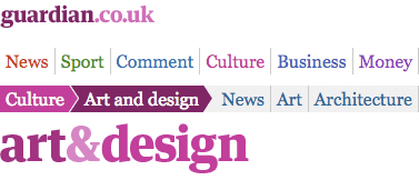
One of the distinguishing features of navigation from the 'quality press' is the prominence of comment, opinion and columnists in their offering. The Guardian sets its priorities out in a horizontal navigation that leads with News, Sport and Comment.
Like The Mirror, links are colour-coded. Selecting a link displays a second-tier of related navigation. The graphical approach of this element makes it resemble a crumb-trail, and as the user delves further into content it acts in that way.

 The Independent
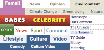
The Independent's navigation system is horizontal, and quite a difficult interaction to master. As I've griped before, the second-tier of navigation changes as you hover over the top-level, and some of the second-tier links also have drop-down menus which can be unfolded. Their usability is poor.
The Independent also flags up the priority they place on their comment and opinion even more than The Guardian does - their navigation starts: "News | Opinion"
 The Telegraph
The Telegraph also use a horizontal navigation. They are the only 'quality' paper website to include a specifically named 'Home' link. Their comment link is also further along than any of the other broadsheets and ex-broadsheets, being prioritised behind Home, News, Sport and Finance.

One thing that The Telegraph does very well is to list 'Hot topics' underneath the primary navigation on the homepage. This clues the user into the day's zeitgeist, and they can follow developing stories and topics with one click instead of having to navigate their way to them via an abstractly categorised system.
Another notable feature in The Telegraph's navigation is the push towards video content. Video appears as a top-level link itself, and contextual specific links also feature in the second-tier navigation for News, Sport, Finance, Travel, Lifestyle and Culture.
 The Times
The Times, like The Guardian, is one of only two papers to split the topic of 'Money' into two related topics - 'Money' and 'Business'. There is also a strong focus on opinion. The masthead area features a visual promo for one of the columns of the day, and 'Comment' is the second item in the horizontal primary navigation.

Unlike any other paper, The Times also uses their top-level navigation to promote their commercial archive service.
And finally...
One of the things that I find most intriguing here is that, given a blank canvas, the entire industry has settled pretty much on the same model of 'subject category' navigation. Nobody appears to be doing anything innovative with exploring news navigation on their homepage with models like visual navigation, timelines or personalised navigation. It is, in fact, amazing how quickly an industry consensus has developed.
Suddenly realised that the other parts were already one the site, that's what happens when your trying to watch Ireland vs France and browse at the same time!!!
Will have a look at the others later, match is getting very good - IRE20 - 18 FRA!!!!