Jakob Nielsen on usability for journalists
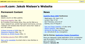
Jakob Nielsen can be seen as either a guru or bête noir of web usability, depending on the extent to which you find yourself agreeing with him. For years now he has been publishing a fortnightly Alertbox which addresses one specific area of web usability, as a free teaser for a more in-depth paid for report. This week's Alertbox looked at the usability of the areas of sites used by journalists.

The short summary confirms the technophobe stereotype of today's established journalists:
"Many journalists work from home. Many also have old computer equipment and aren't exactly obsessed with downloading the latest software. Thus, non-standard data formats or cutting-edge technologies tend to clog their Internet connections and sometimes even crash their computers. It's therefore wise to ensure that all your press materials work on low-end home computers running software that's 2 versions behind the latest release. We recommend that sites present all press information as simple, standard HTML. Journalists dislike PDF just as much as other users do."
The findings are based on a study of 40 journalists in the US, UK, Denmark and Hong Kong.
Perhaps the most interesting conclusion was that poor usability in the press and PR section of your website might deter journalists from featuring a company in a piece altogether.
"Journalists repeatedly said that poor website usability could reduce or completely eliminate their press coverage of a company. For example, after having a difficult time using a site, one journalist said: 'I would be reluctant to go back to the site. If I had a choice to write about something else, then I would write about something else.'"
Another said:
"Better not to write it than to get it wrong. I might avoid the subject altogether."
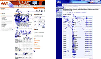
The Alertbox has some pictures of the results of eye-tracking studies of journalists looking at web pages.

They seem to be even more afflicted with short attention spans and the scanning behaviour we associate with most users. In fairness to the profession, Jakob Nielsen observes that:
"journalists are busy and work under tight deadlines. Design your PR pages accordingly."
Definitely worth a peek. The full length report is aimed at corporates rather than journalists, and is titled 'Designing Websites to Maximize Press Relations'
I'd certainly expect Jakob Nielsen to know what he's talking about normally, but ... three rounds of research over four countries over several years, and only 40 people were talked to in total (that's, what, a couple of people per year per country)?
That seems a very odd form of research to me, and a very small fragmented evidence base.
Don't forget that he also argues that you only need 5 people to uncover 80% of site-wide usability problems for a specific site. If you are doing a "generic" usability test like this I guess that finding page-level problems is not so important, it is just the broad trends that you are after.
Fair point about the 5 people stat, though as I'd expect this is an area where the lessons can change over time and also vary between countries, I'm not sure that fully justifies the evidence base.
Not sure talking to 40 people after circling the globe is a big enough pool to research