Taking the 'Ooh' out of Google: Getting site search right - Part 6
Last week I started a series of articles on currybetdotnet based upon my recent talk at the Euro IA Summit. I've been looking at ways that site search can be made distinctive from Google by including thumbnail images and information Google can't obtain, providing usable 'advanced' search, and following some positive examples from newspaper sites across the continent.
Today I want to look at two areas where designs need to exercise caution - 'scoped' search and the use of tabbed navigation.
Getting scoped search right
A 'scoped' search is where you restrict the results to just being from a particular set of content. Effectively a site search is a 'scoped' search that just covers one website. However, you can sub-divide into smaller scopes - for example allowing people to just search over the stories filed in the business section, or the sport section.
When I used to work on search at the BBC at one point there were over 70 different 'scoped' searches available to users, depending on whereabouts in the bbc.co.uk site they were. This has thankfully now been reduced to a mere handful, since it was a user experience and code maintenance nightmare.
The strength of having narrow 'scoped' search available is that it allows the user to refine their search to cover a much smaller set of potential results. The downside is that users rarely have a clear mental model of which scope they should be looking for content in, and they often fail to notice that they are even using a restricted 'scope'.
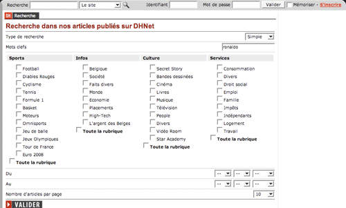
La Dernière Heure is a Belgian newspaper that specialises in sports, and it offers some very granular 'scoped search' options.

The risk here is that the more options provided, the more confusing it is for the user. There is no indication of whether the scoped categories are in any kind of heirarchy. If I wanted to find articles about Belgium's failure to qualify to Euro2008, would I be searching in the 'Diables Rouges' section or the 'Euro 2008' section? If I wanted to find out about Argentina's football gold medal in the Beijing Olympics, would that be under 'Football' or 'Jeux Olympiques'?
The multiple tab problem
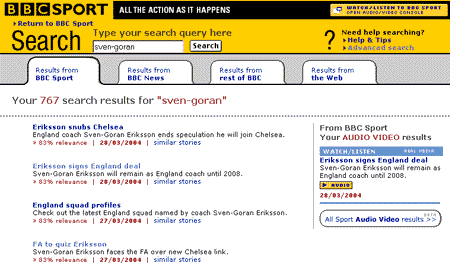
Using 'tabs' as an interface element on a search results page is difficult to get right. I worked on a couple of iterations of search at the BBC that never really successfully got to grips with the problem of how to make the tabs noticeable and usable.

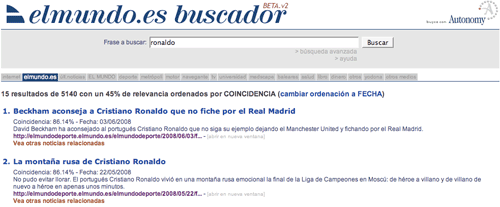
El Mundo in Spain, who, like the BBC, use Autonomy as a search technology provider, also have a selection of tabs above their search results.
A lot of tabs.
A staggering 18 in total.

This provides plenty of options, but probably too many to be displayed using this kind of user interface pattern. El Mundo may be better off having these as faceted options down the side of the results set, where they would be easier to scan. In keeping with the principle of not leading the user down blind alleys, it would also be better if they could indicate to the user in advance how many results they will find under each 'tab' or facet of search.
Next...
Next week I'll be continuing this series, and looking at some further areas of search user experience where design care needs to be taken, specifically around additional navigation elements, and the implementation of localisation.
Heh, well you haven't exactly revealed how to solve the problem of scoped search.
The key problem is knowing when to default to a scope. ie, if you're in the sport section of a website, should the search box be scoped to sport, or cover the whole website? It's a tricky one. My feeling is that it depends on which 'site' users perceive they're in. Usually this will just be THE site, but some big organisations have multiple websites that might be perceived to have separate, strong identities (eg the BBC News site vs the rest of the website).
Another problem is that when you're presenting users with scope options, as in the case of La Dernière Heure, users have no upfront way of knowing which scopes are more likely to have results in. You can easily pick too narrow a scope and have no results, or too wide a scope and have millions. The best approach to this seems to be 'search then filter' - ie let people do a very wide search first, and then present relevant options for narrowing the search by scope. Google does this with the news/blog/images/local scope options, which are presented after an initial search when relevant.