Taking the 'Ooh' out of Google: Getting site search right - Part 5
Since last week I've been posting a series of articles based upon an expanded version of my Amsterdam Euro IA Summit talk.
Having looked at ideas like handling advanced search and adding thumbnail images to search results pages, today I want to concentrate on some positive examples of search user interface design from amongst Europe's newspaper website.
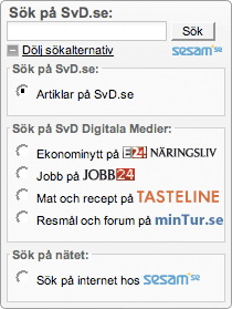
Hide complicated features
Sometimes it is better to hide complicated features. Sweden's Svenska Dagbladet has several options on their homepage search, some of which look suspiciously like commercial partnerships rather than examples of user-centred design at work. Rather than having these options clutter up the interface, they are hidden behind one text link - 'Visa fler sökalternativ'

When clicked, the search box expands to show the full range of options.
Handling multimedia
Google has begun to incorporate more video content in their search results thanks to their ownership of YouTube. A search for any sort of music act will nowadays invariably turn up a - probably copyright infringing - clip as one of the top ten Google results.
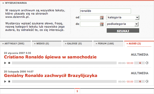
For some multimedia formats you can go much further with your site search. Poland's Dziennik Polska has tabs that divide the results up into different media formats, and the content displayed under the 'Audio' tab can be played directly from the search results page.
Indicate access restrictions
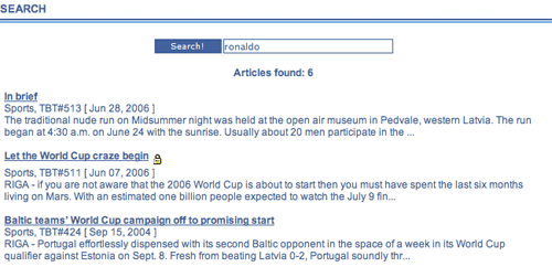
Don't forget that your articles might also have other properties that are worth displaying to users. The Baltic Times is an English language newspaper covering Estonia, Latvia and Lithuania. A lot of their archive content is held behind a subscription 'paywall'. In search results, articles that are only available to paying subscribers are marked with a padlock icon, to indicate that they are not freely available.
Belgium's De Tijd also displays the free availability of archive articles in their search results.
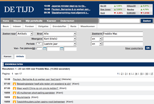
Displaying this kind of information up front avoids the user getting any nasty surprises - always a good rule of thumb in interface design.
Next...
I'll be continuing this series tomorrow with a look at some areas of the site search interface where particular care needs to be taken.